Saturday, March 30, 2013

Friends with You at MCLEMOI GALLERY - 30 March


Second stop in Chippendale and first time at MCLEMOI GALLERY.  I hadn't been here before primarily because I didn't realise how close it was to MOP et al.  It is just around the corner on Chippen Street.  I had put this on our Saturday gallery crawl itinerary with two of my junior critics in mind as the current exhibition (on until 11 April) is by an art collective called 'Friends With You' who to be fair rock an aesthetic that 5 year old girls can definitely associate with in a Yo Gabba Gabba / Hello Kitty kind of way.


Friends With You (I am going to use FWY to save my 4 fingered typing some time) are actually a US based collective of 2 artists.  Not surprisingly Murakami is listed as an influence as are other Big Lamington favourites Yayoi Kusama and Jeff Koons.  I was also reminded of Australian artist Nell who is also fond of the smiley face on inanimate objects.  I am probably not going out on a limb when I say they have a reasonably commercial look, I mean part of their artist statement is trademarked! Seriously, 'Magic, Luck, and Friendship™'!  Definitely blurring the line between art and commerce. I thought my girls would've run around here looking at all the smiley art works (like the floor sculpture, 'infinity pool' above) but they were captivated by a FWY video that was playing on a computer here. With all the good merchandising going on in this show (unique pieces, editions, prints, books and artist toys) I was surprised that video wasn't burned onto a DVD as an open edition. I think there might have been a sale (especially considering where they could've gone with the video art packaging, a la collector's space). Overall a good show, certainly successful in encouraging playfulness and laughter. Did they succeed in becoming friends with Big Lamington? I'd say yes.


Points:  3 points to the Infinity Pond, I liked it but I certainly don't have the floorspace for a floor sculpture of these proportions (147 x 213cm).  2 points to for the rainbow (top).  This was lasercut mdf and car paint and at 94 x 69 x 15 cm would look great on a mantelpiece in a kids room.  1 point to the video, Cloudy (screen shot above).  FWY have put it up on youtube so you can see it yourself here.  Now that I know where this gallery is I will be sure to include MCLEMOI on future escapades to the inner west.

Mansfield, Moore and Smith at MOP & pompom - 30 March


Given these spaces are adjacent it just makes sense to put them both in the same post.  I mean does anyone out there go to one and not the other?  Today I had 2 of my junior critics along for the ride so these were pretty quickish visits.  Just long enough to get a good squiz at everything and say 'no touching' 5 times.

First up was MOP.  I really liked Tully Moore's canvas pennants (at least I would call them pennants, they aren't framed and are stretched like on an Obeid smart pole!).  These were all oil on canvas but to the naked eye looked like a mainly custom fabric although I gather that was the aim (above left '$$Bills' and right 'Chevron' all 180 x 107cm and $3.4k).  Indeed the website says this body of work "looks at how such material links to how we perceive ourselves through branding or patterning, whether that be through a form of camouflage or to use to design to create motif's that link oneself to a particular movement or status".  I think Tully has me nailed as a white rasta because I do love red, gold and green together (as Boy George says 'loving would be easy if your colours were like my dream').  MOP usually has some more experimental work and Deb Mansfield does the honours today.  This collection of work incorporates 'photographic-tapestry' that is upholstered onto a reproduction Louis settee and is meant to symbolise how armchair travellers like remote places.  I have deliberately not included a photo as I want you to imagine what that might look like and then go to MOPs web page to check it out.

Next door at pompom Nicola Smith has pumped out quite a deliberately repetitive set of paintings that take their reference from cinema.  What I like about pompom is that they include a little essay to help you understand the work, if you can understand the essay that is, which I didn't really. I do understand obsession and I appreciate Nicola has been inspired by the same cinematic references for quite a while - I mean my college mates and I still quote Caddyshack ad nauseum after nearly 20 years - I just don't get how she was inspired by such obscure works like Les Enfants du Paradis (1945), The General (1926) or Numance (1937).  Click here to see the images.

Points:  3 for Moore's 'Chevron', I really don't care what I was supposed to feel, but I was feeling Bob Marley.  And Bob is always going to take the 3 points. 2 for Mansfield's 'the armchair traveller' and 1 point awarded jointly by my 5 year old and 2 year old to Smith's 'Jean-Louis Barrault's 1937 production of Cervantes' Numance (1582) with masks by Andre Masson, I'.

Thursday, March 28, 2013

Geoff Dyer at MiCK Gallery - 24 March


Catch up post as I popped into this last weekend and the show ends on April 7 so you have one more week to see these landscapes of Tassie in the flesh before pixels are your next best bet.

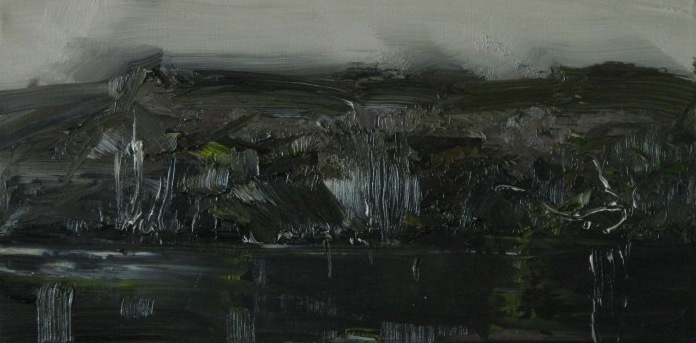
Apparently 'no one does moody Tasmanian landscapes quite like Geoff Dyer', or at least thats the drum from this recent blog review that seems like the perfect copy to leave out in the gallery. Maybe too convenient? Well, you do have to hustle these days. Despite my initial scepticism I do tend to agree with the sentiment.  Geoff does indeed do very good Tasmanian landscapes.  But it is that word 'Tasmanian' that I think is a bit constraining.   I realise everyone specialises sooner or later but to me maybe picking Australia's smallest state might just be limiting the market a little.  I mean, I love Tassie, had a great holiday there last year, but probably am happy looking at Tasmanian landscapes rather than buying one. And some of these works are massive (and by virtue of size not cheap either - Grey Light Crater Lake, above, is 120 x 214cm and yours for $28k) and still pungently reeking of oil paint fumes.  I was very glad from an aesthetic as well as budget perspective to see Geoff had included a number of smaller works and various studies (Crater Lake study below, 30 x 60cm is $3k). It was also great to see a few red dots on these as that practice should be encouraged.


Points:  3 points to Lake St Claire (I've not been but the mountain in this visage is quite distinctive). 2 to one of the Crater Lake studies and 1 to the study of Source of the Derwent which was all mood and no landscape!

Tuesday, March 26, 2013

Easter Show 2013 - 21 March to 3 April


Regular readers will know that I always get out to the Easter Show and 2013 was no different.  Yours truly even camped out a few nights in Homebush to take it all in.  This is one of the oldest continually awarded arts prizes in Australia (I think it could be the oldest, the Show itself started in 1823 and they started exhibiting arts in 1869 - the oldest AGNSW prize by reference is the Wynne from 1897) and I think it is one of the greatest as the amateurs get a real good crack at it.


There are 6 separate painting categories  plus drawing, print making and photography before you start to include all the crafts which are sometimes works of art in themselves.  With ~5 ribbons to hand out in each category (1st, 2nd, 3rd and 2 x Highly Commended) that is a lot of ribbons up for grabs.  I'll start with one of my favourites, the drawing section.  This was judged by Big Lamington favourite Michael Lindeman (& congrats to him for having a finalist in the Archibald and Sulman again this year).  I liked how Michael rewarded both traditional and non-traditional works.  He gave a white ribbon (3rd prize) to Bruce Roxburgh for his work 'Green Polychaete' (at top, yours for $950, but Bruce keeps the ribbon!).  Having won a ribbon previously for a very naive bird painting I do have a soft spot for the Australian Bird section and was surprised to see a flower take 2nd place, but it is Australian Birds and/or Flowers so you are allowed to nix the birds if you must (although I am glad birds took the other 4 ribbons with Kookaburra's being especially popular this year).  I do like the still lifes and Linda Butterfield's 'Green Pears in a Chinese Bowl' (above, yours for $1,650) was a very worthy winner.  Not only that but it won a special purple ribbon for excellence (the one just above the blue ribbon for first) and it also won the Royal Agricultural Society Art Committee Award for best arts exhibit in all classes (that is the purple ribbon at top with the braidy gold ends).  Pretty impressive ribbon haul there.  My other favourite category is of course Class 1, Rural Subject and/or landscape painting.  There are a lot of stereotypical images here of the land here, and I should hope so, although I did think the triptych copy of the Frederick McCubbin's The Pioneer a little too much.  All in all there are hundreds of works to see and it is really refreshing to see the popularity of arts at the grass roots with nary a government grant in sight!

Points:  3 to Bruce for his green drawing.  2 to Linda for the pears (you could've got first if they were quince - but that is another story) and I will give 1 point to yours truly!  I didn't actually enter any paintings or drawings this year but for the last 5 years I have been mimicking Brown Council (well more accurately they have been following my lead) and performance arting my way through some CWA recipes by entering Lamingtons in the perishable cooking category.  And joy of joys I finally snagged a ribbon.  Well done me.

Thursday, March 21, 2013

Hayden Fowler at Artereal - 21 March


So I was actually on my way back from day 1 of the Easter Show and needed to drop some showbags off to my nieces which meant Rozelle art month night was now en route home.  Being a big fan of Artereal and hearing rumours of possible Liam Benson sightings I decided to pop in looking decidedly out of place in my shorts.


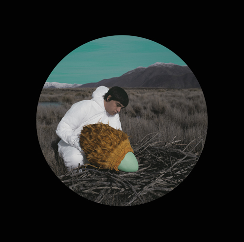
And thankful I am that I did as I was very impressed with the exhibition of Hayden Fowler's new work.  It was very trippy and in a way kind of reminded me of early episodes of that tv show Lost.  Maybe it was the white tyvek suit.  I did like the background and did manage to guess it was kiwi land (which again is what gives it an air of foreigness to an Australian audience).  This is when you need to know a bit of the backstory.  He is using the allegory of the Moa, which apart from being a boutique NZ beer was also a flightless bird bigger than the emu which was hunted to extinction by the maori (although just like the tassie tiger there are a couple of true believers who think it is living somewhere remote, like Dunedin).  I don't know if he is suggesting bringing it back with technology or some such but the detail didn't really matter as I quite liked the aesthetics of these photos.  New Romantic II (pictured top) shows a maori with a traditional feather cape looking after a big blue egg which nearly matches the sky in colour.  I quite like how the prints look as a circle in a black square.  Nice touch.  I would definitely get one if I could handle editions of 5 being priced at 2.5k for an unframed print but then again that is probably me just not getting with the program of how photography is priced these days (indeed Michael Reid reckons photography is a complete bargain but then again he is selling it!).  I also liked his pile of antlers in the corner (called Heap, photo above).  These were made of cement but reminded me of the Marc Swanson crystal encrusted antlers he did for the Peter Norton Christmas project in 2009.   Apparently the MCA ambassadors will visit his studio soon.  Sign me up.

Points:  3 for New Romantic II and 2 for New Romantic III.  The mathematicians out there may see a pattern there although I am now going to break it by giving 1 point to Heap.  Sadly like the Moa there were no Liam Benson sightings (he was actually doing a performance in the grounds at SCA and I didn't see him there either) although Artereal have a heap of postcards of his with the great coat of arms image so I consoled myself with a couple of those.

Friday, March 15, 2013

South of no North at the MCA - 15 March


To be honest I didn't know what this exhibition was going to be, I was only cutting through the MCA as it was raining, when curiosity got the better of me and I nipped in to see what had replaced TABOO ...


Turns out it is "South of no North", which makes absolutely no sense to me as a title.  Here the MCA has picked an Australian artist (Noel McKenna) and contrasted his work with two international artists (William Eggleston - US and Laurence Aberhart - NZ).  It is all a little ANZUS for me, where is David Lange?  Anyway, I was scooting through this exhibition fairly speedily until I entered the side room and paused.  There they were, magnificent paintings! Of Big Things!  Yes, yes, yes and Yes. So it turns out Noel McKenna (who I am not ashamed to admit I had never really heard of) did quite the series of big things back in the day.  Now some excerpts from the gallery blurb: "Noel McKenna's series of paintings of 'big things' are humorous at first but a deeper analysis reveals a more complex set of social and cultural relationships.  Why it it that the civic leaders of Australia are so obsessed with these big things? Is there not something pathetic and forlorn about them or even slightly deranged? But as much as they are cringe-inducing they are also magical sites: places of pilgrimage and wonder. They recall childhood trips and holidays, symbolic markers of a journey - turning the corner to see something marvellous up ahead and knowing you are almost there - be it home or away".  I admit I am a huge fan of big things, always have been, but then I love kitsch.  And spending 7 years in the US certainly made me appreciate our home grown culture all the more upon my return.  In fact, I made sure to get a photo of the Big Spud when I was down in Robertson a week ago!  I did think that William Eggleston's trike (Untitled (Memphis), pictured middle) was a great contrast to the big thing paintings, it complements the Rocking Horse, Gumeracha, particularly well.  As well as the Rocking Horse there was the Big Orange at Berri, the Big Penguin from Tassie, the Big Softdrink bottle from Victoria and the Big Pineapple from Qld. So definitely pop in and see these cultural icons, they are here until 5 May.  Just think of the savings in petrol!  I didn't check but it would be un-Australian of the MCA not to have tea towels of these bad boys in the gift shop.  Fingers crossed.


Points - 3 to the Big Rocking Horse, 2 to the Big Penguin and 1 to the Big Pineapple.  Of course, when the Big Lamington makes its long awaited appearance that order may have to be re-arranged!

Collector's Space - 13/15 March


Collector's Space is is a pop-up gallery for Art Month Sydney (at least I assume it is only open during art month) that features works from the collections of six separate collectors (hence, Collector's Space). I'm in a rush so I am just going to dive straight in ...


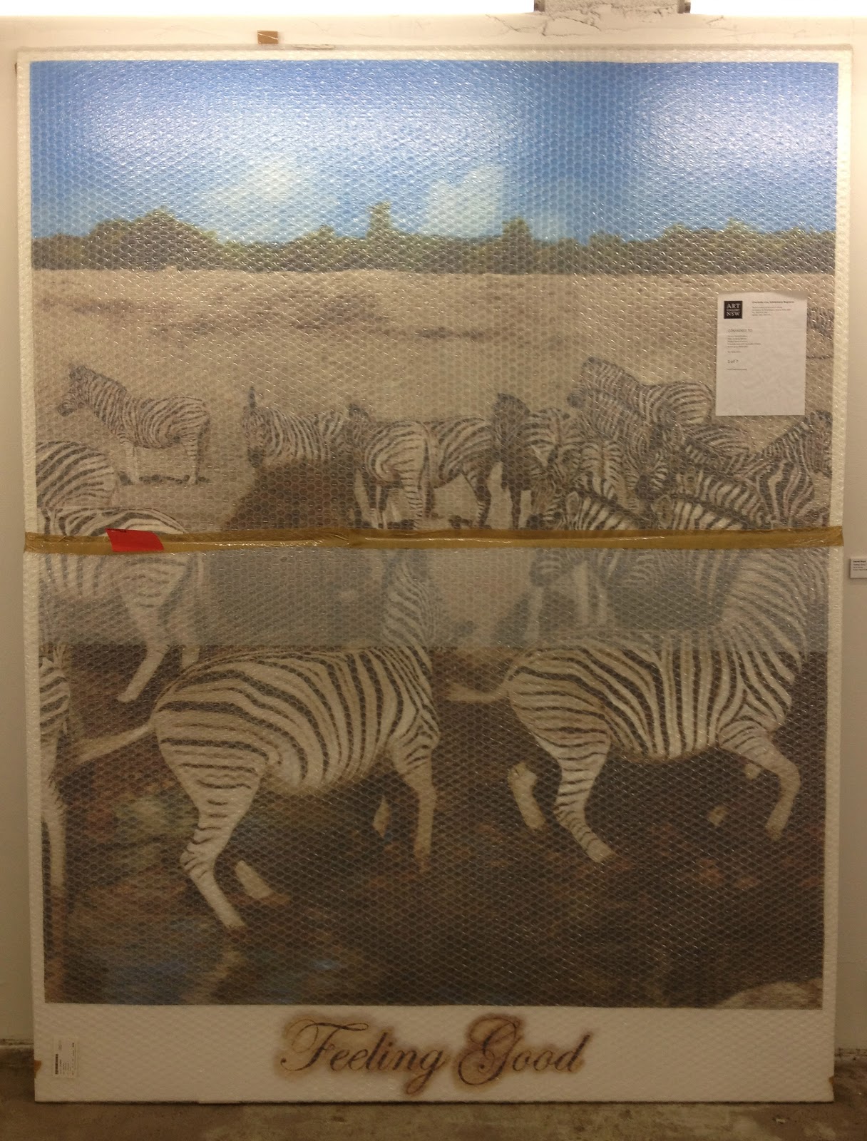
As you would expect this was all over the shop.  Works from Clinton Ng's collection are on the ground floor (he owns the building so probably got first dibs on the floor) and there was a great Shaun Gladwell photo, a Daniel Boyd that I had seen at the MCA still in bubble wrap and with the label on (pictured below), a partially unpacked Alexander Seton marble sculpture that I saw at SSFA not so long ago and a Brook Andrew neon work in the box (pictured above) along with a fantastic little Lionel Bawden pencil work.  This was a great start to the show but it also ended up being in my opinion the strongest of all the mini-collections.  I would've happily taken virtually any piece from Clinton.


Upstairs is an "emerging collector", an "anonymous" collector, Pat Corrigan and Michael Hobbs.  I was interested to see what an emerging collector buys but  I think some of this was gifted which is cheating a little bit, although I was also a little relieved she hadn't spent her money for the Jasper Knight (I think once you start getting advertised in those 'investment art auctions' in the Sunday tele then you are officially overexposed).  My favourite was the "anonymous" collector.  In a sense it was a shame that this lawyer turned mother (there was a bio) decided to stay unknown but my respect for her grew vastly because of it.  There were some interesting artworks here, my favourites were the video works - but specifically the packaging which had been arranged in a glass box so that it became the art instead of the video (pictured top).  It was amazing to see the variation in how artists package up their video art - it reminded me in a way of the Christmas artist multiples that I used to collect from the Peter Norton foundation.  Anonymous had also gone in for the art in the box, leaving a Hany Armanious sitting inside a pine box (well, it is meant to be in there, but it might've just been the box! this is a great idea and I might just start collecting pine boxes and putting labels on them, see below for the sticker you will need!).  There was also a great little Michael Parekowhai (and I can pronounce that, remember I spent 6 months in NZ bro!) taxidermy sculpture for the eagle eyed viewer.  Down in the basement was some of Dick Quan's collection.  But first extracts from his bio ... "Dick Quan was born to collect, and to collect well ... Dick Quan's fearless intellect, natural instincts and honed eye lead him to acquire works by artists that are virtually unknown - but not for long".  Puh-lease.  I also saw Dick speak on the Wednesday night which confirmed to me that Dick's intellect is perhaps exceeded by Dick's fearless ego.  I realise this may seem a little hypocritical given I have a healthy respect for my own opinion but then again I have not commissioned a portrait of myself and then lent that to a gallery for art month ... yet!!


Overall a good little outing.  What I liked most was how a few collectors had left things in the box or partially wrapped.  It does take me some time to unwrap things at home and I admit to leaving a small work on display in the bubble wrap it came in.  I also liked how they had also shown another aspect of what they collect, be they cars or wedgewood.  I did feel a kinship with some of these collectors, I know I was born to collect and have the 500 phantom comics in the attic to prove it (any reasonable offers considered)!

Points:  3 for Anonymous' collection of video works.  2 for Daniel Boyd in bubble wrap and 1 for the Hany Armonius in the box!