Saturday, December 13, 2014

Blake Prize (at whatever COFA is now called) - 13 December


This could be the last ever review of the Blake Prize.  And I am not just referring to how late this one is (it's now April 2015 as I write this, but I am a notorious backdater!).  The Blake Prize society has seen sponsors drift away and apparently they don't have the cash to make it happen in 2015.  The head of the Blake Society has said it is viewed as "too open minded" by religious groups and "too religious" by secular groups.  I kind of see what he means.  Although I dispute that this prize (ostensibly referencing religion) is "too religious".  For the last couple of years you would have been hard pressed to know you were at the Blake if you'd been blindfolded and dragged inside.  Anyway, this is not the forum to point fingers, 'cause its directly the fault of the Blake Society board! I've just checked my own archives having reviewed this since 2011 and every year I bemoan how very little spirituality is on show.  Anyhow, let's see if they can go out with a bang ...


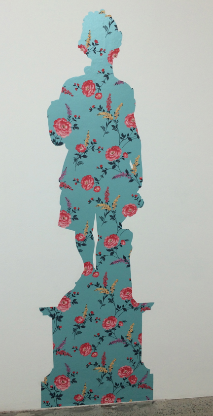
"I couldn't necessarily determine the religious or the spiritual in many of the entries, despite the fact that by themselves there were some great pictures in here".  That was a quote from my 2011 review and things haven't changed.  i could've been talking about Leah Fraser's 'The Strange Wings of Impossible Butterflies" which is a very pretty painting that showcases Leah's dreamy aesthetic.  Some other classics of the Blake were porno tapestry queen Leah Emery's 'Lotus' which was a black and white needlework of a guy going down on a girl standing on her head.  Very spiritual that one!  Not all the work was so obtuse, Bindi Cole's entry was text based in the shape of a crucifix and Philjames' The Shepherd (pictured bottom) was a reworked Christ.  Philjames actually does this type of daubing work very well.  His last show at Damien Minton had quite a few works that could've easily fitted the brief here. Not necessarily a picture but a visually arresting work was Claudia Nicholson's 'Baby I would climb the Andes' (pictured top). This referenced the type of floral arrangement you'd get at a funeral, so it was kind of spiritual (well, enough for the Blake!).  What I loved was that you also got a great fragrance from all the dried flowers so it really hit a few of the senses.  I've been following Claudia's work for a while and I think in this entry she has really knocked it out of the park, but maybe I just like wreaths and dried flower arrangements?


Points:  I've often thought about getting a customised wreath so Claudia is going to win the Big Lamington's Blake Prize! 3 to 'Baby I would climb the Andes'.  I'll give to 2 points to the Leah Fraser work that doesn't really look all that spiritual to me but does look quite pretty.  Back to more out there christian iconography and I will give 1 point to Philjames' The Shepherd.

Friday, November 28, 2014

Graduate Show at NAS - 28 November


How will I #react?  Well, my first reaction was, wasn't this the tagline for last years show?  I mean, I realise Saatchi and Saatchi are still the sponsors but they couldn't spring for some new banners?  I'll be #underwhelmed if this theme is rolled out again next year ...


Second up.  How good is it, finally, that NAS seems to have worked out a half decent online strategy?  The website they had (and I use the past tense as they've already taken it down!) was actually pretty good.  Sorted by all the disciplines you could actually see nearly 100% of the works online.  Which is pretty handy to get a good feel for the show before you actually go, because opening night when I swung by is always jammed packed.  The one downside of the excellent website is that I didn't take notes, thinking I'd just look it up at home.  Big mistake as I am writing this on 9 December and google is not helping out much.  Luckily I had taken a few snaps on opening night.  Pictured top are two of Hilary Sandeman's pieces which made the cut for the main gallery.  Smaller works but I loved them.  Hard to make out in the photo but the glass jars were filled with wax hearts.  I think I've mentioned before I have a thing for medical models of hearts and Hilary was bang on with these.  If I'd have been a bit more organised these should've made their way to Big Lamington HQ as the grad show is always very affordable and good to support young artists.  Other highlights were Bahman Kermani who made these persian rugs (pictured middle) out of train tickets.  Not bad, although would take up a fair bit of space in a Paddo terrace so you might need to think about different ways to display.  Maybe put a glass table top on and make it a coffee table?  Hey, just trying to help.  Lastly, I was really digging the linocuts of one grad whose name I can't track down.  But in trying to find this online I found Jake Morrissey's name.  And he did some cool prints of Fidel & Marilyn from memory.  Speaking of which, next time I will remember to post earlier!


Points:  Hilary Sandeman will get the 3 for Tried to Feel But Couldn't Touch.  Bahman Kermani will take the 2 for the ticket carpet.  And my unknown artist will take a point for these great linocuts above. The two alpacas in the bottom right were my favourite.  I think one was even from the Hunter Valley!  Have I mentioned before that I'm from ….

Thursday, November 20, 2014

Primavera at MCA - 20 November


Okay - apologies for the delay in posts readers but it was a busy November for the Big Lamington team with, well, other stuff happening! I am going to power through some quick thoughts on the shows I saw to get the blog up to date.  Here's my thoughts on Primavera, which if you need the backstory you should first read Frosty as I am going to just dive in.


I read somewhere that the consensus was curator Mikala Dwyer had crammed in too much work into a small area of the gallery and it was an incoherent hang.  Unkindly, my first thought was how could they tell?  That is not to say the MCA always crams random art together, they usually do leave more room.  It is just that my abiding memories of previous Primavera exhibits is that it is always random and incoherent because of the nature of just selecting a couple of young urgers (its like contiki, they have to be under 30 or something) to have a crack.  There was only one real star in my mind, Paul Yore.  Those textile works were, to quote the Chemical Brothers, out of control.  Way out of control.  I loved them.  Maybe a few too many cocks for home display but the fact that the middle one (apologies as I can't find my notes, is that 'Welcome to Hell' or 'This moment is Critical'?) was such an amalgam of random thoughts, like a art school patchwork quilt.  My favourite element was the rainbow eureka flag (pic above).  This was from memory a scaled down version of what he had at Sydney Contemporary.  What else?  I thought the pvc and can sculpture of Sean Peoples was pretty cool and I liked the randomness of his telepathy project with Veronica Kent.  Not so much the art but the fabric on the chairs was cool in a Yinka Shonibare knock off kind of way (image below).  Maybe they should've been inspired by Australia's own Utopia Goods


Points.  3 for middle tapestry (pictured top) and 2 for the ejaculating tapestry (not pictured top).  That's 5 points for Paul overall.  I would say keep an eye on Paul as his works were quite affordable at Sydney Contemporary.  Not for long if you ask me.  Finally, for those who can count backwards you can guess Sean will pick up 1 point for his sculptural effort 'Ouroboros Centipede'.

Thursday, October 30, 2014

Postgrad show at NAS - 30 October


Five years in a row for me checking out the NAS postgrad show.  That has to be some kind of record.  The new innovation this year is the online catalogue!  Finally.  These kids are racking up the HECS debt so the least the school could do is help out with some online promotion.  Here's a link to the site.  It's a little old school as they sort by major but give them time.  The better thing about the web presence is that the shop feature is fully operational.  Take that COFA and SCA!  Anyhoo, enough on the marketing, let's see the art ...


So the great thing about opening night, and the first few days, is that it is open season on the studios.  So you get to see a little more than the supposed highlights in the main gallery.  Quite often my favourite works are out in the studios and again I wasn't to be disappointed.  Out in the side gallery were some fantastic installations.  Elena Tory-Henderson's Big Yellow (plastic strips hanging across the gallery) and Liya Mirzaeva's Pink Rocks (pictured above) were memorable. In the painting studio a couple of artists seemed to have developed a signature, both Sarah Fitzgerald's geometric works (especially the big X) and Kylie Barber's broken down canvasses (the image I tweeted was her Gold Fold).  In the photography space the Mrs gave her tick of approval to Sarah Dugan for her iconic Australian rural scene (and I recognised her from last years grad show, congrats on the honours).  The main space seemed more cluttered this year, but maybe that was just due to the crowd milling about Jeff Wood's interactive toothbrush painting machine contraption (had to be seen to be comprehended). Certainly no artist seemed to pull away from the pack in my mind.  I liked Steven Latimer's still from Asphalt Dingoes (pictured top).  But then again you are talking to someone who has a pinterest board called 'cars with racing numbers'!  And who could miss the big happy portrait of Ian Thorpe, covered with sequins, by Murat Urlali. And on checking him out online I see he did a Tony Abbott in smugglers as well.  Bit of a swimwear theme, come down to North Bondi at 6am on Friday and you might just see the Big Lamington in his budgy smugglers! Now that is art.


Points:  I am going to reward making a statement, so 3 points to Elena Tory-Henderson for the Big Yellow installation.  I didn't take a good photo of it and sadly, as it is NFS, the image on the NAS site isn't very big, which is a long way of saying apologies for the bad image below!  2 points for homo-erotic mad maxness of Steve Latimer's car 69 (top).  1 point will go to Sarah Dugan for Encounter from the Badland series (above).  


Saturday, October 25, 2014

Ohnesorge at pompom / Carsley at MOP - 25 October


After a long spell between drinks its twice in a fortnight to the dynamic duo of artist spaces that is galerie pompom / MOP Projects.  This time around it was all very organised.  Nana Ohnesorge in the galerie and Gary Carsley in the project space.  I've been looking forward to this so let's get going.


Nana has featured on the Big Lamington a few times.  I love her signature use of fluoro colours and the themes she keeps recalling in her work, iconic Australian imagery like Ned Kelly (top) and aboriginal people (above).  The above works (Aboriginal Man, Aboriginal Girl, Young Warrior, Young Woman and Aboriginal Man 2) are based on found prints, photos and illustrations.  These acrylic and pigment pen works look like screenprints but Nana looks to have handrawn the outline and then coloured in with the fluoro acrylics.  Great technique.  Definitely my favourites here and with the Big Lamington HQ extension drawing to an end in the coming weeks on the shortlist to christen the extension.  Nana continues her use of fluoro through collages, a very cool sculpture (which is itself a companion piece to the Bennelong portrait) and portraits of contemporary Australians.  Next door at MOP is a much more subtle affair.  Gary Carsley has taken inspiration from the statues in the Botanic Gardens and made wallpaper cutouts in their silhouettes.  Very Victorian parlour but so contemporary at the same time.  I was very intrigued with these, the idea was just so clever!  They look great en masse, and if you have a big blank wall I bet they would look great at home too.  I think maybe vinyl instead of wallpaper for outside? Gary the possibilities are endless!


Points:  Must rush and catch up with the blog so straight to the points.  3 to Aboriginal Man (the far left in the middle).  2 points will go to Gary for one of the flat statues, probably Autumn (pictured above). I am a sucker for Ned Kelly so 'Local Colour' (top) will grab another point for Nana.  Such is life.

Paula do Prado at Chasm Gallery - 25 October


What great weather in Sydney.  Quick trip out to Chippendale for me to see Pompom / MOP and also managed to visit Chasm Gallery thanks to some twitter logistics, with the artist Paula do Prado kindly arranging to have the gallery open in the afternoon.


And what a treat it was.  Paula shows primarily down in bleak city (at Gallerysmith) so it is good that she is having a solo show in Sydney (it was back in 2012 that we saw Paula at Cross Arts, time flies!).  This had a little bit of everything.  Some newer work, focusing on masks - both painting, collage and textiles, as well as some older works like her sepia siren series (one of which picked up the 2 points on that last visit and since then joined the Big Lamington collection).  I have to say, I was taken by the textile masks in particular (top and above).  Paula has combined different fabrics and then embellished with paint and some occasionally embroidery details.  Don't mind a bit of text in art and Paula has obliged on roughly half of them. Very tribal / oceanic aesthetic.  Have I mentioned previously I'd love to have a tiki bar? Well these would be great in it!


Points: 5 points in all to the 'Self Portrait as Mask' series.  3 to the image top and then I will give 2 points to the blue.  1 point will go to the Fox collage.  Great work Paula and a pleasure to meet you.

Friday, October 24, 2014

Big Lamington turns 4!


It was October 24 2010 when I kicked off this blog.  So today the Big Lamington turns 4!  It is interesting to go back to that first post and see if, just like Jon Bon, I've kept the faith.  And for the most part yes.  Unfortunately, there's no gift shop at the Big Lamington yet, so that is one promise that I haven't delivered.  But I promised I'd check out "galleries and museums in and around Sydney with the occasional jaunt to foreign climes".  Let's see.  So far over 250 posts, the lion share of those are Sydney with the National Art School topping the charts with 21 posts.  There's been the trip to Hobart for MONA.  A trip to Brisneyland for GoMA, an extended period in New Zealand and the recent trip to New York to mix things up a little.  So that is the main goal all ticked off.  I hope whoever has stumbled upon this blog has enjoyed some of the posts as much as I have enjoyed writing them.  For me? It is a great way to make me think, at least a little bit, about the art I see.  It is also a great tool for answering the question 'Have I seen that artist before?', thank you handy blogger search function!

Since the get-go I have been handing out points in the footy coach 'best & fairest' style; 3, 2 and 1.  Initially I promised a Big Lamington pewter mug to the artist with the most points.  Well, I thought I should go back and see who has amassed the most points, I won't do the the Dally M round by round scorecard, but I will tweet the top 5 during November.  Better get on twitter, even the Motel Sisters are (pictured above from their MCA performance).


I also wanted to see what others have thought of the blog.  For this I had to swap my strategy of usually stalking artists to actually stalking myself online to see what punters have been saying.  And it was a rewarding bit of research.  I've really enjoyed seeing the Big Lamington name pop up on a few artist CV's - thanks to all (the first time I saw it I felt a tinge of respectability wash over me!).  My favourite Facebook shout out was probably the Nell / Lionel Bawden exchange above, love Nell's work and so am very pleased the Big Lamington is on her radar.  As a fellow Maitlander can you please design a Big Pumpkin for our hometown?  With that background from regional NSW I must say another real highlight was being quoted in the Walgett Daily News! Some extracts below:


So what's in store for the 5th year?  Well more of the same really - random art musings from some semi-anonymous punter with a little bit of spare time.  Hopefully the Sydney art scene continues to be interesting.  I've seen lots of galleries close, lots of galleries open, and even seen some galleries open and close.  I'll still be front and centre at the art school shows which I find so enjoyable and I will still try and call it as I see it.  But I do make this promise.  Tea-towels will be available in the gift shop within 12 months!!

Thanks all for reading.

Saturday, October 18, 2014

Everything at M.Contemporary - 18 October


So much on at M. Contemporary at the moment.  We were swinging by to check out the emerging artist show, but they also have jewellery, some remnants of their last show and maybe a bit of stock room going on as well. Too hard to classify, we're calling this 'Everything'.


So no room sheets in the main space here, you have to pay attention to the walls.  Except for the Lynne Roberts-Goodwin photo of the mountain in the front room. For that work you have to ask at the front desk. Well, that was my strategy anyways.  I had dragged along the 5 year old art critic who was a little edgy as we'd just borrowed a Star Wars dvd from Paddo library and he had some different culture in mind for Saturday afternoon. Luckily for us a diversion in the form of Wong Ho Lun's ceramic figures sprung into view. These works all included mini stormtroopers in each piece, although there were an especial feature of 'Clone' (image top).  That said, Wong, as even my 5 year old will tell you, there is a world of difference between a Clone Trooper and a Storm Trooper. Geez! With that we made our ways upstairs to see the emerging show that had been our goal. Now I didn't even know there was an upstairs. And no wonder.  It is such a well hidden space you actually have to go outside the gallery and then walk up the outside back stairs to get into the upstairs space. For some reason room sheets are also the flavour of the day up here and this reminds me it is actually .M rather than M. which I will never get used to (and no wonder I have struggles googling this place!).  In this show was a small Eloise Cato and a very big Anna Cuthill (go NAS!) along with quite a few similar looking works from Tom Blake, a Will Coles concrete bag, and some interesting photos from Tanya Dyhin and Kai Wasikowski. Anna Cuthill's dye sublimation printo on polyester fabric is a big digi print curtain (Rest Area 31 Federal Highway, pictured above in iPhone panorama), and it is 3m x 9m. And it is an edition of 3! Loved it. Don't know where I have a 9m long space in my house but you this does get me thinking all manner of possibilities. Again there were some unlabelled works upstairs which turned out to be the stockroom.  Chris Uphues colourful love hearts stood out as did a few of Conrad Botes works. After a good explore of this space and another look through the downstairs on the way out we certainly could say we had seen everything.  Or at least enough.


Points:  So I used that handy search function to see why I remembered Anna's name.  She's got points before! 1 point for the massive Milk print at the NAS postgrad show.  Looks like she is making large format her signature.  3 points today for this vast effort.  2 points will go to Wong for the Clone Stormtrooper Ceramic. I will give 1 point to Chris Uphues for these stockroom beauties (pictured above). What can I say, I love stuff packaged up in bubble wrap! Lastly, and not wanting to get all house & garden here but how good is .M courtyard going in spring? Great work with whatever those flowers are.  We have this aspect at our terrace and Mrs BL would love our courtyard looking like this. My 5 year old also rated the hanging sculpture as the best work in joint. Nicely.


Thursday, October 16, 2014

French & Marshall at Chalk Horse - 16 October


Opening night at Chalk Horse and who happened to be walking by?  You guessed it.  This guy.  A good reminder of an opening night here is the crowd milling about outside on William Street, a drinking and a smoking.  After a couple of quick hellos to some familiar faces it was downstairs to check out the wares.


In the front room is Will French's show Uno Momento and around the corner you'll find Addison Marshall's It's What you Don't See.  I was a little disoriented upon entering and actually walked all over one Will's works, a coiled piece of rope on the floor called 'Attension', yours for $3200.  Feeling a bit self-conscious I scurried over to check out his photographs and then calmed down when I saw another half a dozen punters step all over the art!  His photos (pictured top) document a performance undertaken a few weeks ago when he got a plane to write 'This will never last'.  Quite.  Great idea and I always like seeing an artist merchandise performance art.  Other works included a random steel pennant which looked like oversize castle lego hanging from a wooden pole attached to a mirror on the ceiling, aka 'Half Masked'.  So you can see this had everything!  My preference was the skywriting which was a novel idea, and apparently also using themes of the momento mori according to the catalogue essay.  Yeah, I can see that.  I'm liking this even more.  Speaking of likes, I thought Addison Marshall's sculptures were pretty cool.  These were ceramic works that were variously freestanding, attached to the wall, and hanging from the ceiling.  I didn't really get the titles, but reading the accompanying essay learnt he has taken them from self-help books.  I am still none the wiser.  I did like the pieces hanging from the ceiling but these were hard to take a snap of on opening night so I'll illustrate the show with mainly pieces on the wall.  I thought the use of coloured thread on variously white or coloured ceramic was a great touch.  Gave a real luminosity to some of the pieces.  I just may steal this technique for the Easter Show ...


Points: Tough one.  Had I looked up on the evening of 22nd September and seen the art in the sky and then on the walls tonight Will French would've had a lock on the 3.  As it is, the photos are cool but they are one step removed as documentation of a performance, 2 points to Will.  Addison will take the 3 points for Sink or Swim and the 1 point for the Stress Relief series (pic above, they were actually 10 in all).  These were 9cm diameter and only $200 each.  Nicely.

Saturday, October 11, 2014

Banyard, Beckingham and Whalen at MOP/Pompom - 11 October


Time flies.  It's October already and turns out this is my first trip to the double act that is Galerie Pompom and MOP projects this year.  How do I know?  Well, the layout change.  What was formerly MOP is now Pompom and vice versa.  They have also cut a handy hole in the wall between the two spaces to cut down on attendant requirements.  Its been like this all year apparently.  Don't I have my finger on the pulse!


There are three artists showing at the moment and you have to check the room sheets to see who is representing whom.  Jodie Whalen is firmly in the MOP project space, Kylie Banyard is in MOP and then Kate Beckingham is also in the main space as a "MOP Projects exhibition hosted by Galerie Pompom".  All clear?  Let's go.  The first art you see is Beckingham's.  Interesting pieces.  Apparently photos from a residency in Iceland with some later studio works inspired by the trip.  I spot a white flag.  It is apparently showing (also in white) the international symbol for S.O.S - not sure Kate enjoyed the trip to Iceland!  Another piece that caught my eye was Ring (pictured above).  This was a wooden gymnastics ring hanging from the ceiling.  Don't know what it is supposed to mean but the minimal aesthetic did look good (and also as someone with relatively full walls I could see this hanging from my ceiling!).  On to Kylie Banyard whose interiors seemed a little trippy - they are all focused on handmade houses (pictured top, 'Somewhere').  I thought I saw some John Coburn references in the Bell Chamber but the interiors are all from the US as I understand.  I also liked the Cosmic Chimes but maybe that is because I used to ring the bells at church - true story! This was the last weekend on view and this show was a sellout so great work from Kylie.  Moving into the front room you are confronted with seven similarly sized collages (all 21 x 29cm)  I am disappointed I didn't bring one of my junior critics as they would have loved the Hello Kitty! aesthetic that Jodie is using here.  A little bit Murakami mixed in there as well.  Not sure I get the title (each one called 'Everyday is a job well done', I think #7 or #4 is pictured below).


Points:  Tough choices for the points.  I liked aspects of each of these shows.  3 points will go to Kate Beckingham for the Ring.  I also liked her flag but white on white was a little too subtle for me.  2 points to Jodie Whalen for the happy collages. 1 point will go to Kylie for Bell Chamber, which reminds me, I need to get back into bellringing ...

Friday, October 10, 2014

Richard Prince's Instagrams at Gagosian.


Long time readers would know that whilst the Big Lamington keeps its finger on the pulse of The Arts in Sydney that I have a very soft spot for Prince, Richard.  I've said it before that one of my all time favourite images is his untitled (Cowboy), of which both the AGNSW and Patrick Bateman have a copy.  Now for those that have come in late, or don't read the global arts press he has an amazing exhibition on right now at Gagosian in NY.  I wish I was in town to see it in the flesh as, being a follower of Prince on both twitter and instagram, I have unwittingly been witnessing this exhibition come together.  To avoid me having to give you all chapter and verse, go read Jerry Saltz's awesome review here.  Apart from being a top art critic, and personal friend of the Big Lamington, he is also a Prince fanboy so I share his views.


Prince has, for those that haven't worked it out.  Taken appropriation to a whole new level in the iphone age.  He started by just taking screen shots of peoples profiles on twitter.  Then posting it as "Portrait of [  ]".  Then he started finding images on instagram, adding comments under his own name, then taken screen shots of those posts.  In his show at Gagosian he has printed out those screen shots on canvas.  163 x 124 cm canvasses.  In other words BIG.  To top it all off, when the exhibition went up, Prince deleted his instagram feed.  What a marketer!  Luckily the Big Lamington had been screenshotting in the background along the way, examples pictured above & below.  Now one of the best bits of this show is the Gagosian press release which states "All images are subject to copyright.  Gallery approval must be granted prior to reproduction."  Righto, gallery install view at bottom.  I tweeted a sneaky pic of a Richard Prince canvas from his Canal Zone show at Gagosian in May and got a great response tweet from artist - "I want to be a hypocrite".  Love it.  He deleted that tweet, but not before I took a screenshot.  Canvasses available shortly ...


Points - Prince gets them all. Hey AGNSW, when are we bringing this genius out to Aus?


Thursday, October 9, 2014

Ingenious Inhabitants at William Street Windows - 9 October


So I am still making the daily trek into the City from Paddington via shanks pony.  Which means I get to walk past the William Street windows on a daily basis.  Their current show, Ingenious Inhabitants, is on until 12 October.  Will this be as good as their last show?  Let's find out ...


So first off, I think there are a few less artists this time around.  The windows certainly feel a little emptier.  Which means you can't miss Ramesh Nithiyendran's work.  His oil, acrylic, enamel and resin on plywood works are big, bright and a little out there in subject.  I've also only just discovered their names, 'My Birth' (pictured top) and 'Self-portrait masturbating' - I never considered that moment as worthy of art before. Performance art maybe, but not a self portrait!  Next to this was Monica Brooks' work, 'Besia's Glasses' (pictured below).  This looked fairly plain, and is usually the type of thing I would slag off a bit, especially when I am in a narky mood.  But I didn't mind this.  Yes, it looks like you could pull it off for about $80 from your nearest SVdeP but the backstory is quite interesting. I couldn't work out whether Monica or her aunt was the collector, but I've got that bug as well so this could be in line for some points!  At the other end of the same window was Amber Boardman.  Amber will have "achieved [her] goal if someone feels something, anything at all" about the work. I like where she is going here.  To me it recalls the ambition of Andres "I like to make pieces that make people feel something.  Any reaction is better than indifference" Serrano of piss-christ fame.  So no pressure then, how do I feel about these works? Well, to be honest, I'm not feeling all that much.  Maybe it needed to be bigger?  Onto the next window where it was all about the installations.  These looked pretty interesting, but the window gallery does provide a limitation as you can't get as close as you'd maybe like to study the detail in some of the works.  The pile of what looked like green turds for instance (Peter Nelson's 'Extensions of a No Place', pictured above) actually turned out to be 3D printed ceramics when you read the online guide.  Gee, I'm not sure that is why we invented 3D printing!  The accompanying video is tied into in a way the casual viewer will get but only the art historian will appreciate when they read the artist statement.


Points:  You can probably guess this exhibit didn't really grab me like their last one.  3 points will go to Monica's glass collection - let me know if you want to borrow my tiki mugs one day.  2 points to Ramesh, who should probably stop painting himself wacking off, and 1 to Peter Nelson, whose sculptures I think you need to get up closer to rather than being kept at arms length.

Wednesday, September 24, 2014

Bridie Connell at ALASKA - 24 September


How great it is to have venues like Alaska putting out something different for the punters.  Just a couple of weeks after seeing Alex Munt's awesome American Corner (will have to come back and post about that) we have Bridie Connell promising some burlesque with 'B-Girl Rhapsody'.


I love the poster design, and by implication, the bad girl vibe it is throwing out.  Harking back to the 'golden age' of comic design and by reference, the Cross itself.  In my mind, the golden age of the Cross was the '90s (vale Joe's Garage, Baron's, Mansions, Sugar Reef etc).  That said I do remember seeing some sights that would challenge anyones definition of performance art.  I was actually expecting some performance art tonight but one thing you should expect about Alaska is you never know exactly what it is going to entail.  The small gallery space was cut in half by a thick velvet curtain.  In the front half were a series of ostrich feather fans, tools of the trade so to speak.  I was excited to see what was behind the curtain.  It was the sign pictured top.  Now with a smattering of high school latin and also a bit of ancient history to boot it was easy to pick up the gag of famous Julius Caesar quote.  Traditionally, Veni, Vidi, Vici; I came, I saw, I conquered.  Bridie has gone for I came, I saw, I came.  Indeed Bridie.  I'm not really all that familiar with Bridie but after a bit of intrawebs research I am sad that I am only just getting up to speed with this artist.  Apparently there will be a different text based work for each day of the exhibition (till the 28th!).  Well, I am out on Saturday but will try and see a few more.  Points to come.  Get it?

Saturday, September 20, 2014

Melissa Coote at Jensen Gallery - 20 September


Only just made this show which finished on Saturday.  I had been trying to cajole one of the junior critics to come down the road with me to no avail.  So, under the pretext of delivering birthday party invitations for one of the junior critics I set off to Jensen Gallery and just made it in before closing.  And luckily I did because this was one great show.


Hearts are dear to my heart! My old man is/was a heart specialist and courtesy of my childhood memories I can still vividly see medical models of hearts that he used to have lying about his office.  So Melissa's works all hit the right note for me.  They were big canvasses, small editions on paper and lots of bronze sculptures.  Melissa had used sheep hearts (the little ones) and bull hearts (the big ones) as the basis for works.  Confusingly, they were all titled variants of Heart.  The sculptures used letters and numbers (e.g. Heart B and Heart 4) whereas the works on the wall used roman numerals (e.g. Heart IV).  Now even luckier for me was the fact that invigilating on this slow Saturday was arts writer Chloe Wolifson.  Conveniently, Chloe had written the profile in the arts collector magazine on Melissa so she was a font of knowledge.  Then, Melissa decides to pop into the gallery herself and I am treated to a one-on-one artist chat about technique and all sorts of things.  Even better, when discussing the patina effect to make the black heart (it uses acid and then some polish) Chloe pulled another sheep's heart out of the drawer in a 'here's one we made earlier' type move and I got to feel it snug in my palm.  After that it was all on for touchy feely time and I picked up quite a few of them to inspect for heft.  All very impressive stuff.  It really is something special when you can make a relatively modest work in terms of size and for it to have such an impact.  The subject, the detail, the weight, the material all worked together beautifully.  The paintings were also impressive.  Not only due to their oversize scale but also the amount of 3D detail in their creation which you miss in the pics, lots of layering and scraping away in their drafting apparently.  It was such a cohesive show and one that will stick with me for a while.  Inspiring.


Points:  I quite liked the large heart drawings but for mine the stars were the sculptures.  I'm really torn between the two sizes and the two finishes.  I am leaning towards shiny and so the only question is will the bull or the sheep take the blue ribbon?  I am actually going to go small and give the 3 points to the bronze sheeps heart (pictured above).  Great work and fits in your hand perfectly.  The bronze bull heart will take the 2 points and one of the patina finish black hearts will take the 1, the sheep again had it for me.

Saturday, September 13, 2014

Reko Rennie at AGNSW - 13 September


So I am not very technical, but one of the things I like about blogger is the 'schedule' function as it allows me to travel back in time and pretend to post this on 13 September, when I actually visited this exhibition, as opposed to todays date which is a week and half later.  Luckily you all still have time to see this work, as the AGNSW has this up until November 30.  And you should definitely see it.  The AGNSW's contemporary space has been kicking a lot of goals recently.  Well, by recently, I mean I liked Tony Albert's Projecting our Future in July 2013 and Tony Garifalakas' Mob Rule in July of this year.


That said, Reko Rennie's work 'No Sleep till Dreamtime' (full image top & bottom) isn't actually in the contemporary project space.  That whole floor is being renovated for the summer Pop show so this project is downstairs in the aboriginal galleries.  Which is a bit disappointing to me as there were plenty of crowds on the main level but only about 4 others punters downstairs when I visited.  Now I like this on a number of levels.  Firstly, great title.  I am, as Reko obviously is, a bit of a fan of the Beastie Boys (except for their suing of a great toy company Goldie Blox for using a song in an AWESOME youtube commercial - my daughters have some of the toys and they still watch this ad on youtube) and Reko is taking inspiration from their No Sleep till Brooklyn.  The hip hop vibe totally ties in with the street origins of Reko's style.  Secondly, Reko's has really trademarked a street style especially the tagged crown, diamond and flag symbols common in much of his recent work. I also really liked the 'deadly' (image bottom) in the stylised font, but as I have said many times.  I am a sucker for text in art.  The stencils were also very cool.  These you had to get up close to as from a distance you can't really see them in the pics.  One great example was the kangaroo on the boomerang (image above) and another was a playing card (a king of some suit). Lastly that glitter works a treat in the darkened space AGNSW provided.  Lots of sparkly diamonds interspersed between the symbols and stencils.  On the whole I found this work similar in ambition to Tony Albert's AGNSW project.  They both collect a number of works that could stand on their own and make a much, much bigger work across a horizontal plane.  And just like Tony's I left very impressed.


Points:  As is traditional in a solo show with a single work there can only be one set of points.  Best on ground to Reko.  Come along on 5 November and hear the Reko's artist talk.  Details here.


Wednesday, September 10, 2014

Nothing New at William St Windows - 10 September


So I've just started schlepping walking to work from Paddington.  It's not a bad walk, about 30 minutes or so if determined and more like 40 if dawdling.  One of the side benefits (or positive externalities for any art loving economists out there) has been the City of Sydney sponsored William Street Windows (here's their website).  It is basically a couple of windows from a council owned building that have been taken over in a curatorial sense by Sophie Kitson.  I understand there are going to be a few shows from now until November.  The first show in the window, Nothing New, runs until 15 September - so you've only got a couple of days to check it out ...


Now I've been seeing the show twice daily for the last month, so I feel I am more than well qualified to opine on it.  Sophie has collected a bakers dozen of artists (thats 13 for the art loving non-bakers out there).  The show itself is an agglomeration of paintings that the artists just had lying about - hence they called it nothing new.  So far so literal.  Anyway, lots of random works and some have grown on me, some have not.  I am actually surprised how much I've enjoyed Tom Polo's Fleshy (top) on my daily walk past.  Am I just a whore for recognisable style or is Tom's naive oeuvre growing on me?  And is Andrew Frost's full court press to blame?  Part of me thinks that it is great you can be acknowledged as a painter without actually seeming to know how to paint.  That sounds like a terrible thing to say but really Tom will just have to learn to live with comments like that for. the. rest. of. his. life.  Unless he changes his style.  The jokes on all the haters anyway as it is a trick Tom seems to be pulling off over and over.  Certainly no "decorative obsequiousness" here.  Would I want one?  Hmmm, maybe.  I could go a 'Self Portrait with Lamington'.  I think I've mentioned a couple of times before that I am a big fan of tiki.  And I was really feeling an exotic vibe from Rosie Deacon's Face Feels series (above).  Again with the naive but this time with feeling.  And much brighter colours! I think a few high vis pinks, oranges and yellows.  Again, I could go for a few of these, and you'd need a few.  This is one of those pieces that works well displayed en masse but would look a little lame on its own.  I know from experience, I have a little Penny Byrne that looked great with its mates in the gallery but is pretty sad all by itself on my shelf (by the way, just checking out S+S website trying to remember Penny's name and it looks like she's been cut from the roster - tough gig this art biz).  Mitchel Cumming's this picture isn't absolute (below) was an interesting conceit.  Mitchel has copied the Tintin illustration of Professor Calculus from the coffee cup (foreground) into a diptych leaning against the wall.  Reason? None that I could think of. But luckily for Mitchel a lot of people like Tintin.  And I am one of them.  Other hits included Angela Garrick's colourful patterns, Anna Kristensen's Column and Emily Hunt's totes over the top collage work called Fermi's Paradox (image bottom).  This even has clocks embedded behind the canvas.  This was one of my early favourites but I feel now it has too much going on in it and I think I would prefer Emily to split this up into a series of 12 separate works.  Some of the squares are much better than the others.


Points:  This is a tough one.  Tom Polo will take the 3 points!  Keep up the good work.  My advice to artists is to beware using titles where the wikipedia entry threatens to be more interesting than your work.  Luckily for Emily Hunt her Fermi's Paradox just did it for me, and she will grab the 2 points.  1 point will go to Rosie for the tiki faces.  I love tiki all year round but especially at Father's Day as the junior critics buy me a tiki mug every year and this years was a beauty.