Showing posts with label Sydney artist run space. Show all posts

Friday, June 19, 2015

2015 Yen Art Award at Gaffa - 19 June


"Now in its 4th year, the Yen Staedtler Female Art Awards is back to bring you the best in homegrown female talent".  Well, with promo copy like that, who is the Big Lamington to resist saddling up again to see who is emerging in 2015 (you can click here for 2014 and 2013).


I missed the opening but thankfully the organisers were keeping the winner a big secret, seriously I had to google this after my visit, which meant I was able to pick my point winner without bias (ha!). On the whole, I didn't think this was as strong as the prior years, and I am not sure why that is.  The prize is fantastic for an emerging artist, you get a solo show at Gaffa as well as a feature in the magazine.  As well, the judges seem to favour the "serious" artists that have graduated from a top art school (last years winner was a BFA (Hons) and this years winner is doing her MFA).  I recognised Eliza Slater's work immediately.  Eliza had taken a point in the NAS graduate show last year and had entered the same work here, nice work being selected as a finalist (image above on the right).  I liked Miranda Lorikeet's name and her entry, 'Dive / Survive'  According to the bio she did this in her lunch break on MS-Paint.  Great to see some amateur's / hobbyists involved.  This work (image above, middle) was a little pixellated when printed out to 100 x 80cm, but that could have been on purpose.  I don't think it is a Yen art prize unless there is a bit of embroidery involved and I wasn't to be disappointed this year.  Annie Comelli has made the cut with a collection of works focusing on her vajayjay.  I liked the illustrator style of Anna Gareeva (image above on the left) and similarly the rough graphic design style of Nicola Mitchell.  A standout was Louise Zhang, who I recognise from Artereal.  Her colourful, abstract work 'and it came from Goo Lagoon' (pictured top) was also big (125 x 126cm) so really differentiated itself from the mostly figurative crowd.


Points:   I am going to agree with the judges here and give 3 points for big and colourful.  Well done Louise.  Eliza is going to take the 2 points for her screen prints.  I will give one point to Annaliesa Horne for the North Sydney Bears inspired drawing (pictured above).  Always great to see some cross over between NSW Cup teams and the arts.  Also highly commended to the team from Yen for keeping this going.  And they do a handy little online publication where you can see all the finalists and get a bit more info, it's here.


Friday, June 5, 2015

Chris Twiney at Gaffa - 5 June


I haven't been to Gaffa for a little while, but the email newsletter piqued my interest last week.  Luxury packaging design rebranded with rural towns? Well that ticks a few of the Big Lamington's boxes so we nipped over during the week to learn more about Chris Twiney and his show 'Rural Gucci'.


Turns out Chris Twiney is an emerging visual artist based in Sydney.  And according to his CV, this is his first solo show.  Even better he has a good little website so you can see more of his earlier work.  Chris is apparently using the luxury branding to highlight the widening economic divide between cities and rural towns in Australia.  I love the concept here, with its hints to Elmgren & Dragset's Prada Marfa and those t-shirts that say "London / New York / Paris / Moree". My only question is in regards the disparate towns presented. They are all over the map, literally.  Yass, Collector, Berrima, Braidwood, Hobrook (all NSW) and Glenrowan (VIC) are all within striking distance of an ANU arts student, I guess, but they're not on the same road trip.  If you were going for disadvantaged towns you could probably pick some better ones than Berrima.  And if you were being a little more collector friendly, you could have picked some better known towns as well!  I mean Holbrook?  Anyhow.  My favourite pieces involved the packaging, but then again I love the aesthetics over at the Dieline. Braidwood got the Hermes treatment (pictured top), Holbrook got the Tiffany blue box, and Collector got the Chanel white shopping bag.  The screen prints were good, again I liked Braidwood and also the YSL version of Yass (pictured above).  There was also a great photo were Chris had re-fashioned the sign at the entrance to Yass.  All in all a great debut solo show and I will be interested to see where Chris takes this theme.


Points:  3 points to the Braidwood box.  2 points will go to one of the screen prints.  I probably liked Braidwood's the best again and while it is looking like I have a soft spot for this town, regular readers would know I'd prefer something from the Hunter or the Southern Highlands!  The 1 point will go to the LVMH wheelbarrow (above).  This didn't really question the economic plight of towns but was a nice fun inclusion to the luxury theme.  Great show.

Saturday, October 25, 2014

Ohnesorge at pompom / Carsley at MOP - 25 October


After a long spell between drinks its twice in a fortnight to the dynamic duo of artist spaces that is galerie pompom / MOP Projects.  This time around it was all very organised.  Nana Ohnesorge in the galerie and Gary Carsley in the project space.  I've been looking forward to this so let's get going.


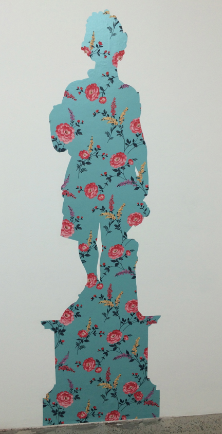
Nana has featured on the Big Lamington a few times.  I love her signature use of fluoro colours and the themes she keeps recalling in her work, iconic Australian imagery like Ned Kelly (top) and aboriginal people (above).  The above works (Aboriginal Man, Aboriginal Girl, Young Warrior, Young Woman and Aboriginal Man 2) are based on found prints, photos and illustrations.  These acrylic and pigment pen works look like screenprints but Nana looks to have handrawn the outline and then coloured in with the fluoro acrylics.  Great technique.  Definitely my favourites here and with the Big Lamington HQ extension drawing to an end in the coming weeks on the shortlist to christen the extension.  Nana continues her use of fluoro through collages, a very cool sculpture (which is itself a companion piece to the Bennelong portrait) and portraits of contemporary Australians.  Next door at MOP is a much more subtle affair.  Gary Carsley has taken inspiration from the statues in the Botanic Gardens and made wallpaper cutouts in their silhouettes.  Very Victorian parlour but so contemporary at the same time.  I was very intrigued with these, the idea was just so clever!  They look great en masse, and if you have a big blank wall I bet they would look great at home too.  I think maybe vinyl instead of wallpaper for outside? Gary the possibilities are endless!


Points:  Must rush and catch up with the blog so straight to the points.  3 to Aboriginal Man (the far left in the middle).  2 points will go to Gary for one of the flat statues, probably Autumn (pictured above). I am a sucker for Ned Kelly so 'Local Colour' (top) will grab another point for Nana.  Such is life.

Saturday, October 11, 2014

Banyard, Beckingham and Whalen at MOP/Pompom - 11 October


Time flies.  It's October already and turns out this is my first trip to the double act that is Galerie Pompom and MOP projects this year.  How do I know?  Well, the layout change.  What was formerly MOP is now Pompom and vice versa.  They have also cut a handy hole in the wall between the two spaces to cut down on attendant requirements.  Its been like this all year apparently.  Don't I have my finger on the pulse!


There are three artists showing at the moment and you have to check the room sheets to see who is representing whom.  Jodie Whalen is firmly in the MOP project space, Kylie Banyard is in MOP and then Kate Beckingham is also in the main space as a "MOP Projects exhibition hosted by Galerie Pompom".  All clear?  Let's go.  The first art you see is Beckingham's.  Interesting pieces.  Apparently photos from a residency in Iceland with some later studio works inspired by the trip.  I spot a white flag.  It is apparently showing (also in white) the international symbol for S.O.S - not sure Kate enjoyed the trip to Iceland!  Another piece that caught my eye was Ring (pictured above).  This was a wooden gymnastics ring hanging from the ceiling.  Don't know what it is supposed to mean but the minimal aesthetic did look good (and also as someone with relatively full walls I could see this hanging from my ceiling!).  On to Kylie Banyard whose interiors seemed a little trippy - they are all focused on handmade houses (pictured top, 'Somewhere').  I thought I saw some John Coburn references in the Bell Chamber but the interiors are all from the US as I understand.  I also liked the Cosmic Chimes but maybe that is because I used to ring the bells at church - true story! This was the last weekend on view and this show was a sellout so great work from Kylie.  Moving into the front room you are confronted with seven similarly sized collages (all 21 x 29cm)  I am disappointed I didn't bring one of my junior critics as they would have loved the Hello Kitty! aesthetic that Jodie is using here.  A little bit Murakami mixed in there as well.  Not sure I get the title (each one called 'Everyday is a job well done', I think #7 or #4 is pictured below).


Points:  Tough choices for the points.  I liked aspects of each of these shows.  3 points will go to Kate Beckingham for the Ring.  I also liked her flag but white on white was a little too subtle for me.  2 points to Jodie Whalen for the happy collages. 1 point will go to Kylie for Bell Chamber, which reminds me, I need to get back into bellringing ...

Wednesday, September 24, 2014

Bridie Connell at ALASKA - 24 September


How great it is to have venues like Alaska putting out something different for the punters.  Just a couple of weeks after seeing Alex Munt's awesome American Corner (will have to come back and post about that) we have Bridie Connell promising some burlesque with 'B-Girl Rhapsody'.


I love the poster design, and by implication, the bad girl vibe it is throwing out.  Harking back to the 'golden age' of comic design and by reference, the Cross itself.  In my mind, the golden age of the Cross was the '90s (vale Joe's Garage, Baron's, Mansions, Sugar Reef etc).  That said I do remember seeing some sights that would challenge anyones definition of performance art.  I was actually expecting some performance art tonight but one thing you should expect about Alaska is you never know exactly what it is going to entail.  The small gallery space was cut in half by a thick velvet curtain.  In the front half were a series of ostrich feather fans, tools of the trade so to speak.  I was excited to see what was behind the curtain.  It was the sign pictured top.  Now with a smattering of high school latin and also a bit of ancient history to boot it was easy to pick up the gag of famous Julius Caesar quote.  Traditionally, Veni, Vidi, Vici; I came, I saw, I conquered.  Bridie has gone for I came, I saw, I came.  Indeed Bridie.  I'm not really all that familiar with Bridie but after a bit of intrawebs research I am sad that I am only just getting up to speed with this artist.  Apparently there will be a different text based work for each day of the exhibition (till the 28th!).  Well, I am out on Saturday but will try and see a few more.  Points to come.  Get it?

Thursday, June 19, 2014

2014 Yen Art Award at gaffa gallery - 19 June


So it turns out that this is the 3rd year of the Yen Art Awards which means the Big Lamington has coverage of 67% of their history (see last years thoughts here, I just re-read the post and it was a cracker!).  For those that can't be bothered lets do a quick revision:  Yen is an Australian magazine aimed at "smart creative cookies who love to be inspired".  I guess they target smart young creative cookies as this award is restricted to women aged 18-35.  Five judges in all (and yet they still didn't need me as a guest judge, editors my offer stands for 2015) and they have whittled the 530* entries down to 20 finalists.  Let's see who inspired this creative lamington cookie!


Now given the prominence of social media it is hard to keep anything a secret and so I'd already heard via tweeter that Claudia Nicholson had won this years award.  Congrats Claudia!  Loyal readers will remember Claudia has taken some points before (here and here) so it was great to see her recognised with a win.  Her work, 'Si Tomas el Agua de Neshuya (once you have tasted the water of neshuya)' (pictured top) continues with her pink dolphin theme which is a commentary on the folklore and myth of illegitimacy in Columbia (that is the pink river dolphins turn into charming blokes that seduce innocent girls).  Unless you know that back story I guess you are just appreciating the handmade aesthetics of the embroidery but with knowledge of the myth I find it much more interesting.  Also inspiring were the pencil or charcoal drawing of Phoebe Boyle ('Day trippin' in Versailles', pictured above).  There was some great technique on display here as the drawn folds were very intricate.  Top work and a great buy at $800.  Most of these works were very affordable (under $1k) so there were quite a few dots on the walls.  I'm a fan of collage so enjoyed Meredith Earl's 'Commonplace Magic' (you'll have to check out Yen's handy website which has a booklet of the finalists for this image).  And I liked the retro illustration of Camila de Gregorio's 'Birds 1'.  I had a great time looking at this exhibition, not only did I have the place to myself for my first walk through, but then to top it off I even got a curatorial tour from gaffa's own Grace Mackey at the end.  In addition to discussing the works above she pointed out Grace Blake's '3 hrs', '18 hrs' and '9 hrs' (pictured below).  These were prints but Grace's great trick is the framing which is actually coloured perspex.  Hello innovation.  I've been picking up a growing trend for inventive framing (Marian Tubbs, Phil James, and at the Frieze fair in NY) and this is a great continuation.


Points:  This is tough.  I was all set to give Claudia another 3 when the curators tips brought Grace Blake into the frame so to speak!  But the dolphin story takes it to another level for me and that pink pimp takes another 3 points.  2 to Grace and 1 to Phoebe.

* that is a lot, see them all here.  I am also going to call out a couple of artists that didn't make the shortlist based on my own trawl through the long list.  Two I would've included both rock a textaqueen aesthetic and incorporate a bit of text, Alanna Lorenzon's Things that are not healed (who has her own website here, good hustle) and Alexandra Sherger's Lana Americana.

Saturday, February 22, 2014

Daisy Chain at Marrickville Garage - 22 February


So turns out Marrickville Garage (web here) is an actual garage.  In the same vein as one of my favourite ever small gallery spaces (the Suite Gallery annexe in Wellington), the team behind Marrickville Garage have repurposed their off street parking into a tiny gallery space with the addition of a few pots of white paint (see below).  I'd heard about this space (and their current show 'Daisy Chain') because I stalk follow one of Maitland's finest exports, Nell, on facebook. She had contributed a couple of small works to the group show (if you follow Nell on facebook you'll see those images, I'll put one on twitter as well - go social media!).  I think the premise was that artists had to invite other artists to submit something.  Liam Benson was listed on their website so I was a little disappointed he was a no show (& I'd schlepped all the way out to Marrickville and the Jets weren't even playing).  Lionel Bawden made up for it with a piece totally removed from his pencil sculptures (image top).  Stood out amongst the mix of works contributed.


Points: well, it was very hard to work out who had contributed what.  Let's face it, a room sheet wouldn't have hurt.  That said Nell, Lionel and Schapylle Scragg made an impact.  I will give Nell the 3 for the repurposed record mailer that I would've loved to take off the wall.  Rainbows are very much favourites of my junior critics.  I'll give Lionel 2 for his cool t-shirt, he could do well with these at Paddo markets!  Schapylle Scragg (not her real name I am guessing) will pick up the 1 point for her portfolio of confronting bogan Australiana.  This place is open the first weekend of every month.  Now if they manage to co-ordinate that with some Newtown home games I might be back ...

Sunny and Hilly at Minerva Gallery - 22 February


New year, new galleries.  There's been a bit of noise about a few galleries closing recently but a lot of news on new ones opening.  One new gallery in the Cross Elizabeth Bay, is Minerva Gallery.  This space has taken over the old James Dorahy Project Space.  To me, Minerva seemed to blur the line between artist run space and commercial gallery.  But they are just getting started so it will be interesting to see how it evolves.  Their first show, fittingly, is a group one.  Showcasing all the artists that will be getting a solo gig at some time over 2014/15.


I swung by mainly to check out a firm favourite of Big Lamington in Jonny Niesche.  His signature glitter work ('Her love sticking out like stars', image below) couldn't be missed.  The install was a little questionable, sitting precariously in a pile of recycling right by the front door.  Lucky it wasn't council clean-up day or I might have swiped it!  In the main room you also couldn't miss Hany Armanious' adhesive vinyl installation (it was untitled but spelt out 'Eggs').  This was a massive 1,140 x 330 cm.  Helpfully the gallery sheet noted that the work can be scaled to any size which will determine price.  I like the way Hany does business, what can I get for a pineapple? In the middle room I quite liked the cut of James Deutsher's gig.  He had two works, 'North West' in iron and 'Red Nation (I can't tell you what's good but I can tell you what's not)', combined image above.  I quite liked the explanation of the dimensions of these works in the room sheet.  The iron sign was based on Kanye West and Kim Kardashian foot length (and for those that don't keep up with the gossip rags, North is their spawn).  The Red Nation was "Kirsten Stewart standing height x Dries Van Noten medium scarf".  This work made me deeply think ... gee, she's short.


Points: hmmm, I think Jonny will take another 3 for the glitter (above).  I'd really like one of these but I am running out of wall space at HQ so friends and family will be getting recommendations here.  I am going to give 2 points to James' Red Nation, which I thought was a clever way to get a fairly minimalist sculpture to comment on celebrity / consumer culture.  1 point will go to Jonny's 'Untitled' (top).  I've seen a few of these mirrored works of Jonny's now and they are starting to grow on me.  His solo show at Minerva is slated for March/April.  Get along and check it out.

Friday, September 20, 2013

Firstdraft fundraiser - 20 September


I had hoped to add the label 'new acquisitions' to this post but it wasn't to be on a very busy night at Firstdraft gallery in Surry Hills.  They were hosting their annual fundraising auction and I had tagged along to see what gives.

There were about 70 works kindly donated by artists to the evening.  Firstdraft had planned for live auctions for the big names and silent auction sheets for the balance.  I tiptoed around a packed gallery space and managed to put a few silent auction bids in although I did want to hold back to see how the live items played out.  For the live auction I liked the look of Jonny Niesche's glitter stick and Rochelle Haley's jewel.  Also up (amongst others) were a Philjames, Oliver Watts and Andrew Frost's favourite (aka Tom Polo).  Unluckily for me the Niesche was up first before I had truly got in to the auction spirit and I managed to let this bad boy slip away for a bargain to a lucky punter who looked a lot like the proprietor of the Commercial gallery.  Everyone was getting into the spirit and I recognised a few artists also bidding up big.  Trying to mitigate my disappointment with the live game I had another recce around the silent auction and saw a few great bargains (like Beth Dillon's Institutional Rainbows, top or Emma Thomson's Ray, below) which were all looking like complete bargains for some lucky bidders.  I put down a cheeky bid on a Claudia Nicholson but haven't got the call so must've been pipped at the post by some cheeky sniper (I couldn't stay till the death).  I feel like discouraging everyone from attending in the future but it is all for a good cause so everyone mark it in your diaries or alternatively just follow @first_draft on tweeter.  Be warned, I will be better prepped to bid big early!


Points:  1 point to all the artists who generously donated their works for the event, 2 points for the collectors who opened their wallets in the pursuit of art and 3 to Firstdraft for arranging a great fun night.

Monday, July 22, 2013

Niesche / Goran / Sampson at Firstdraft - 20 July


There are four galleries at firstdraft and three shows on at present which means someone is double parked.  Hopefully the combined impact of what is here can make up for it!  The current shows are on until August and include Jonny Niesche with a show called 'Too many heroes', Simonne Goran with 'The colour of shadows' and Lizzy Sampson with 'Dollars and sense'.


I was here primarily to see Jonny Niesche's latest work.  I've seen his stuff a few times now (at RoslynOxley last August and at Galerie pompom just the other month) and it is really growing on me.  Even the logicsticks (giant wooden poles covered in glitter, pictured below) seem like something I need to have in the house, although the one in this show at 3m long is starting to a bit large for most domestic settings.  Of the works on show I preferred the straight up glitter to the 'wall work' which I am still kind of trying to work out.  The glitter work included the tricky 'Split event horizon' which had a double sided glitter triangle sitting on a mirror to make a visual cube from the right angles.  It is like something he had at RoslynOxley and I must say it is a neat technique.  The glitter on the wall was a more traditional shape but hung in a diamond pattern ('A carrot is as close as a rabbit gets to a diamond', pictured top). More evidence as to my growing appreciation for Jonny's work is my reticence to take the piss out of his room sheet which uses far too many big art words for my comprehension.  The bits I did get I agreed with for the most part, this did seem like "a magical carnival of shape shifting possibilities", it was "teasing and stretching the spatial limitations of traditional painting" (I think he means the mirror here!!) and I do see the "visualizations of deep space ... glam rock and geometric minimalism".  Roll on August 3 for the artist talk. Bring a dictionary, or Andrew Frost. Moving further back into the main room you meet up with Simonne Goran's experimental sculptures.  In general I like her re-use (not sure it is upcycling) of everyday objects into sculptures.  She claims to extract materials from their more familiar uses to make more ambiguous shapes, "the challenge thus becomes to extract their [the new shapes] meaning".  Again, we are going to need to come back to get to the bottom of this!!  Finally Lizzy Sampson is in the back room with Dollars & Sense.  This was a pretty random collection of technique brought together with some (at times tenuous) connection to 'finance'.  I quite like the video concept, Lizzy is out with the metal detector looking for treasure in her back garden.  This references quite well to the sculptures in her show where she has some made up metal detectors with all kinds of odds and ends including coins, old batteries, sticks, tape and random handles.  On one of the walls there is a map of Australia made just by marking where a mine is located, it was pretty interesting and even better there was a souvenir version to take home.  Score!


Points:  Really like what Jonny is doing with all this glitter on a large scale, he won't scoop all the points but he'll get the 3, for the diamond that is as close as a rabbit gets etc.  I will give Lizzy 2 points for her metal detector, helped also by the fact she had the giveaway map! 1 point will go to Simonne whose 'Pearls' (pictured middle) was probably my favourite work of hers and possibly also the least ambiguous.

Thursday, July 11, 2013

Everything is Lit at Gaffa - 11 July


Three days later and I am back at Gaffa to see a few shows.  It is a great space in the CBD, 3 galleries AND a project space.  Today is the first day for Kirra Jamison in Gallery 1, Leyla Stevens in Gallery 2, Nick Collerson in Gallery 3 and Claudia Stevens in the project space. I was interested to see it all and struggled to coin a collective title for this smorgasbord of art.  I ended up channelling my pinball fuelled uni memories when you've managed to get all the features on the machine turned on and you don't know where to hit: 'everything is lit' ...


In a quirk of interior design I couldn't get to Gallery 1 without going through either 2 or 3.  So I decided to check out Nick Collerson's work first.  I have one of Nick's paper leaves he did a few years ago but was struggling to connect the titles to the images in this group of work.  Turns out the numbers were all squiff as Gaffa had skipped the 2.  Once that was fixed (and gallery staff alerted, my good deed of the day) it all came together much better.  These works showcase a minimal almost naive style of painting and for me I was left wanting to know more about the 'why'.  The statement in the accompanying room sheet didn't really help, however Nick's website has a more detailed post about the Gaffa show.  It turns out he is being cryptic on purpose (primarily the paintings but to me also the text).  Thankfully Gallery 1 doesn't ask that many questions.  Kirra Jamison's work in this show is at the more decorative end of abstract.  There are large (all around 120-170cm cubes and rectangles) acrylic on polyester pieces which will take the better of $7k down to smaller (76 x 56cm) gouache on paper works (like Loop, mineral blue 4, above) that will run you closer to $2.5k.  These are bright and energetic works that kind of remind me of Gemma Smith's last show at Sarah Cottier, just even more colourful. There is nothing wrong in an artwork that would actually look great above the mantelpiece so I am not going to try to ascribe some deeper meaning here.  Moving on to Gallery 2 and here Leyla Stevens has some great video works. On the smaller screen is a work called 'Buoy', which coincidentally depicts a buoy with a flashing red light (which kind of recalled the Great Gatsby, just with red instead of green) and on the big screen a work called Signalmaster (still image top). Here Leyla is performing a semaphore sequence to the empty ocean in front of her. I loved it, you could tell there was a message here but given most of us don't know semaphore (I am not even sure they would teach it in the navy these days) the meaning is obscured despite being in plain sight. A riddle you are drawn to keep watching but one that you will never solve.  One riddle Leyla has solved for the punters is the editioning puzzle.  Usually right now I would be complaining about an edition of 5 in the digital age being all about enforced scarcity to drive up prices but these are editions of 100 for $80, a complete bargain in my mind.  Finally tucked away in the Project Space was Claudia Nicholson. Her show is called Silly Homelands and includes a few of the works we had recently seen at 4A as well as a couple of new ones. There was a mix of NFS and very reasonably priced works here. Of course the star of the show in my mind, the pimpin pink dolphin 'Papi Chulo', was NFS.  The new watercolours were all great. The cabbage patch and pink dolphin myths were covered in her earlier show (for those that couldn't be bothered clinking the link, Claudia's work explores children born out of wedlock so coming from the cabbage patch or the pink river dolphin that shapeshifts into a stylish man to seduce young women at parties) but the significance of the coconuts in Los Cocos was not immediately apparent.  I really liked this body of work and I think it is an interesting exploration of culture I have no familiarity with - definitely one to keep an eye on.  Oh, and watch out for pink dolphins slipping roofies into your drinks.


Points: No conflict, no interest - there is a new acquisition here.  3 points to Leyla Stevens' 'Signalmaster' (top).  Great video, great editioning. I will definitely put my money where my opinions are when it comes to a bigger edition at a reasonable price (and in this case it is probably a little too fair!). Can't wait to see what it looks like on the smaller screen at Big Lamington HQ.  2 points to Claudia for the pink dolphins in Mamacitas (above).  1 point to Kirra for the Loops, on the night I liked the mineral blue version the best but now I am beginning to think more pastel might be the go.

Monday, July 8, 2013

2013 Yen Artist Awards at Gaffa - 8 July


Hands up who loves a random art prize?  Yep, thought so.  So do I and I was lucky enough to squeeze in a visit to Gaffa on the last day they were showing the 2013 Yen Artist Awards.  According to their website, Yen Magazine is Australia's #1 independent magazine for women.  Who knew? Their art prize is also women only, but they've gone all contiki tours and made it for 18-35s only.  You can't see this at Gaffa anymore but Yen have done a great little website with all the finalists (all the entries, as in at least a hundred appear to be online, at Gaffa there were probably only 20 works).


I had actually spent some time on the award website prior to my visit so had seen quite a few familiar works online (Leah Emery's cross stitch porno come to mind!) and probably a few that should've made the exhibit in my opinion (Sarah Sheehan's entry a great example here). Some works look much better in person than on the computer, Annie Davidson's Cactus Land was a great example. Bright, vivid colours and a little bit quirky.  The official winner was a fairly dour affair for mine, certainly when compared to works that really captured the eye like Robin Clare's Tropical Thunder (top) or Emma Coulter's Foreign Landscape (above). It was about 50/50 works for sale versus NFS, and given most of those featured were emerging the prices were more than reasonable. All in all a great show and certainly one that has given me some names to watch out for. A few I was already aware of, like Claudia Nicholson and Montana Miller but also some new ones like Robin Clare and Nicole O'Loughlin.


Points: 3 points to Robin Clare's Tropic Thunder.  Just like 10CC said, 'I don't like Jamaica, I love it'! Robin actually has a solo show right now at Black Penny in Surry Hills.  Here's a link.  I missed the opening but will be sure to go check these out over the weekend if not before, stay tuned!  2 points to Emma Coulter.  It's a little more abstract than what I usually go for but it certainly stood out in the room.  I will give the 1 point to Greedy Hen (their "we just ignore the neighbours" digital collage above). I do like their name! Great work Yen, just shout if you need a hand with the judging next year. 

Thursday, June 6, 2013

Nell at Roslyn Oxley & Alaska - 4/6 June


It was a big week for Nell fans.  Openings at Alaska on Tuesday (Let there be Robe) and Roslyn Oxley on Thursday (Gravest Hits 2013).  Would the Big Lamington be able to make both?  You betcha.


First up was Alaska.  As I understand it this is the same show that Nell had down in MONA, and I am thankful Alaska has brought it up here.  The room (image above, I think this was actually MONA, there were too many punters in my iphone snaps of the Alaska opening!) was decorated with crucifixes of paintbrushes and drumsticks (there were also a couple of interlopers I recognised from the Christmas project Nell did a few years back that the junior critics collected - from memory we had a heart, star and a leaf although I wish the kids had picked a ghost!), however the big focus was the AC/DC t-shirts reincarnated as a Buddhist robe.  In front of this was a pile of guitar picks will Nell spelt out in the AC/DC font (points, but not that original, we did the same thing on black t-shirts for my rugby club back in the day - for those about to ruck!).  I actually liked how this was described in the program - "Jesus said 'Let there be light', AC/DC said 'let there be rock', Nell says 'LET THERE BE ROBE!'".  I've said it before but Nell is of my vintage and we're from the same hometown and I agree that it is impossible to grow up in the '80s / '90s in regional NSW and not be into Acca Dacca.  I thought the Bon Scott tribute wall at Alaska was a particularly nice touch.  Here Nell has painted a wall white and put a cross with "Bon Scott 1946 - 1980" on the wall in the AC/DC font.  Punters are encouraged to graffiti it up and it will be interesting to go back and have a look at it now.

But before I do that we headed over to Roslyn Oxley for Gravest Hits.  There's more AC/DC here.  Pride of place are a series of 3 large works each containing 49 (7 x 7) Back in Black album sleeves.  That makes the work a massive 220 x 220 cm and for that size it was a pretty good deal.  This obviously continues the Bon Scott tribute link (the all black cover being a memorial to Bon Scott whose death by misadventure precluded his participation in this album).  Officially called 'More Sound Hours than can ever be repaid' (pictured below) these works are quite impressive, but I think that is as a result of the scale.  You need to be pretty close to see the differences in the condition of each individual cover.  On the other side of the gallery is a companion piece of 3 similar works featuring the Beatle's white album (which also answers my question as to why Nell didn't use Dirty Deeds done dirt cheap - great album but shite cover art, and would've clashed badly with the White Albums!).  Elsewhere there were other new works which repeated themes and images that Nell has used before (hence I guess the gravest hits reference).  My favourite of these other works was definitely 'girls and boys of the same name' (pictured top).  Is this meant to reference pac-man? Because I was really wishing I had a table top console version when I got home.


Points:  3 to the ghosts of 'girls and boys of the same name'.  This references the great tapestry Nell has at Deutsche Bank (let me put my love into you).  2 points to the Alaska install.  1 point to the Sound Hours for Back in Black.  I did love it but thought I could maybe re-do this as a 3 x 3 courtesy of the 'bay?

Saturday, June 1, 2013

As Above | So Below at MOP - 1 June


So pinch and punch for the first day of the month and all that.  Sadly some bad calendar management saw me miss the opening night festivities of this show where the Kings Cross based Alaska Projects have sent their 1st XI into the beating heart of Chippendale to do a group show at MOP Projects.  I managed to swing by on the weekend with a couple of junior critics who were keen to take on the climbing frame at the nearby park so this was a quick stop.

MOP's non-commercial instincts are mostly charming but this show took it to another level.  Today's trick was a group show of 13 artists and a room sheet without numbers and actually a little out of order. It was quite tricky to navigate, as keeping with current contemporary art practices the titles of the work don't give much away.  My trick was to find someone whose style you knew and then try and work out the artists adjacent.  That took me to Philjames and his 'Untitled' oil on vintage cigarette card (pictured top).  I was at uni with Phil so I know we are of similar vintage.  Accordingly I loved the Battle of the Planets reference, a real blast from the past and rekindled much fond memories.  I really like how Phil does his daubing over existing works, I might need to pick up a few vintage pieces to let him work his magic on.  Next to Phil was Biljana Jancic whose 'Slalom' the room sheet described as being constructed of aluminium flashing.  Well it was shiny so I guess that was the flashing.  Sadly the TV wasn't working on my visit so I didn't get to check out the video works but near here was Kate Scardifield's Patterns for Penance.  I quite like some of Kate's work and wouldn't be too surprised if this joins the collection at some stage.  Kate also has a great website which gets a lot more ticks in my book.  I got a little confused in the middle of the space, not knowing which was Nick Collerson and Marilyn Schneider (even more embarrassing as I have one of Nick's paper leaves from Robin Gibson a few years ago), Tom Polo also squeezed a work in here but without being able to jog my memory on the MOP website (no photos, I am going to have to go more silly with iPhone on the next visit) I can't really place it.  Right near the front door were a couple of great works by Bridie Connell.  My youngest daughter liked As Above, So Below (pictured below, left) but mainly I think due to the mardi gras beads.  You know for $350 this was a complete bargain.  Her sign on the other hand, 'Queens X' (below right), whilst admittedly a funny intervention seemed a little too easy.


Points:  I will give 3 to Philjames' Mark from Battle of the Planets.  2 to Bridie Connell's sculpture and 1 to Kate Scardifield.

Sunday, April 28, 2013

Special Moves at MOP - 28 April


I love the education in emerging artists that MOP provides.  I also love their Sunday opening hours so I snuck in here for a quick squiz sans junior critics who after a busy morning were happy to watch dvds at home (although I was instructed to take photos of any rainbow artworks if they had them).  I thought I had read some press that described this show as a survey of drawing but the catalogue essay sets me straight - "this exhibition must not be mistaken for a survey of broader drawing" rather drawing "acts as loose connective tissue between [the artists in the show] and their work".


Sadly for my daughter there were no rainbows.  And I probably wasn't going to take a photo of Leah Emery's cross stitched porno scenes for her.  I am not sure that tapestry counts as drawing in the literal sense but I know the Dobell used to allow it so I am down with the 'drawing with thread' / 'mark making' angle.  I am familiar with Leah's work from Sullivan & Strumpf and again she has some small scale scenes on show.  I would love to see these get a bit bigger (I actually think the repro in the MOP catalogue is bigger than the real work) although I appreciate that cross-stitch takes some time.  Maybe some studio assistants are required?  More traditional drawing came from Jonathan McBurnie who had about 8 large scenes of quite intricate craziness.  Lots of body builders, super heroes and the odd topless women.  All good there.  He is also the man behind the essay in the catalogue.  I am not sure I really agree with his take on drawing as a resistance to the digital status quo (and from what I could gather he was saying was that if it isn't realistic looking then it can be a drawing, even if it is actually a painting).  Christian Flynn had a few colourful acrylics on canvas.  As paintings they were great, I liked the colourful Unification Theory II the best (above).  As drawings?  My advice would be to not enter them in the Easter Show, they take things a bit more literally.  Also interesting was Miles Hall's take on colour swatches, Splice (top) was my favourite of these paint on aluminium works.  It also leant itself to the cover of MOP's quite detailed catalogue for the show.  If you want to learn more about abstraction and see the words "mimetic realism" used in a sentence then grab this and flip to page 14/15 for more!  This show runs until 5 May.


Points:  I will give 3 points to Jonathan's Grief Beard (above).  Not just because it was a drawing but it also had cameo appearances of the Phantom, Rupert the Bear and no less than 3 topless women.  Someone agrees with me as it has sold.  2 points will go to Christian Flynn for Unification Theory and 1 point will go to Miles for his Splice.


Friday, April 5, 2013

Mark Whalen at Chalk Horse - 5 April


I do like going to Chalk Horse.  I love that a loading dock can be an effective gallery space.  Their latest show, Maze Walkers by Mark Whalen just opened and is on until 20 July.  And if you are only in the market for a browse then get along as all bar one thing has been sold.  Solid effort that.

I'd never heard of Mark but checking online shows he is also better known as street artist Kill Pixie.  I still can't say if I have heard of him but back in the day used to get into that whole lowbrow juxtapoz magazine scene (this was when I was in grad school in the US).  I also recognise his LA gallery, Merry Karnowsky, from the same influences.  Despite being from Sydney it looks like he has shown mainly in Melbourne and BrisVegas.  Indeed Chalk Horse is putting on this show with a mob called BlackArtProjects.  I didn't really pick up any street references in these works.  They are all detailed illustrations and paintings on board and then coated with resin.  Kind of like Sam Leach in scale and finish but with more detailed futuristic scenes and much much more geometry.  I was lucky to actually be at Chalk Horse as Mark explained his work to another punter and it was fascinating to eaves drop on the technical aspects of it - turns out to be works on paper that are then mounted and resin coated.  I am a sucker for the shiny finish and liked a lot of what I saw.  I didn't really understand the whole meaning of the amorphous futuristic characters but I found the little worlds that were constructed in each work fascinating.  I also loved how he references his own work from the show in different pieces.  That is getting quite common and I realise its one of the things I like about Tony Albert's work as well.  My favourites were probably The Baller Room (60 x 45cm top), Self Portrait - Isolated Swimming through my subconscious, and some of the circular works like Plant Collectors and Into the Mind (32cm diameter, above).  These were all reasonably priced, starting at $2k for the smaller circle works up to $11k for a larger 4 panel work.  Mark also has some ceramics in this show and it is an interesting little collection of pieces although for me the paintings were the stars.  If you can't get there in person you can also browse the catalogue at home here.

Points:  3 to the Baller Room, 2 to Into the Mind and 1 to the Self Portrait.   Also Highly Commended for the broad web presence of this artist - here's Mark's site.

Saturday, March 30, 2013

Mansfield, Moore and Smith at MOP & pompom - 30 March


Given these spaces are adjacent it just makes sense to put them both in the same post.  I mean does anyone out there go to one and not the other?  Today I had 2 of my junior critics along for the ride so these were pretty quickish visits.  Just long enough to get a good squiz at everything and say 'no touching' 5 times.

First up was MOP.  I really liked Tully Moore's canvas pennants (at least I would call them pennants, they aren't framed and are stretched like on an Obeid smart pole!).  These were all oil on canvas but to the naked eye looked like a mainly custom fabric although I gather that was the aim (above left '$$Bills' and right 'Chevron' all 180 x 107cm and $3.4k).  Indeed the website says this body of work "looks at how such material links to how we perceive ourselves through branding or patterning, whether that be through a form of camouflage or to use to design to create motif's that link oneself to a particular movement or status".  I think Tully has me nailed as a white rasta because I do love red, gold and green together (as Boy George says 'loving would be easy if your colours were like my dream').  MOP usually has some more experimental work and Deb Mansfield does the honours today.  This collection of work incorporates 'photographic-tapestry' that is upholstered onto a reproduction Louis settee and is meant to symbolise how armchair travellers like remote places.  I have deliberately not included a photo as I want you to imagine what that might look like and then go to MOPs web page to check it out.

Next door at pompom Nicola Smith has pumped out quite a deliberately repetitive set of paintings that take their reference from cinema.  What I like about pompom is that they include a little essay to help you understand the work, if you can understand the essay that is, which I didn't really. I do understand obsession and I appreciate Nicola has been inspired by the same cinematic references for quite a while - I mean my college mates and I still quote Caddyshack ad nauseum after nearly 20 years - I just don't get how she was inspired by such obscure works like Les Enfants du Paradis (1945), The General (1926) or Numance (1937).  Click here to see the images.

Points:  3 for Moore's 'Chevron', I really don't care what I was supposed to feel, but I was feeling Bob Marley.  And Bob is always going to take the 3 points. 2 for Mansfield's 'the armchair traveller' and 1 point awarded jointly by my 5 year old and 2 year old to Smith's 'Jean-Louis Barrault's 1937 production of Cervantes' Numance (1582) with masks by Andre Masson, I'.

Monday, December 24, 2012

Christmas eve special at MOP and pompom - 23 December


Okay - I realise this is a little late!  But I did want to put the 59th (and last) post up for 2012.  I could've made 60 but will defer Taboo until 2013.  This was a Christmas eve eve eve special to check out MOP and Galerie pompom before they (and I) take a long break.


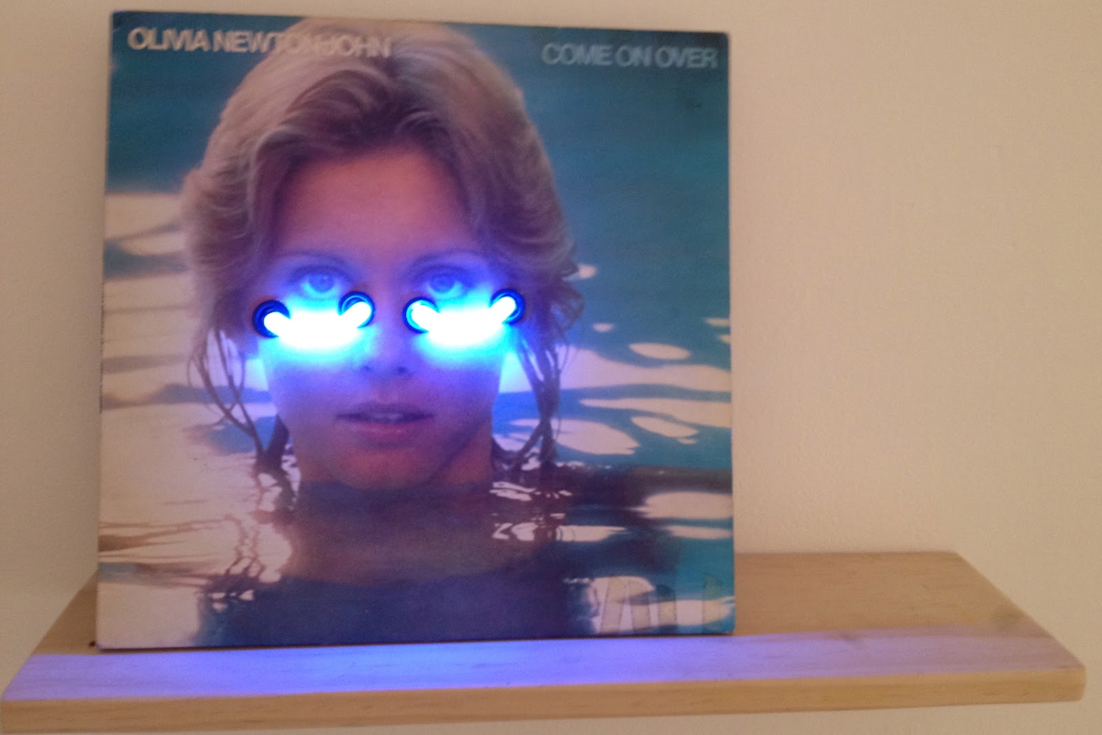
First up was MOP.  Here Sarah Contos (yes, more artists with websites, keep it up) has a show called 'My Eyes Through Your Mountains'. I really liked this.  I finally got around to reading the exhibition essay by Joel Mu (who guest curated the show at Alaska I quite liked) and it is pretty reassuring as even Joel makes the same titular links as I did.  Apparently Sarah likes working with images of old iconic Aussie performers, Olivia Newton John, Kamahl, Dame Joan Sutherland etc.  I didn't realise that the embellished screenprints (above 'Spring (DJS)') was actually meant to be Dame Joan, I think a little cut and paste job here.  There were 4 of these screenprints and only $650 each so a total bargain although I would struggle getting these breasts in the house, even covered up with bead tassels.  Family friendly was 'the bluest moon' (pictured top) which was neon on an old album cover.  Loved it.  And only $850?  I should've got her sooner ... and not spent my 2012 budget already!  Great work MOP.


Next door at pompom was a good old fashioned group show called 'heaven or las vegas'. Which sounded promising but to me had nothing to do with the works on show, but that is kind of par for the course with modern curatorial practice so you barely even make note of it nowadays.  Here I quite liked Craig Bender's photos.  Especially the ones where he orients them a little squiff.  My favourite was a work called 'Ballad of the New World II' which was turned on its side.  Mr Squiggle eat your heart out.    I did like Vivian Cooper-Smith's works which appear crumpled and then re-photographed (instal photo of 'The sound of tomorrow 1 & 2' above).  Also appealing was Todd Robinson's funny sculpture of a pink balloon called 'he knows at any moment it may be lost in a vertical field'! Much better than 'untitled'.

Points:  3 to Sarah for her Olivia Neon. I want one. Did Melissa Tkautz ever release on vinyl?  2 points for Craig's side photo and 1 point back to Sarah for her collagey screenprints.  In my interpretation those were the mountains ...

Wednesday, November 28, 2012

Passing Parade at Alaska Projects - 28 November


A little MCA young ambassador outing to see the latest group show at Alaska Projects, called Passing Parade.  The crew at Alaska are all MCA alums so they welcomed this motley bunch of art lovers with open arms. Now Alaska is a crazy art space, it is in the middle of nowhere in Kings Cross.  More precisely it on the 2nd underground floor in a council car park.  The proprietors of this artist run space approached council and scored a tiny former mechanics office for their gallery.  And it really works.  Enough with the car park, let's check out the art ...

This show was curated by Joel Mu.  I was dead keen to see Reko Rennie.  Yes he of the now famous Taylor Square art installation (which Sydney Council have apparently extended for three years).  Now I think Reko is fantastic and his work has really grown on me, to the extent I am kicking myself for not picking up one of his vibrant diamond works when he showed at MOP a year or so ago.  This time he has again stencilled a wall with the trademark diamond pattern of his people.  But, seeing as how this is basically what he did at Taylor Square on a bigger scale he has also added a vintage Australian flag which he has outlined in whitewash an aboriginal flag over.  The work is called 'Original' (pictured below) and is political in a subtle way, on first glance I didn't even recognise the aboriginal flag outline.  In front of this was an amazing airbrush job on a standalone car bonnet.  Called "Kingswood high with the windows down" (pictured top) this was the work of The Motel Sisters.  Now initially I didn't know anything about the Motel Sisters.  I had come mainly to see Reko, but it turns out that the Motel Sisters is the group act of one of my other favourite artists - Liam Benson (the other half is Naomi Oliver).  They really play up their Western Sydney background and explore a bit of bogan culture.  The airbrush bonnet was so over the top kitsch it was amazing.  It even had a cat with unicorn wings.  And even better, it was a portrait of the Motel Sisters.  You know, I can kind of see a bit Liam in drag on the left, and I am kind of scared to say that he looks hot.  Other artists represented included Sarah Contos with a random scuplture of found and crafted objects called 'Cornucopia'.  It was really great to hear the curator speak about all the works but even after hearing Joel's spiel I am not sure I got what Sarah was about with this.  There were also a couple of video works which are hard to really appreciate in a crowded group setting.  I thought Zehra Ahmed's were pretty good and I was glad to see they were made on an iPhone - I have no excuse!  George Tillianakis' work was tough to approach without the backstory, which did explain it all quite neatly.  As a former New Yorker I can appreciate that no one really batted an eyelid when he did one of his performances in NYC.


Points:  3 to the Motel Sisters - that was awesome.  I want to buy a 2nd hand commodore and put that bonnet on it and just do laps.  2 to Reko Rennie. Not sure I should praise him too much as he is right at the top of my "like to buy" list!  1 to Zehra Ahmed and her iPhone.  Also a highly commended to Sebastian for bringing this crazy space to life.  Loved it.  And another highly commended ribbon to Joel Mu who gave a really passionate back story to the show he put together.  I'll be back.

Saturday, October 13, 2012

Ohnesorge at Pompom and others at MOP - 13 October


There is a lot to like about MOP and its commercial offshoot Galerie Pompom.  Their web pages are the only things I'd like to see them improve, mainly because I can never seem to find all the images of who they have on show.  This could all be a cunning ploy to increase gallery attendance.  And if it is, it works, as with two of my junior critics in tow we trooped off to get a gander at the works of Nana Ohnesorge, Tiffany Shafran, Maria Gorton, Marisa Purcell and Matthew Allen.

First up was MOP.  I really liked what Tiffany Shafran had on show.  There was a collection of about 30 pieces, each called "Adventure Sampler" with a corresponding number.  To make the room sheet an adventure in itself they were arranged out of order.  Construction wise they were "digital print and embroidery floss on archival paper".  In layman's terms Tiff has got a heap of old found black and white images that are presumably helpfully out of copyright and then punched some tiny holes and embellished the images with some random embroidery.  We all liked them, my 5 year old was liking the beards that had been added to some whilst my 2 year old liked the feather american indian headdresses that had been added to others (Tiffany by way of background grew up in the States but has done her uni work in Australia and is currently completing a PhD at USQ).  These were all quite small and quite affordable at $350 a pop.  Plenty of little black dots up.  Also selling out at MOP was Matthew Allen, although he only had one thing, admittedly a diptych.  This was similar to his work that SSFA has shown, all one colour running into another.  Interesting from a technique standpoint but a little too contemplative for my liking, although I could see it growing on me I think I need works to really grab me.

Next door at Pompom was Nana Ohnesorge latest efforts.  I had seen one of her Ned Kelly's on the cover of an art mag last year so was keen to see more of her work.  I was not to be disappointed, and what a diverse practice.  My junior critics were quite taken by some of the sculptures, including one that was probably a little parental guidance recommended.  There were a couple of Ned Kelly's which were great.  I mean, easily recognisable and iconic due to subject matter, I guess that's why Regan Tamanui also uses him extensively.  I quite liked the colonial themes that this german born artist referenced.  Lionel Bawden (who we would like to have represented in the collection by the way) did the essay for this show and explains it all much cleverer than I will.  I really liked the mixed media approach, her brave use of vibrant colours and some top notch collage work (is it collage month or something? I think nearly every show I have been to in the last month has rocked some collage somewhere).

Points:  I will give 3 points to Nana's 'Trophy (Bennelong)' (pictured at top) which looked great in the gallery.  2 points for the 'Play it your way' which was a fantastic bright collage and a little kitschy. 1 point to Tiffany Shafran for the samplers.  I cannot tell you which number it was but it was one of the two headress ones.  I might have to be back with iphone in hand to record it for posterity.