Friday, May 23, 2014

Other Criteria - 23 May


Last post for now on the NY trip.  I couldn't go past including Damien Hirst's shop, Other Criteria.  Apparently this had just opened in Manhattan so there were a few people coming in for a gawk.  Downstairs was the traditional gallery space where you could buy any of the thousands of prints / editions that Damien has put out.  Seriously, if this guy is really signing everything I am amazed.  Not that I am against anything mind you.  I still like Hirst quite a lot, and one of his skull prints was my first purchase that involved a comma back in the day.


Apart from that there are tchotchke's galore.  Pins, tote bags, t shirts, playing cards you name it, Damo has it.  You get a sense of it here. As gift shops go, you could pick up some ideas from the artist turned retailer.  I went for the kitsch angle, with the iron on spots and a few I (colour spot) DH badges.  In the religious sense that accompanies a lot of Hirst's work I felt it was akin to putting some change on the plate.  Points today are in the retailing sense, keep an eye out for a knock off Big Lamington gift shop, 3 for the key ring, everyone needs a key ring!  2 for the iron on spots.  Loving the iron on and don't know when these will get a use.  I will give 1 to the t-shirts which appropriately appropriated the I (heart) NY.


Thursday, May 22, 2014

Chelsea Galleries & points - 22 May


So this is my 'catch all' post from the series of entries about my crawl around Chelsea last Thursday.  Dozens of galleries and I'll I've come away with is a fistful of room sheets and a pretty full photostream!    There are also a few cryptic notes on my iphone like 'Ed Paschke at Mary Boone.  Lehman Maupin'.  Now those are the sort of high quality notes to craft a cracker of a post.  Let's see what I can make of it.


First of all, how about the image selection.  I am learning from Richard Prince and leading with the naked chicks.  This work (Oubliette, top) is by rocker turned artist Aaron Nagel who is showing at Lyons Weir Gallery on W24th.  Too rude for instagram but not the Big Lamington.  Next up (above) is a image of the turning lotto machine installation at Andrea Rosen gallery by Mika Rottenberg.  This show 'Bowls Balls Souls Holes (Bingo)' was as random as random can get.  Firstly, just to get into the gallery you had to negotiate the spinning wall which, for me at least, recalled Batgirl's hideout.  Then inside the gallery there was all manner of random craziness.  Flipping pony tails (yes these were kinetic sculptures) and a video that played like an art world version of a Lost episode.  I want what Mika's having!


For those still wondering who Ed Paschke is, see the above image.  Love the really drenched colour of these works.  To me evocative of contemporary Australian artist Samuel Tupou.  Is Ed copying?  No, Ed's brown bread.  1939 to 2004.  These works were painted when he was 65.  This is going to sound slightly ageist but these works are so vibrant I nearly cannot believe they were painted by someone in their 60's.  Way to go Ed.  You'll be missed.  Now I like a good flag but sadly Luhring Augustine gallery was the best I could come up with (image below).  Tunga (I guess just the one name) has created a series of baffling installations that would require further studies in art history to appreciate and common sense to just dismiss as crap.  Sorra Tunga, maybe next time mate.


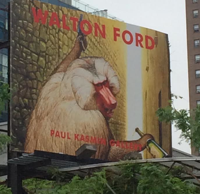
Other highlights were Walton Ford.  Not just at the Paul Kasmin gallery but even on a billboard high over 10th Avenue (image below).  Walton's style is like Audobon on crack and if I could draw better would be ripping off like no-ones business.  I keep trying to push Angus Fisher in this direction but he is keeping it scientific for now.


What else?  How about how there are so many branches of the same gallery chains in the same 'hood.  My notes say Mika was at Andrea Rosen but I also have Jose Lerma (whose Kirra Jamison'esque works are on mirrors, see pic below) listed for the same gallery.  Turns out they have two on the same street, just on opposite sides.  Cray cray.  I mean we have Michael Reid but not many other impressarios in Sydney.


Other highlights?  Well the entrance at Hauser and Wirth was pretty cool (see below).  This was by Martin Creed, called 'Work No. 1461'. 2 inch wide adhesive tape. Dimensions variable.  Of course. Better in my opinion than the work inside.  You'd think the Big Lamington would be a big fan of Big Art.  And I am but this place was just eerie.  The space is just so big that even the massive art of Sterling Ruby looked out of place in it.  Hauser took it out of me.  I was spent.  It also helps that they are on 18th street, so essentially the 10 block tour is done and you are now in the Meatpacking district.


But first, the points!  Tara Donovan is going to nab the 3 points for her acrylic untitled.  The highlight of the day.  I will give Walton Ford the 2 points.  Loved the Tiger and I loved Kasmin putting in a billboard for chrissakes.  1 point will go to Tomaselli for his mixed media works.  But mainly for his use of resin.  I love that material and need to start experimenting with it now I am back at base.

For more, see these links for Schnabel at Gagosian, Donovan at Pace, Shimomura at Flomenhaft, and Tomaselli at Cohan.  Oh if you are still interested to know what the Lehmann Maupin reference was, it is for Adriana Varejao.  It's here.

Fred Tomaselli at James Cohan - 22 May


How long has Fred Tomaselli been doodling on the front page of the Grey Lady?  I seem to remember this from him when I lived in NY and that was 6 years ago.  For those that came in late or can't remember it turns out Fred started altering the Times in 2005 with ex-Worldcom chief Bernie Ebbers and hasn't looked back.  Nearing 10 years of this he now has a book out with a selection of the best.  And a show at James Cohan Gallery on W26th Street.


There are quite a few newspaper covers in this show.  For more check out the gallery's website here.  I couldn't resist selecting Putin as Pussy Riot for the blog.  A great take on contemporary affairs.  As well as the newsprint he has quite a few larger works like Head 2013 (above).  This 230 x 170 cm work has mixed media under resin and then Fred paints again on top of the resin.  A great technique.  Loved it all.  Points here.

Roger Shimomura at Flomenhaft Gallery - 22 May


The Big Lamington wasn't just hitting the big names during my afternoon in Chelsea.  The smaller galleries featured prominently.  The great thing about Chelsea is you get these converted factories which have a rabbit warren of smaller galleries on the upper floors.  547 West 27th is one such building.  It is home to the Aperture Gallery (the big photography organisation) and I remember it having a great selection of galleries focused on emerging artists back in the day.  Sadly one of my old favourites Foley Gallery had left the building (and I didn't manage to track it down in its new location) but I stopped by Flomenhaft for what looked like a Japanese take on Pop!


Turns out Roger Shimomura is a bit of an old stager.  This guy (born 1939 and still going) has had over 130 solo shows.  His personal papers and letters are being collected by the Archives of American Art and the Smithsonian.  And his series of 32 'Great Ameican Muses', mostly 60 x 60cm, are only $8k a throw.  Sounds like a steal.  I couldn't resist a little bit of risque Japanese anime for the blog (#14 top, this was one of the first 3 works sold, great taste me).  The junior critics would've liked the Hello Kitty crossed Warhol of #26 below.  I kind've liked how he treated the taxonomy like a cheap asian takeaway!  I probably would've ordered #'s 19, 8 and 24 as well.  See here for more on Roger and here for the days points.

Schnabel at Gagosian - 22 May


'Schnabel at Gagosian'.  I am not sure what else I need to say.  Jules must've got the memo re size week and he has contributed a couple of whoppers.  Seem totally appropriate amongst the cavernous spaces in Gagosian's Chelsea bunker but I have a inkling they'd look a little too big for most domestic spaces.


I don't really have a lot to say about these massive works.  I do like that he has confirmed some amateur psycho-pap I once read that said punters preferred bigger works to smaller, and those coloured red to others.  So you are on to a winner with big red works, like 'Los Patos del Buen Retiro III' above.  This 460 x 460 cm oil on velvet was probably my top pick.  I didn't really love any of the works in particular but I do love the renaissance man that is Julian Schnabel.  Art, sculpture, films (Basquait, Diving Bell & the Butterfly), furniture, interior design (he did the Gramercy Park Hotel where I took the Mrs before junior critic #1) and more.  He does it.  The below image is not his.  It is the Commissioner from Dept of Buildings obviously.  These signs are everywhere in NY and I love them.  This is Gagosian's Chelsea branch.  389 persons?  Can't they round that up to 390 or even 400?  Points here.

Tara Donovan at Pace Gallery - 22 May


So this post could also be called 'Chelsea Gallery Crawl, Ch 1'.  I'll try and pick some highlights in separate posts and then put all the randomness in right at the end.  This is all out of order but I am going to start with Tara Donovan as these were probably my stand out works of the day ...


And a massive spectacle each was.  The great thing about the show was that both works were called 'Untitled, 2014'.  Another candidate for the Damian Hirst class in artistic taxonomy.  The image below was the one you can see from the street.  I should've asked some punter to get in my photo for me to give you a sense of scale.  This bad boy was 380 x 680 x 700 cm (the big galleries are international enough to run imperial and metric on the room sheets).  Made from Styrene index cards, metal, wood, paint and glue I wondered who is in the market for something this sized.  This is the huge difference between NY and Sydney galleries.  The wallet size of the customers.  I doubt even the biggest Sydney commercial galleries would be so bold to put on something like this.  Apart from the odd museum there just isn't anyone who would be in the market for something this sized.  And Pace is not the exception.  Hauser & Wirth, Gagosian, Zwirner and others all had contemporary art I would've more expected to see in a gallery as it just didn't look to me like art that would be for sale.  Maybe I need to hang out with Steve Wynn for a couple of weeks.  Into the next room and the other untitled nearly took my breath away.  This dominated the room, like some kind of natural crystal formation, freshly excavated from a cave.  This was just acrylic rods and adhesive.  Again, just massive at 300 x 430 x 400 cm.  Good work with the lighting as the whole gallery had a smoky quartz like glow.  A great work and certainly Tara just made my short list for putting forward to the local galleries.  I mean this show in itself would've been 10x better than the played out Yoko Ono the MCA tried to foster onto the punters recently.

Points:  Stay tuned.  I will give the days points out in a following post.  They're here.

Tuesday, May 20, 2014

Richard Prince, Canal Zone - 20 May


Another must-see on the Big Lamington NY list was Richard Prince. His Canal Zone show is at the Gagosian on the Upper East Side, this was a Tuesday so of course the Whitney was closed.  Let's hope the trip was worth it!


But of course it was.  Any long time follower of this blog will know I have a bit of a man crush on Richard Prince that started way back before I was an aspiring M&A banker (as his untitled cowboy is featured in Patrick Bateman's apartment in American Psycho, and yes, most junior bankers idolise this movie).  Anyhoo this Canal Zone series is pretty famous, or infamous.  It is the one where Prince was taken to court by photographer Patrick Cariou over the minor issue of appropriation (Greg.org followed the case relentlessly, his site is here).  All the press on this case seemed to focus on the image of a lone rasta with a guitar added to his hands and his eyes painted over (it is one of the main images you get if you google "Richard Prince Canal Zone").  This piece was probably the weakest in the show.  It is exhibited in the stairwell.  I haven't included a pic of it as it was so different from the rest of the show.  I was very surprised to see that virtually all of the larger works were very transformative of the source imagery.  For much of the first floor of this massive Gagosian space I was wondering why Patrick Cariou had bothered with the court case in the first place!  My favourites were one floor down.  This room had a mixture of large photo collages (see Canal Zone, top) and the even larger painted over collages (like 'the other side of the island', middle).  Loved it all.  And just like the good little tourist I am I was just about to start snapping away with the iphone when the security guard stopped me.  No photos allowed.  Seriously?  Richard Prince's work based on appropriation and no photos allowed?  I loved it.  A challenge.  Well, just as I was wondering how to be sneaky this guard needs to take a pee.  Snap. Not only got the picks I needed but picked up a great anecdote for the twitter feed which even Richard responded to. Nearly as good as my selfie with Jerry Saltz!  


Points: 3 points to 'Canal Zone' (pictured top). No girls in this one but the horticultural angle appeals to me. 2 points to 'The other side of the Island'. Girls in this one, and probably hotter than the others!  I really liked the assemblage of photos, also confusingly called 'The Canal Zone' so it will pick up the 1 point.  For a really good review of the show, as opposed to my subjective ramblings, see Walter Robinson's piece here.  

Thursday, May 15, 2014

Art Truancy: celebrating 20 years of Juxtapoz magazine - 15 May


Bonus art opening on our evening Chelsea stroll, and what a bonus! Juxtapoz magazine is an alternative (I think some might say Lowbrow) contemporary arts magazine and it takes me back - I was a subscriber 10 years ago at grad school!  They are celebrating 20 years in the biz with an exhibition at Jonathan Levine gallery.


Well the perriers were flowing like water and it was a pretty excitable crowd. But then I saw why. They were handing out goodie bags and free mags! And little mini spray paint tins! What about the art? Well quite a few recognisable names to anyone who frequents Outré in Sydney. Shag, Mark Ryden. Tim Biskup. Shepherd Fairey. Just to name a few. I'll post a link on my return but googling 101 skills should be able to locate Jonathan's gallery on the intrawebs. Ditto for the press from the 'poz. It was a great night and I'll have to look up international subs.


Points: I am a going to give 3 to Maya Hayuk whose colourful geometrical works (pic above) really caught the eye, and also featured on the catalogue cover.  2 to Camille Rose Garcia for a great trippy piece. Lastly a point for Mark Ryden (pic middle) whose Wooden Abe could've used a splash more colour and a bit more Masonic imagery to get my juices flowing but did have a pretty sweet custom frame.

Insider Art Fair (aka Mark Flood at Zach Feuer Gallery) - 15 May


I didn't really know what to think of the Insider Art Fair.  Helpfully, I read this article after visiting, titled "Did Mark Flood just come up with the solution to the art worlds problems, or is he just another hack?".


The Big Lamington, with our parochial focus of recent years on Australian contemporary arts had helpfully never heard of Mark Flood.  So was blissfully unaware of any hype.  So we approached it eyes wide open and despite liking quite a few things probably think he is a hack.  Don't get me wrong.  A very savvy hack no doubt but a hack nonetheless.  That is a little playa hater of me as I'd love to be a savvy hack but hey hypocrisy is everywhere.  Maybe that is the point Flood is trying to make!  The show itself was pretty random.  A big black stripper dancing on a stage, a pile of fake bills at the door, bad lighting.  It had it all!


Points:  I loved his card pyramids.  Tony Albert snap!  As an aside, everyone should follow 'who wore it better' on twitter which posts artists rocking identical works!  Mark needs to learn about the aluminium frames that Tony uses to make these ace of spades stand a little better, 3 points.  The old philatelist in me liked his classic 'biplane jenny' stamp updated for a drone (top), 2 points.  He also has an upside down version for the rarer stamp.  As a former banker I will give 1 point to the logos (middle).  Wish he went old school and put in a Bear Stearns ...

Oscar Murillo at Zwirner - 15 May


When planning this trip to New York I researched what shows were on and picked my own top 5 of what I wanted to see. Oscar Murillo at Zwirner was right up there. I'd read a few bad reviews, even from my new friend Jerry Saltz (I'm blogging on the go here so will fix up formatting and add some links when back in Oz - here's Jerry's piece). But I was excited to see this. Maybe it is the baker in me but I just love the idea of a chocolate factory (and it shouldn't be hard to believe I invented a chocolate bar in the '90s - it was a cross Bounty / Milky Way, and it was awesome!). Anyhoo, let's grab our golden ticket and go ...


Firstly, this was a little tricky to find. Only because Zwirner has about 4 galleries in a 2 block radius! But once in I was entranced. What a Willy Wonka conceit! Oscar is Columbian and has is making his favourite Columbian chocolate, the Colombina, in the gallery. The artist is nowhere to be seen but there is a team of Colombian factory workers transplanted into the gallery pumping out the choccies (pic above). Great idea. The only downside I could see is that I will be labelled derivative when I set up the Golden rough factory at Gagosian next year!  You could sample to your hearts content and I helped myself to a few. The choccies themselves aren't all that much. Mass market milk chocolate with a marshmallow centre. The packaging was pretty sweet with the shiny silver and smiley face. Very Pharrell happy looking.  That said, I was interested to know what the regular packaging looked like.  There is a website to this show, a mercantile novel, which goes into a bit more theory about trade and such we needn't get into now (but I will post a link later for those art history phd types). I think it works best thought of in the sense of fantasy. And it's a fantasy I share.


Points:  Like Kara Walker this is again one of those best on ground awards, and actually there is a strong link between the two sweet shows as there were quite a few Domino sugar bags sprinkled through the factory bit.  There's only one thing to see and it was great. Check out the website of the show, I will be sure to post a photo of the junior critics with their Columbina's in Sydney.

Tuesday, May 13, 2014

Phillips Auction Preview - 13 May


Straight on the subway from Sotheby's to Phillips. They've moved to midtown since I was last here. They used to have a cool meatpacking district location but I guess there's more money in midtown. Which is a good a time as any to get sidetracked with an old banking joke which was 'boutiques are cool in Soho, not in Midtown'. It might only be funny if you worked on Wall Street ...


Anyway Phillips has always been the younger brother to the big two but they appeared to have scored a coup with a big Rothko which was given its own room (actually more like a shrine, see above) at their hq. It didn't really float my boat but hey what do I know - it sold for a tad over $56 million. That it accounted for 43% of Phillips total take tells you that there wasn't any other really massive works. A pretty crazy Koons, tick. A big Hirst spinner, tick. A Warhol Jackie Kennedy, tick. By this stage I was interested in seeing some younger works as this is where Phillips usually differentiates itself so it was down to the basement in the slow elevator. And if that is not enough suspense for you I am going to pause now and take this post back up when I am back in Sydney!


Points: I'll give the 3 to Jeff Koon's Big Bikini (top) which neatly fits in with my penchant for supersized attractions! 2 points to Andres Serrano's Black Jesus (above) although I am sure if push came to shove I would really take the Piss Christ for the sake of its infamy. I will give the 1 point to Mark Ryden, not so much for this work but as a reflection of how much I loved his work when at grad school.

Sotheby's Auction Preview - 13 May


So the art just doesn't stop this week. With Frieze over the Big Collectors will hit the contemporary art auctions. The Big Lamington will join them. Sotheby's is up first.


Wow. Just wow. I've always maintained that NY auction previews are great. Sotheby's is where it was when I used to live here, which is miles from anywhere in the East 70s, although next to the hospital where one of the junior critics was born. So handy if you have a strong reaction to the art! First up all I noticed were the assistants. Lots of them. That is to show that this art is Expensive. This floor was mostly for the night sale, the day sale (& slightly cheaper works) were on another level. Pride of place in the main room was Jeff Koons' Popeye (pic top). This sold for $28 million. So I guess it did justify having its own separate catalogue with an essay comparing it to the marble statues of antiquity like Michaelangelo's David (seriously). I should've taken a selfie like Ja Rule. I actually happened to be there with Ja but didn't actually recognise him. Well I realised he was someone famous given the attention he was getting but not that it was Ja. I'd have clocked Birdman for sure but now we are getting off topic again.  Overall this was as great a contemporary collection as you would see in any gallery, on par and probably better than what's on show in the AGNSW contemporary section (& MCA as well).  There was a whole room of Warhol's and Basquiat's hung together, including a Warhol portrait of Basquiat. There were quite a few Richard Prince's, including Cowboys, girl pictures, nurse paintings and jokes. A nice couple of John Baldessari's. An iconic Pettibon surfer (well maybe just iconic to me!) and a few younger artists like Mickalene Thomas with her signature glitter infused portraits. What great fun poking around. Might've been a bit more fun with a couple of million to spend but I'm not sure I have the wall space! Interestingly I had taken note of Richard Prince's Goat painting (pic above, left). Which is the subject of a great essay he just wrote (link here). 


Points: what can I say? I am a sucker for Richard Prince. A great artist and one I am learning more about through twitter! Seriously, he is the artist king of all social media.  Follow him.  3 for 'Spiritual America 3'. It is a little pervy but that's the point. I'll give 2 to the Untitled Cowboy which was hard to take a photo of due to the reflection of the Kosuth neon opposite. 1 point will go to Baldessari's Prima Facie. I've got a lot more exposure to his work on this trip and it is really growing on me (or just becoming more familiar!).

Monday, May 12, 2014

Frieze Art Fair - 12 May


Okay this is the big one. Frieze wasn't around when I lived in NY so this is my first time and didn't really know what to expect. It is held on Randalls Island which is just up the east river from Manhattan. You can get there by bus or ferry, we took the tourist friendly ferry option (like most of the locals who we're soaking up a great spring day where the temperature hit 85 Fahrenheit after being in the 60's all week). Let's hit the tent ...


So there were hundreds of galleries and therefore thousands of works.  It was a lot to take in.  More exciting however (but old news to my loyal twitter followers) was bumping into New York magazine art critic (and sometime TV star courtesy of Bravo TV's work of art) Jerry Saltz.  What a great guy. Thankfully I think my accent helped deflect the stalking angle a little bit but I don't think Jerry knew what a lamington was when I told him my twitter handle! We had a brief chat and a quick selfie, although apologies as I may have opened the floodgates to a few more fan requests (you know the one place everyone will recognise you as an art critic is at Frieze!). Anyway, I was still counting my good luck as we trawled up and down the aisles looking for our favourites. I've got to say there was quite a bit of tat. As well as the big recognisable works by Gursky, Yayoi Kusama, Shonibare, Kehinde Wiley, Kara Walker and others that you would expect at a fair. But I was here to see new (for me) stuff. And there was a lot of that. Far too much for a brief post on the go. So I'll jot down some highlights now and come back with a part II when back home. Espaivisor Gallery from Valencia had a great series from Sanja Ivekovic (pic above). She has taken sunglasses adverts from fashion mags and teamed them with stories from women's shelters. Liked how the sense of anonymity was dealt with. Points below, I will add some more once I am back at Big Lamington HQ.


Points: it's such a hard task to single out 3 work from such a diverse show. I will give 3 points to Sanja Ivekovic for her sunglasses series. 2 points for Haegue Yang for the belled sculpture and 1 point to Janice Korbel just because I like text in art.

Sunday, May 11, 2014

Kara Walker at the Domino Sugar Factory - 11 May


Okay for those that came in late the Big Lamington team spent quite a few years in NYC back in the day.  I am excited to be back for a visit and even more excited to be seeing some art.  Despite the fact I was one of those types that liked to stay on the island I find myself on the J Train humming the infamous chant of Biggie Smalls ... "Where Brooklyn at? Where Brooklyn at?" ... because we are going to deepest darkest Williamsburg for the next instalment of the Big Lamington International Art Series 2014.


We are off to see Kara Walker. A very well known US artist and one that is featured in the Big Lamington collection through the multiple that she produced for the Norton Christmas project back in the day.  She is known for her cut-paper silhouettes and tableaus which discuss power and race, especially as it has to do with slavery and the south.  For her Creative Time project (more here) she has 'confected' a work called 'A Subtlety' or the Marvelous Sugar Baby.  This is meant as "an homage to the unpaid and overworked Artisans who have refined our Sweet tastes from the cane fields to the Kitchens of the New World on the Occasion of the demolition of the Domino Sugar Refining Plant".  All good.  What is it exactly.  Well it is a dirty great big sphinx like creation made from foam I gather but coated in white sugar which Kara has sculpted with a hot iron to put the shape into it.  Is anyone else seeing the connection I am?  Notorious B.I.G., a Big "Negress as Sphinx" (as the NY Times calls it), and the Big Lamington.  This was meant to be!  This place smells, unsurprisingly, like a lolly factory. Burnt sugar. And watch your step, there are also a dozen or so smaller boys made from molasses which appear to be melting sticky stuff all over the floor. After the long wait to get in the crowd doesn't waste any time and it is a shitfight to get into the prime selfie spots (which are right in front of the breasts and right at the back just in front of her front bottom!). What a great day out. Props to Creative Time who put this on. They do great stuff and I reckon something similar would be great in Sydney.


Points:  well, there is only one thing going on here so best on ground to Kara Walker.  What a crazy monumental work, only open 3 days a week for a month or so and then it is all coming down. Would love to see her out in Australia.  MCA / AGNSW, take notes.

Pulse Art Fair - 11 May


So the Big Lamington International Art Series 2014 kicked off in the formal sense with the Pulse Art Fair. This was my 'bonus' art fair as I had planned for Frieze on Monday and Kara Walker for the Sunday outing. But just like that concrete jungle where dreams are made* I managed to be in the right place at the right time. Pulse just happened to share the Metropolitan Pavillion on 18th street where yours truly had already planned to visit for the pop up flea (think obscure menswear brands). So we paid up and strolled in.


I've been to Pulse a few times, but not for a while. It is probably the main 'American' owned fair (as distinct from Art Basel Miami and Frieze NY). It is a great compact show and they have a few great things like the Pulse prize for the best artist at the show (where a gallery has only done a solo hang, so that does whittle it down a bit). This year's pulse prize winner was Hassan Hajjaj (pictured top) who was being repped by LA gallery GUSFORD. It was the first booth I saw but I walked all around the show before I realised it was the winner. Not only were the photos so colourful and stunning (and I love that kitschy Dutch wax cloth) but the innovation in framing was particularly clever with all sorts of exotic produce completing the larger photos. Continuing the African fabric theme another highlight was Martina Bacigalupo whose series of rephotographs (pictured above) of an actual African photo studio (Gulu real art) were made mysterious by the cropping / censoring of the heads. Privacy concerns or just merely aesthetics? You be the judge. I thought I saw a Tom Polo as part of a great hang at NY's Keeler and Co. but realised messy text works are taking over the whole world and enjoyed a William Powhida print where he gives tips for artists to sell. Some great ones, like '5. Remain sexually available' and '12. Performance and video are for porn.' Other highlights included Ryan and Trevor Oakes' match stick dome, price $25k but likely only $50 in matches. That's art right there!  No Australian galleries but did see an Aussie (Rosemary Laing) being shown by a US gallery. Great work.  Also liked Pulse commissioning some projects like Tamara Gayer whose "I'll be your mirror" (pictured below), featured in the bathrooms (boys and girls). 


Points: I am in agreement with the officials here. Hassan Hajjaj is getting 3 points to go with his Pulse prize. Not only did I love his works but also really liked the merchandising he did for the fair with different sized editions as well as a cheaper smaller one just for the Fair. 2 points to Martina Bacigalupo for her Gulu real art series. 1 point will go to William Powhida for his tips for artists who want to sell. Very appropriate for a fair.

* okay, I will see if I can stop lyric checking that song but it really does get in your head, let's hear it for New York! 

Saturday, May 10, 2014

New York tour - May 2014


Okay punters, stay tuned for a few updates from the northern hemisphere.  Under the cover of a university reunion (Ivy League baby, you just knew that's how the Big Lamington rolled!) we have left the junior critics back in Sydney whilst taking a well deserved break.  Some break, there is so much art to see and not all that long to do it!  So tee up Hova's Empire State of Mind and let's get into it ...


We got started the first night in. Battling jetlag and a skinful of margaritas we set off to check out old haunt Lever House, an office building on Park Ave that always has a show on. At present it is Urs Fischer.  He presents a series of two dimensional mirrored sculptures (see above, Kikkoman sauce bottle). There were all manner of mundane items transformed into a super flat 3D layout. These are scattered all over the place. According to the accompanying room sheet "Fischer's choice of objects is as random as their placement, and they do not suggest any narrative or socio-political statement". Phew, and I thought I might have missed something.  If Urs is going for random he has really nailed it. That said, I didn't mind some of them. So deliberately arty. On the way back to our apartment we walked by the Seagram Building where Jeff Koons works adorn the lobby (pictured top). I love how the corporate offices get in on the act in NY (although 375 Park Ave is one of the more prestigious addresses). I'd love to see a Koons every day. Hey maybe our landlords could pick up the Popeye going to auction next week ...

Points. I'm giving Jeff the 3 points to kick things off. I'm a big fan of his and of lobsters so that works doubly well. Urs will pick up the balance. 2 points for the honey jar and 1 for the chess piece.

Thursday, May 1, 2014

19th Biennale at AGNSW and MCA - 1 May


It's taken a little while to get around to Biennale of Sydney but with the Big Lamington team getting set for a cheeky May trip to the USA I figured I needed to see some of this just to be sure I wasn't missing out.  Taking advantage of late night Wednesday at the AGNSW, and then late night Thursday at the MCA I managed to see enough to understand why McDonald and Frost are so underwhelmed. 


First up for me was the AGNSW.  Firstly, this place was absolutely buzzing for a Thursday night.  Awesome, totally awesome.  Way to go Hamilton*.  I checked out Artexpress first before venturing downstairs for the Biennale floor.  Things started well as I saw Deborah Kelly's big collaged nudes (& also a fully clothed Deborah Kelly wandering showing some friends around).  I like Kelly's works and this series continues with the visual theme from her Magdalene's we saw at GBK back in 2012.  This time around Deborah has interspersed the collaging of photographs of nude people with just some lifesize shots of nude people.  Probably a few too many plain nudes for my liking - the embellishment was where its all at for me**.  My favourite (pictured top), was one that used lots of Deborah's signature hair extensions.  What else?  Yhonnie Scarce's glassworks were very good, and if there wasn't an eagle eyed attendant in the room I would've loved a nice souvenir! Around the corner I thought Michael Cook's photo's were clever but my favourite was Scottish artist Nathan Coley who has taken black and white protest photos and then applied gold leaf to the protest (pictured above).  Visually appealing and probably also politically so for me!  The next night was the MCA.  Sadly I hadn't been warned about the giant cheese beanie in Pippilotti Rist's video.  I hated it.  Jim Lambie's taped up floor was much better but we were coming from a low base.  Upstairs I liked TV Moore's psychedelic photos the best.  And not just because of the great subway tile wall they were hanging on (pictured below).  Okay, maybe a little bit because of the subway tile.  


Points:  I will give the 3 points to Nathan Coley on debut! 2 points to TV Moore for the standout visuals of the Biennale so far.  1 point to Deborah Kelly for the collages.  I will say that the curator has a lot to answer for so far.  I don't get how any of this really goes together.  Cockatoo Island better not suck!  To paraphrase McDonald, so far I have seen a more cohesive thematic at the Easter Show ...

* quoting Spiccoli to give props to the AGNSW here.  Much more buzz than the MCA the night after.
** I think 2 post scripts is nearly a record but this is courtesy of one of the comments.  Apparently Deborah is collaging the nudes throughout the BOS so they will be progressively covered up.  This runs till 9 June so I'll have to come back and see what happens.