Showing posts with label Sydney commercial galleries. Show all posts
Saturday, July 9, 2016
Jonny Niesche at Minerva - 9 July
And kicking off the 2016 posts is an old favourite of the Big Lamington, Jonny Niesche. He has a solo show on at Minerva Gallery until 23 July. I managed to duck in whilst on my way to the Bourke St Bakery (where the spiced quince cake comes highly recommended!). I'm ready for this Jonny. Dazzle me.
Because you are always going to be dazzled at a Jonny Niesche show. And in at least 2 ways. Firstly its the visuals. Very bright, alluring, great use of vibrant colour. And secondly you are always going to be mindblown by the titles. Jonny loves him a bit of philosophy and I am always struggling to catch up with where he is off to. This show is called Cosmos Cosmetics. And to any punter on the street that makes absolutely no sense. But go read the essay by Amelia Groom (it is also online) and it starts to make it a little clearer. Both words come from the same Greek root Cosmos which translates as ornament and order (or so I am told). Amelia also quotes the French (obviously) philosopher Michel Serres who brings the concepts of veils into the whole adornment and order debate. Which is my way of segueing to the use of materials here. I didn't realise it until I got into the second room (pictured top) that the artist is effectively wrapping a thin semi transparent fabric that has been digitally printed with colour over a steel frame which he has also painted. It's a neat trick and at the same time references his earlier glitter works which used varying colours of the spectrum so well. I preferred the rectangles to the odd shapes, but hey, I am a traditionalist at heart! Alongside the veiled works are some sculptures scattered around the place. You can see one (I think it is "haptic rule of thumb" in the gallery shot above). These are auto paint (officially 'vibrance prismatic flake auto paint') on steel. Again, I can see how he has developed from the glitter sticks (which I loved by the way) to these. Although I can't shake the thought that they look like over sized swizzle sticks. But that is probably because I always have swizzle sticks on my mind. The gallery attendant thought this show was a real step forward in Jonny's work and I can kind of see that. Although I am nostalgic for a bit of glitter as well. I hope we haven't seen the last of that weapon from his armoury. Job done Jonny, a great show and a good way for me to ease back into the blogging game. Now what is that schtick I do for every show? Oh, yes - points ....
Points: 3 points to "... that was not first in the bouquet" (top right) and 2 points to its partner in crime "There is nothing in language ..." (top left). 1 point will go to "moving through atmospheres" (above on the wall). This is great to look at on the gallery website, as when you scroll down the art moves from side to side given the off centre properties of the steel parallelogram he is using.
Saturday, June 27, 2015
Everything & Nothing at Sarah Cottier - 27 June
Everything and nothing. Covers a lot of bases really. Not sure where they were going with this here. Sadly, I only picked up the room sheet and not the essay so I am going to have to wing it ...
For starters it's a good old fashioned group show. And this being Sarah Cottier it is at the edgier end of the conceptual / commercial spectrum. The Mikala Dwyer plastic sculpture was interesting, looks good in the gallery but not sure how this see through work would go at home. That said I'd fit this in more easily than the Tim Bruniges Piano, which is (naturally enough) upright piano sized. Great to see someone up cycling an old piano - although I am interested that this P.O.A work is an edition of 3! A firm family favourite (I had all the 3 junior critics with me) was Gemma Smith's 'Radiant Greige' (pictured above). This was a small work, 34cm x 28cm, but packed quite a visual trick. At eye level it is half grey / half pink. Moving up, the work turns pink and moving down it goes grey. I've tried to show that in the above snaps. The kids initially didn't think much of it, being grey from their vantage. But they did think it was cool as it changed colour, and I was kept very busy picking up junior critic after junior critic. They also liked the Todd McMillan video work but that's the youtube generation for you. I lean more old school, which means a nice big framed print will appeal to me - and Sarah Mosca has delivered a great abstract one called 'Gestural Ode' (pictured top).
Points: Gemma is going to take the 3 points here. Radiant Greige was a family favourite, and I even learnt a new word (greige that is). 2 points for Sarah Mosca's massive 190cm x 155cm print. Koji Ryui will take 1 point for the Spring sculpture - which was quite a nice little piece and it had a cool plinth.
Saturday, June 6, 2015
Leah Fraser at Arthouse Gallery - 6 June
I've only noticed Leah Fraser over the last year, but I've really taken to her style (she got 2 points at the Blake Prize and 3 at a group show at the arthouse). So I made a beeline back to the arthouse on Saturday when I saw she had a new solo show, Message from the World Invisible.
En masse, you are completely immersed in the fictitious world that Leah has developed. And I liked it. And it wasn't just me, as this show had sold out on opening night. All women buyers too according to the gallerina. I can see that, there is a strong Frankie magazine x Del Kathryn Barton vibe running through this show (Leah used to work for Del Kathryn Barton). I particularly enjoyed the overuse of birds and flowers in these pieces. Despite the naive style (the cockatoo and kookaburra's are particularly funky) you really get the sense that Leah has put deliberate thought into the different species to use, which I appreciated as a viewer trying to decipher the images. Native orchids, tropical plants, flowing hipster beards. These paintings had. it. all. As in the recent group show, Leah has included a few interesting ceramic pieces. I really liked the incorporation of the raw crystals / semi-precious gemstones into the pieces such as in 'Turn Your Body to Light Shaman' (pictured below).
Points: 3 for the prolific hibiscus in 'My Heart Belongs to the Sea' (pictured top). 2 points for 'We Sang Songs beneath a web of Stars', and I will give 1 point for the spears of what looked like dendrobium speciosum in 'His Opal Hands Gathering You'.
Saturday, May 30, 2015
Tony Schwensen at Sarah Cottier - 30 May
"If you liked how Tom Polo became an emerging art star without learning to paint, then you are going to love how Tony Schwensen has been able to sustain a career retrospective with a $200 Bunnings voucher" - Irvine Welch
Okay, so that quote is made up. But I was made to think of the transpotting novelist's collection of short stories when I toured around this solo show at Sarah Cottier.
And it might surprise you that, on the whole, I didn't mind it. But that was mainly due to the presence of 'Border Protection Assistance / Proposed Monument to the Torres Strait (Am I ever going to see your face again?)'. This work from 2002 (pictured top), mainly appealed due to the use of the famous Angels crowd refrain as an apt summary of Australia's approach to illegal maritime arrivals. Most of the other pieces seemed needlessly conceptual. Namely, Monument to Progressing Thought (aka the wheelbarrow on the car stands) and Elegy to the Australian Republic (aka the pvc pipes set in concrete in buckets with the coloured lights). But I may have just been reacting to the titles. This guy has a PhD in art, I wondered if his thesis might have been "Alternatives to the use of (Untitled) in contemporary art". Tony was at it again around the corner. Here is a room with vinyl letters spelling out Nothing Makes You Free in three languages. This title is a beauty: 'The Indelible Stain of the White Australia Policy / or the gates of Manus Island / or for all the lucky cunts in the lucky country'. My problem with it, is that all the work is in the artist statement, the actual idea is very lazy (the analogy to Auschwitz's work makes you free). Is there a contemporary art version of Godwin's Law where the first artist to link Australia's immigration policies to Nazism has to give back all their Australia Council grants?
Points: I am going to give 3 to the Torres Monument. I will give 2 points to the party lights because I am a republican and will give 1 point to 'The Idiot' (aka the steel bucket with speedos stretched around it with concrete and a steel post). This was at least easier to guess the subject given the literal metaphor that red speedos have become (for better or worse, but I'm a sunburnt lobster type of guy myself).
Saturday, April 18, 2015
Tony Albert "Thou didst fall" at Sullivan Strumpf - 18 April
S+S's (gee I'm using a lot of S's today) ground floor has the big works on show. There is a large bronze sculpture (which is actually a miniature version of the Hyde Park bullets, but it is still pretty big). There are some overscale anzac'esque mixed media assemblages which to me just screamed "institutional buyer", mainly due to the size (one was 550cm long, the other 270cm high) but also due to the six figure price. I really loved some of the components of these assemblages, especially the camouflage 'rosettes' with vintage aboriginal badges at the centre. My favourite works, as is often the case, were in the upstairs gallery. Here the star of the show was Wake Up (pictured top). This is the classic aboriginalia inspired mixed media work with the military twist that has the trademark text included. That is, this work ticks all the boxes you'd want as a collector and no surprise it has been picked up. If $48k gives you sticker shock (and make you kick yourself for not picking up a Tony Albert watercolour from Jan Manton when they were selling for 3 figures 6 years ago) then Tony has a few prints of the work that he has embellished in different way at a more friendly price for younger collectors. I really like how Tony does this, takes a print and makes it special through re-work. A few punters agreed with me as these had all sold pre-opening. What I think makes Tony such an interesting artist to follow is that he is always trying new things. What do I really mean by that? Well certain artists in Australia (and globally really) do get 'stuck' in a certain style - you look and it and can name the artist straight away. Tony is always evolving but referencing back, velvets, photography, watercolours and now these very large (150 x 200cm and up) acrylics on canvas (you can see them in the background of the middle photo). They are based on old WWII era cartoons but they have some images painted on top, which again reminded me of the watercolour series I saw all those years ago. Now if you look to the foreground of that middle photo you will see some fabulous cabinetry. This bullet-legged cabinet contains an art diary that Tony kept whilst doing the war memorial commission. I hear it is going to the City of Sydney. Lastly, but not leastly, I looked through the Green Skin series of works where Tony has daubed over some collected images. I loved these and to be honest was quite partial to some of the vintage comics he has transformed. Hmmm, what is that art budget again ...
Points: I am giving 3 points to Wake Up. I also like its circular shape, which on further thought is reminiscent of an old Anzac day badge. It also recalls the target shape that Tony uses throughout his work. 2 points will go to the war diary cabinet (hopefully City of Sydney will have this on show somewhere so we can come back and study it better). 1 point will go to one of the Green Skin series (of them all I would choose the target above).
Thursday, March 26, 2015
Liam Benson at Artereal - 26 March
Liam Benson is showing at Artereal? Of course I made it. Naturally with the Easter Show in full swing it took me a while to get around to documenting that trip. But with the magic of blogger it looks like this was posted on the 26th, when I managed to swing by the gallery after tasting success with my namesake category in the perishable cooking category at the Big Show!
For those that came in late, this blog is a bit of a fan of Liam's work. I'd run into Liam at the MCA in December and seen his trademark beard getting bushier and bushier and asked him if he was going to be doing a Ned Kelly. Bingo. And here there are. Now I have long argued you could arrange a whole collection around depictions of Captain Cook in contemporary art (Quilty, Daniel Boyd, Jason Wing etc), and I think I can now safely add Ned Kelly to that list (Nolan, Ha-Ha, Ohnesorge, and now Benson!). To be honest I was a little confused as to the images. Liam has applied a camouflage facepaint in styles that are meant to evoke the different gum trees around Ned's bushranging haunts. The top image is meant to be a red gum, the bottom image a snow gum. In that way the Ned homage is potentially a little too subtle for most. I mean, I think a metal helmet somewhere would've helped! That said, I really liked the series. And I hope he keeps the beard a while longer as I think there should be an accompanying video work. Also in this show are Liam's continuing needlepoint works (me & you, pictured above) which still look great (although, full disclosure I do have one). Again, not wanting to keep harping on with suggestions but I think a good old fashioned "such is life" would've gone really well here. Maybe a little too Ben Cousins but hey. Now Liam has another whole series in this show where he is wearing see through head outfits of an executioner, a crusader, and a terrorist. That is like 3 separate exhibitions in one, and he is showing again in a group show at Artereal in April. He certainly has been busy!
Points: Well, the Neds were the stars of the show in my opinion. The question is whether I am going for the more colourful or the more subtle. It's a tough call but I am going to sling 3 points at the Ned Kelly Snow Gum (Kosciuszko) [the bottom one!]. 2 points will go to the Blue Gum (coral) Ned [not pictured, go to the Artereal webs]. 1 point will go to the Liam needlepoint* Me & you (pictured middle).
*WHICH HE NEEDS TO ENTER IN THE EASTER SHOW NEXT YEAR!!
Saturday, March 21, 2015
In the Still at Arthouse Gallery - 21 March
So the non-perishable items (that's jams and things like fruitcake) were dropped off at the Easter Show last weekend, and the perishable items (like Lamingtons and other baking categories) are due this Thursday. What does all that mean? Well it means I can go see some art this Saturday! First up was a quick visit to Arthouse for their art month group show, 'In the Still'.
True story, I very nearly went to Still School at a whiskey distillery in Washington State USA. So I was a little disappointed that this show actually meant 'still life' rather than say, bathtub gin. I soon got over my disappointment by the great pieces that Leah Fraser has in. I'm quite taken by her recognisable style. I can't really describe it, but I like it. All blues, greens and creams, and a little boho / etsy feel to it. For some reason I think of interiors blogs when I think of Leah, that's probably 'cause she has featured heavily on the design files (which my better half likes reading). What I really like about her entries here is that she has cross branded the mini sculptures into the pieces (top, A simple beautiful truth, 60 x 60cm; and down below you can pick some of the ceramics in the piece). Its no surprise to me that both the painting has sold, as well as some of the key pieces in it (like the 'umal shaman' figurine). I like to think that a single collector picked all that up to keep it together. Moving around the room I thought it was good to see Kirra Jamison not knocking off Gemma Smith's squiggles and actually doing something less abstract. Her big piece, Morning Glory (200 x 170cm, above) was great and I liked the over the top pattern that recalled Reuben Patterson without the glitter. I also like her titling work as the one with the dark background was called 'Evening Glory'. I always prefer my glories in the morning but the dark painting was also quite striking. Craig Waddell had quite a few flowers in here, which is playing to a strength of his but in my mind (& maybe its just because I am in Easter Show mode, where they take the brief very seriously) I don't reckon half of these are actually "still lifes". Much more traditional were entries from Claudia Damichi (very neat) and Laura Jones (a little messier). Laura's 'Flowering Gum' (below), was perhaps one of the most classical, also incorporating the textile casually dropped over the table.
Points: I think most know where I am going here. 3 points for Leah Fraser. Loved the painting and especially the interaction with the ceramics. I will give 2 points to Laura for her traditional composition, and also 'cause she is from the Southern Highlands (I think I read a profile in Highlife!). And what's the story morning glory? 1 point for Kirra for her massive flower piece (which given the grief I am throwing at Craig I is probably not really a still life either but you are not coming to the Big Lamington for consistency!).
Saturday, October 25, 2014
Ohnesorge at pompom / Carsley at MOP - 25 October
After a long spell between drinks its twice in a fortnight to the dynamic duo of artist spaces that is galerie pompom / MOP Projects. This time around it was all very organised. Nana Ohnesorge in the galerie and Gary Carsley in the project space. I've been looking forward to this so let's get going.
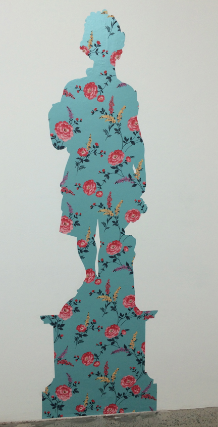
Nana has featured on the Big Lamington a few times. I love her signature use of fluoro colours and the themes she keeps recalling in her work, iconic Australian imagery like Ned Kelly (top) and aboriginal people (above). The above works (Aboriginal Man, Aboriginal Girl, Young Warrior, Young Woman and Aboriginal Man 2) are based on found prints, photos and illustrations. These acrylic and pigment pen works look like screenprints but Nana looks to have handrawn the outline and then coloured in with the fluoro acrylics. Great technique. Definitely my favourites here and with the Big Lamington HQ extension drawing to an end in the coming weeks on the shortlist to christen the extension. Nana continues her use of fluoro through collages, a very cool sculpture (which is itself a companion piece to the Bennelong portrait) and portraits of contemporary Australians. Next door at MOP is a much more subtle affair. Gary Carsley has taken inspiration from the statues in the Botanic Gardens and made wallpaper cutouts in their silhouettes. Very Victorian parlour but so contemporary at the same time. I was very intrigued with these, the idea was just so clever! They look great en masse, and if you have a big blank wall I bet they would look great at home too. I think maybe vinyl instead of wallpaper for outside? Gary the possibilities are endless!
Points: Must rush and catch up with the blog so straight to the points. 3 to Aboriginal Man (the far left in the middle). 2 points will go to Gary for one of the flat statues, probably Autumn (pictured above). I am a sucker for Ned Kelly so 'Local Colour' (top) will grab another point for Nana. Such is life.
Paula do Prado at Chasm Gallery - 25 October
What great weather in Sydney. Quick trip out to Chippendale for me to see Pompom / MOP and also managed to visit Chasm Gallery thanks to some twitter logistics, with the artist Paula do Prado kindly arranging to have the gallery open in the afternoon.
And what a treat it was. Paula shows primarily down in bleak city (at Gallerysmith) so it is good that she is having a solo show in Sydney (it was back in 2012 that we saw Paula at Cross Arts, time flies!). This had a little bit of everything. Some newer work, focusing on masks - both painting, collage and textiles, as well as some older works like her sepia siren series (one of which picked up the 2 points on that last visit and since then joined the Big Lamington collection). I have to say, I was taken by the textile masks in particular (top and above). Paula has combined different fabrics and then embellished with paint and some occasionally embroidery details. Don't mind a bit of text in art and Paula has obliged on roughly half of them. Very tribal / oceanic aesthetic. Have I mentioned previously I'd love to have a tiki bar? Well these would be great in it!
Points: 5 points in all to the 'Self Portrait as Mask' series. 3 to the image top and then I will give 2 points to the blue. 1 point will go to the Fox collage. Great work Paula and a pleasure to meet you.
Saturday, October 18, 2014
Everything at M.Contemporary - 18 October
So much on at M. Contemporary at the moment. We were swinging by to check out the emerging artist show, but they also have jewellery, some remnants of their last show and maybe a bit of stock room going on as well. Too hard to classify, we're calling this 'Everything'.
So no room sheets in the main space here, you have to pay attention to the walls. Except for the Lynne Roberts-Goodwin photo of the mountain in the front room. For that work you have to ask at the front desk. Well, that was my strategy anyways. I had dragged along the 5 year old art critic who was a little edgy as we'd just borrowed a Star Wars dvd from Paddo library and he had some different culture in mind for Saturday afternoon. Luckily for us a diversion in the form of Wong Ho Lun's ceramic figures sprung into view. These works all included mini stormtroopers in each piece, although there were an especial feature of 'Clone' (image top). That said, Wong, as even my 5 year old will tell you, there is a world of difference between a Clone Trooper and a Storm Trooper. Geez! With that we made our ways upstairs to see the emerging show that had been our goal. Now I didn't even know there was an upstairs. And no wonder. It is such a well hidden space you actually have to go outside the gallery and then walk up the outside back stairs to get into the upstairs space. For some reason room sheets are also the flavour of the day up here and this reminds me it is actually .M rather than M. which I will never get used to (and no wonder I have struggles googling this place!). In this show was a small Eloise Cato and a very big Anna Cuthill (go NAS!) along with quite a few similar looking works from Tom Blake, a Will Coles concrete bag, and some interesting photos from Tanya Dyhin and Kai Wasikowski. Anna Cuthill's dye sublimation printo on polyester fabric is a big digi print curtain (Rest Area 31 Federal Highway, pictured above in iPhone panorama), and it is 3m x 9m. And it is an edition of 3! Loved it. Don't know where I have a 9m long space in my house but you this does get me thinking all manner of possibilities. Again there were some unlabelled works upstairs which turned out to be the stockroom. Chris Uphues colourful love hearts stood out as did a few of Conrad Botes works. After a good explore of this space and another look through the downstairs on the way out we certainly could say we had seen everything. Or at least enough.
Points: So I used that handy search function to see why I remembered Anna's name. She's got points before! 1 point for the massive Milk print at the NAS postgrad show. Looks like she is making large format her signature. 3 points today for this vast effort. 2 points will go to Wong for the Clone Stormtrooper Ceramic. I will give 1 point to Chris Uphues for these stockroom beauties (pictured above). What can I say, I love stuff packaged up in bubble wrap! Lastly, and not wanting to get all house & garden here but how good is .M courtyard going in spring? Great work with whatever those flowers are. We have this aspect at our terrace and Mrs BL would love our courtyard looking like this. My 5 year old also rated the hanging sculpture as the best work in joint. Nicely.
Thursday, October 16, 2014
French & Marshall at Chalk Horse - 16 October
Opening night at Chalk Horse and who happened to be walking by? You guessed it. This guy. A good reminder of an opening night here is the crowd milling about outside on William Street, a drinking and a smoking. After a couple of quick hellos to some familiar faces it was downstairs to check out the wares.
In the front room is Will French's show Uno Momento and around the corner you'll find Addison Marshall's It's What you Don't See. I was a little disoriented upon entering and actually walked all over one Will's works, a coiled piece of rope on the floor called 'Attension', yours for $3200. Feeling a bit self-conscious I scurried over to check out his photographs and then calmed down when I saw another half a dozen punters step all over the art! His photos (pictured top) document a performance undertaken a few weeks ago when he got a plane to write 'This will never last'. Quite. Great idea and I always like seeing an artist merchandise performance art. Other works included a random steel pennant which looked like oversize castle lego hanging from a wooden pole attached to a mirror on the ceiling, aka 'Half Masked'. So you can see this had everything! My preference was the skywriting which was a novel idea, and apparently also using themes of the momento mori according to the catalogue essay. Yeah, I can see that. I'm liking this even more. Speaking of likes, I thought Addison Marshall's sculptures were pretty cool. These were ceramic works that were variously freestanding, attached to the wall, and hanging from the ceiling. I didn't really get the titles, but reading the accompanying essay learnt he has taken them from self-help books. I am still none the wiser. I did like the pieces hanging from the ceiling but these were hard to take a snap of on opening night so I'll illustrate the show with mainly pieces on the wall. I thought the use of coloured thread on variously white or coloured ceramic was a great touch. Gave a real luminosity to some of the pieces. I just may steal this technique for the Easter Show ...
Points: Tough one. Had I looked up on the evening of 22nd September and seen the art in the sky and then on the walls tonight Will French would've had a lock on the 3. As it is, the photos are cool but they are one step removed as documentation of a performance, 2 points to Will. Addison will take the 3 points for Sink or Swim and the 1 point for the Stress Relief series (pic above, they were actually 10 in all). These were 9cm diameter and only $200 each. Nicely.
Saturday, October 11, 2014
Banyard, Beckingham and Whalen at MOP/Pompom - 11 October
Time flies. It's October already and turns out this is my first trip to the double act that is Galerie Pompom and MOP projects this year. How do I know? Well, the layout change. What was formerly MOP is now Pompom and vice versa. They have also cut a handy hole in the wall between the two spaces to cut down on attendant requirements. Its been like this all year apparently. Don't I have my finger on the pulse!
There are three artists showing at the moment and you have to check the room sheets to see who is representing whom. Jodie Whalen is firmly in the MOP project space, Kylie Banyard is in MOP and then Kate Beckingham is also in the main space as a "MOP Projects exhibition hosted by Galerie Pompom". All clear? Let's go. The first art you see is Beckingham's. Interesting pieces. Apparently photos from a residency in Iceland with some later studio works inspired by the trip. I spot a white flag. It is apparently showing (also in white) the international symbol for S.O.S - not sure Kate enjoyed the trip to Iceland! Another piece that caught my eye was Ring (pictured above). This was a wooden gymnastics ring hanging from the ceiling. Don't know what it is supposed to mean but the minimal aesthetic did look good (and also as someone with relatively full walls I could see this hanging from my ceiling!). On to Kylie Banyard whose interiors seemed a little trippy - they are all focused on handmade houses (pictured top, 'Somewhere'). I thought I saw some John Coburn references in the Bell Chamber but the interiors are all from the US as I understand. I also liked the Cosmic Chimes but maybe that is because I used to ring the bells at church - true story! This was the last weekend on view and this show was a sellout so great work from Kylie. Moving into the front room you are confronted with seven similarly sized collages (all 21 x 29cm) I am disappointed I didn't bring one of my junior critics as they would have loved the Hello Kitty! aesthetic that Jodie is using here. A little bit Murakami mixed in there as well. Not sure I get the title (each one called 'Everyday is a job well done', I think #7 or #4 is pictured below).
Points: Tough choices for the points. I liked aspects of each of these shows. 3 points will go to Kate Beckingham for the Ring. I also liked her flag but white on white was a little too subtle for me. 2 points to Jodie Whalen for the happy collages. 1 point will go to Kylie for Bell Chamber, which reminds me, I need to get back into bellringing ...
Saturday, September 20, 2014
Melissa Coote at Jensen Gallery - 20 September
Only just made this show which finished on Saturday. I had been trying to cajole one of the junior critics to come down the road with me to no avail. So, under the pretext of delivering birthday party invitations for one of the junior critics I set off to Jensen Gallery and just made it in before closing. And luckily I did because this was one great show.
Hearts are dear to my heart! My old man is/was a heart specialist and courtesy of my childhood memories I can still vividly see medical models of hearts that he used to have lying about his office. So Melissa's works all hit the right note for me. They were big canvasses, small editions on paper and lots of bronze sculptures. Melissa had used sheep hearts (the little ones) and bull hearts (the big ones) as the basis for works. Confusingly, they were all titled variants of Heart. The sculptures used letters and numbers (e.g. Heart B and Heart 4) whereas the works on the wall used roman numerals (e.g. Heart IV). Now even luckier for me was the fact that invigilating on this slow Saturday was arts writer Chloe Wolifson. Conveniently, Chloe had written the profile in the arts collector magazine on Melissa so she was a font of knowledge. Then, Melissa decides to pop into the gallery herself and I am treated to a one-on-one artist chat about technique and all sorts of things. Even better, when discussing the patina effect to make the black heart (it uses acid and then some polish) Chloe pulled another sheep's heart out of the drawer in a 'here's one we made earlier' type move and I got to feel it snug in my palm. After that it was all on for touchy feely time and I picked up quite a few of them to inspect for heft. All very impressive stuff. It really is something special when you can make a relatively modest work in terms of size and for it to have such an impact. The subject, the detail, the weight, the material all worked together beautifully. The paintings were also impressive. Not only due to their oversize scale but also the amount of 3D detail in their creation which you miss in the pics, lots of layering and scraping away in their drafting apparently. It was such a cohesive show and one that will stick with me for a while. Inspiring.
Points: I quite liked the large heart drawings but for mine the stars were the sculptures. I'm really torn between the two sizes and the two finishes. I am leaning towards shiny and so the only question is will the bull or the sheep take the blue ribbon? I am actually going to go small and give the 3 points to the bronze sheeps heart (pictured above). Great work and fits in your hand perfectly. The bronze bull heart will take the 2 points and one of the patina finish black hearts will take the 1, the sheep again had it for me.
Saturday, August 16, 2014
Venereal Architecture at Roslyn Oxley - 16 August
Hands up who wants to see some Lego® animals? Thought so. Full complement of my junior critics along for the gallery jaunt today plus a couple of nieces and nephews to inspect the creations of Claire Healy and Sean Cordeiro. With five junior critics aged 6 and under the standard warnings were emphasised: no touching, no running and no yelling. Waivers signed lets go see the show ...
I am going to open by stating the obvious. This is a very family friendly show that is open for another two weekends. Definitely get down and check it out. The second point I will make is that I know Lego® is a pretty expensive toy, certainly if you see what Santa is bringing the Big Lamington HQ this Chrissy. But I wasn't really expecting the sticker shock of this show, probably a price rise in the move from Gallery Barry Keldoulis to Roslyn Oxley. Now I did wonder about why they teamed the Lego® sculptures with ikea furniture. I know they've used both in the past, the ikea with dinosaur and the lego space shuttle portraits at their MCA retrospective. But as was pointed out to me, at these prices they might've sprung for some decent furniture! Thankfully a pretty decent artist statement accompanied the exhibit:
"they are both objects of aspiration that require assembly. Lego, which we grew up with, represents the dreams and fantasies of a child; Ikea furniture, which has become so ubiquitous, represents the dreams and fantasies of an adult. By meshing these two objects together we can think about the gap between our fantastic dreams and our banal longings. Both products represent destruction and re-construction, which are concerns we revisit continually within our practice."
This is where they should've stopped. After this the artists went on to compare a trip to ikea being all about sex. Um, not really. I try to avoid ikea like the plague, and I think most people popping in to Roslyn Oxley on a weekend wouldn't even know where the closest ikea is (and would be proud of the fact). This sex thing is where the show got a little disjointed for me, as around on the walls were these Lego® brick portraits of porno screenshots of films where ikea furniture was used on the set. Again, not being convinced of the original link, these works seem very out of place. Thankfully they are not explicit and whilst I suspected it at the time you wouldn't notice from looking at them, and the junior critics didn't give the portraits a second glance. Neither should you, the big stars are the animals. Lions, deer, monkeys, penguins, snakes, sharks all imprisoned within a piece of ikea furniture. I am not sure they made me think about the gap between fantastic dreams and banal longings but I did hear a lot of "wow", "cool", "awesome" and "hey daddy, take a photo of me in front of this". And that is a good review in anyone's book.
Points: full participation on the points today. My favourite was the deer, 3 points to the 8 pointed buck (top). Most popular amongst the junior critics was the Lion (pictured middle), 2 points. Another crowd favourite was the Manta Ray (above). This will pick up the 1 point. The final observation was that the kids were pretty impressed these were done without instructions. Claire Healy and Sean Cordeiro - master builders!
Saturday, August 2, 2014
ENGAGE at .M Contemporary - 2 August
So I thought this was the last day of the group show of emerging artists at .M contemporary, despite the wall text proclaiming it would run to the 24th. Turns out that we are both correct. The show is closing in the main space and the last few weeks will be upstairs, and if something has sold it might not be transferred up. Even Liz Ann Macgregor was confused, as her assistant had noted this show as 'last day' in her calendar. Now as an aside, there is something the MCA should promote, what commercial shows is their Director off to see. I'd be interested. But enough of the intro, lets get on with the show ...
I'm always excited to see some emerging artists, more so if I see a familiar name. Eloise Cato took the 2 points at the National Art School grad show last year so I was keen to see more of her work. And I also recognised the name of an artist that complained bitterly on twitter about a Big Lamington reference, so we won't mention them again! First up was a random looking installation (image above). Turns out this was the end state of a performance called 'The Arrangement' by Adrian Clement. All those little balls are pink and blue bubble gum that started out mixed in the middle perspex vessel and Adrian's performance sorted them. Well, I'd probably be more impressed if they were from Bubble O'Bill's but this was still a clever little concept. It made more sense when I got home and had a look at the catalogue online and saw the 'before' shot (see image bottom). I also like that Adrian is merchandising this performance through a video (set of 5), although I didn't get to see this as the technology was on the fritz. Very zen and in my mind I can link the performance here to the Marina Abromivic documentary where I remember seeing the artist get her volunteers to 'get in the zone' by sorting out different coloured rice grains. Moving through to the back you come up against a giant framed silver survival blanket. This was a memento attaching to another video work, this time by Jacobus Capone (Dark Learning, image below). To me this evoked a Warhol factory look. The framed silver blanket that is. The video, which ran for a little over 8 minutes, didn't seem to have all that much action in it. That's likely the point, and whilst it does force you to slow down to try to appreciate it you are left wondering what the artists intent was. Looks like it is back to the catalogue, and boy is this artist statement a doozy: " 'Dark Learning' is an ongoing process attempting to integrate all action into the wholeness of one lived experience utilising certain experimental gestures that earnestly strive for the sublime." Maybe. I kind of like the one word artist statement I had imagined before reading the catalogue. Contemplative. I recognised Eloise's work next. The resin/polyethylene/charcoal mix is quite a unique signature (image top, Untidaled Artithesis). I think I heard the Director of the MCA describe this work as very 'tactile', no wonder she gets paid the big bucks. I only remember her resin finished works from before, but in this show she has contrasted those with some very matte finished pieces. Still all Johnny Cash in feel, that is all black, they look very good in a gallery setting against a white wall.
Points: 3 points goes to the bubble gum performance of Adrian Clement. This is a bit of a leap of faith as I hadn't actually seen the performance, and the video wasn't working. But thanks to the before and after photos and a little bit of imagination I think this would've been cool (note: if I do ever see the video, and if it sucked, then I might reverse the points!). Nevertheless a great concept and quite a decorative outcome. Eloise will pick up another 2 points. I do like the effect she gets with resin. Very shiny, tactile even! Also, I think Eloise was the pick of Liz Ann, based on observed iphone photography! 1 point will go to Jacobus Capone for Dark Learning, I did like the merchandising here, with the 'special collectors edition' of the video coming with the framed survival blanket. Keep up the good work.
Saturday, July 26, 2014
Hall & Deacon at Roslyn Oxley - 26 July
Last day of the solo shows of Fiona Hall (in the main space) and Destiny Deacon (in the side room) at RoslynOxley. I'd heard very good word of mouth about these shows so phoned ahead to make they were still on to avoid disappointment. I grabbed the 6 year old to come with as we made the short trek downhill to Paddo gallery central ...
Let's cut to the chase, these shows lived up to the hype. I didn't love everything but there were a couple of standout works in each to make this a show to see. So sorry about the late review and all, but hey, we try our best! For those that came in late, Fiona Hall is a bit of a big deal. Selected to represent Australia at the upcoming Venice Biennale in 2015 her works deal with the relationship between people and nature. Upon entering I made a beeline for the vitrine (pictured top). This work, Thicket, was totes amazeballs. The container was filled with pvc pipes painted up as faux branches with ceramic birds that looked like they were sourced from ebay or vinnies perching upon each branch with targets on them. Then on top of this was a collection of jet planes. Crazy. Weird. Fantastic. I've seen a few Fiona Hall vitrines and this was a beauty. It is amazing what putting some random objects in a very formal glass box will do to the mind. I can't help thinking Museum of Natural History. I guess I was also expecting to see some stainless steel sardine tins but the closest we got to that was an aluminium skull sitting on a pile of burnt books. What did surprise me was the collection of Tongan bark cloths. Would've liked to have investigated these in a little more detail but the junior critic was unsupervising herself around the corner. Destiny Deacon's installation was a top effort. The walls were covered in images and then the prints were displayed on top. I liked a couple of the kitschy dolls which reminded me of my hometowns one time (former?) calling card, the Black Boy. I tweeted an image of the Cake Man but you can also have a look at the images on the gallery site which has them all. Also, this seems a good a time as any to call out Roslyn Oxley for having THE BEST room sheets in Sydney, perhaps Australia. Nearly always an A3 that is folded booklet style I love that they have a little thumbnail image along with all the details, prices and there is usually a little blurb / essay on the back. Keep up that great work. Now the highlight from Destiny for both of us was the video work, Snap out of it. My daughter was lying on the floor strapped into get the whole 2 minutes 30 seconds of this intriguing work. Hard to explain but luckily a few stills were available (see above, Snap out of it, C). It is basically two hands rolling around a few different coloured 'water bombs' (or something that looked like a water bomb) over what appears to be a wallaby fur. We were Transfixed. On the way out we had time to appreciate some of Fiona's Untitled pieces. There were, confusingly, 6 of them. All just plain 'Untitled'. Not even the Richard Prince style brackets of 'Untitled (Cowboy)' to tell apart the Vatican on the Tank from the Billiard Ball Antlers. Someone might want to give Fiona a book on Damien Hirst before she heads to Venice ...
Points: Well the 3 points is easy. Fiona Hall's Thicket stands out by a country mile in my mind. Loved this. Loved the old school vitrine and the interesting contents. I still don't necessarily get it, but love the aesthetics and that it gets you thinking. Another detail shot below and will also tweet a close up of the jets. The 2 points will go to the Destiny Deacon video. Snap out of it. Although this could've been called Untitled because now I am thinking about Cher, which is dangerous as it is nearly bedtime. Just like Fiona's vitrine I still don't really get this work either but ditto for the aesthetics and the thinking. The final point will go to Untitled. Wait, you want to know which of the 6 untitled works? Hint: The one pictured above.
Subscribe to:
Posts (Atom)