Showing posts with label Art prizes. Show all posts

Friday, June 19, 2015

2015 Yen Art Award at Gaffa - 19 June


"Now in its 4th year, the Yen Staedtler Female Art Awards is back to bring you the best in homegrown female talent".  Well, with promo copy like that, who is the Big Lamington to resist saddling up again to see who is emerging in 2015 (you can click here for 2014 and 2013).


I missed the opening but thankfully the organisers were keeping the winner a big secret, seriously I had to google this after my visit, which meant I was able to pick my point winner without bias (ha!). On the whole, I didn't think this was as strong as the prior years, and I am not sure why that is.  The prize is fantastic for an emerging artist, you get a solo show at Gaffa as well as a feature in the magazine.  As well, the judges seem to favour the "serious" artists that have graduated from a top art school (last years winner was a BFA (Hons) and this years winner is doing her MFA).  I recognised Eliza Slater's work immediately.  Eliza had taken a point in the NAS graduate show last year and had entered the same work here, nice work being selected as a finalist (image above on the right).  I liked Miranda Lorikeet's name and her entry, 'Dive / Survive'  According to the bio she did this in her lunch break on MS-Paint.  Great to see some amateur's / hobbyists involved.  This work (image above, middle) was a little pixellated when printed out to 100 x 80cm, but that could have been on purpose.  I don't think it is a Yen art prize unless there is a bit of embroidery involved and I wasn't to be disappointed this year.  Annie Comelli has made the cut with a collection of works focusing on her vajayjay.  I liked the illustrator style of Anna Gareeva (image above on the left) and similarly the rough graphic design style of Nicola Mitchell.  A standout was Louise Zhang, who I recognise from Artereal.  Her colourful, abstract work 'and it came from Goo Lagoon' (pictured top) was also big (125 x 126cm) so really differentiated itself from the mostly figurative crowd.


Points:   I am going to agree with the judges here and give 3 points for big and colourful.  Well done Louise.  Eliza is going to take the 2 points for her screen prints.  I will give one point to Annaliesa Horne for the North Sydney Bears inspired drawing (pictured above).  Always great to see some cross over between NSW Cup teams and the arts.  Also highly commended to the team from Yen for keeping this going.  And they do a handy little online publication where you can see all the finalists and get a bit more info, it's here.


Saturday, April 25, 2015

2015 Gallipoli Art Prize - 25 April


One of my favourite art little art prizes, the Gallipoli Art Prize is in its tenth (and by design) last year. Out of all the random little art prizes I am much sadder about this ending than say, the Blake Prize.  Walking around you knew exactly where you were, all the entries were right on brief.  Let's take the elevator to the second floor of the Gallipoli Memorial Club and check out the finalists ...


So it was good to see this art prize get a bit of press.  By now you may have read that Sally Robinson won the $20,000 for her Boy Soldiers.  All in all this was a worthy winner.  This year I really noticed how popular animal entries have been over the years.  A dog in a gas mask won the prize (and my 3 points) in 2013. A pigeon bearing medals took my 3 points last year.  And again there are animals everywhere this year.  I think the donkey's had it with 4 representatives but there were at least 2 horses and even pigeons again!  Of the donkey's I did quite like Martin Tighe's 'The Burden' (top).  This work also took out one of the judges highly commended's.  Alison Mackay's 'Fallen' (bottom) was actually two works.  The spoons were in order on the left and all mixed up on the right.  I think there was some deeper meaning hidden here but more importantly if you look closely she has managed to include both a donkey and a pigeon!!  Leaving the animals entirely out of it there was quite a lot of portraiture, of old diggers, of young diggers, of generations of soldiers and more.  To be honest, that does get a little generic en masse.  Of the figurative works I probably likes Susan Sutton's best, her 'Out Came the Sherrin' (pictured middle) showing some soldiers enjoying some down time.  And very appropriate although I am not sure I left my slouch hat on whilst playing footy at cadet camp!


Points:  3 points will go to Martin Tighe's donkey, s/he looks like s/he needs it!  I will give 2 points to the spoons which appeals to the badge collector in me and I will give 1 point to Susan Sutton.  I might have scored that one higher if it wasn't AFL.  Seriously this is Sydney.  Our diggers played league!

Wednesday, April 8, 2015

Easter Show 2015 - 26 March to 8 April


Okay folks, this is the big one.  The show you have been waiting for all year and it is only March.  The one, the only, the Easter Show!  As regular readers would know, apart from running the Big Lamington I am a bit of a prize winning baker and preserver.  And this year was no different with the Big Lamington team elbow deep in chutneys, relishes, jellies and jams all through art month.  It's a real relief to have finished all the cooking, cause then I actually get to go visit the show.  Now, I think I say this every year but it does deserve repeating for those that came in late.  The Easter Show is the oldest art prize in Australia.  The Show itself kicked off in 1823 and awarded its first art ribbons in 1869 (compared to the oldest AGNSW art prize, the Wynne, which kicked off in 1897).  It covers over 500 categories from traditional painting, through photography, to all the crafts and cooking arts. There are many thousands of entries but only a handful lucky enough to bag a coveted ribbon.  The show itself has finished for the year but lets take a look back at the highlights from my perspective ...


But before we really get going I should point out that the Easter Show has some serious art credentials this year.  Art world identity Alison Renwick has been a driving force on the arts & crafts committee for many years and it looks like she has recruited Evan Hughes of the Hughes gallery onto the committee.  They have lined up a great panel of judges including Carriageworks' Lisa Havileh (watercolours), Art months Glenn Barkley (rural subject and/or landscape), artist Lucy Culliton (australian birds / flowers), and dealer James Dorahy (marine / seascape).  Now did you notice how specific some of the categories are?  I just love it.  As well as the traditional, the Royal Agricultural Society has branched out and included digital art this year.  But not content with just saying "digital" they are very specific in their categories of vector art or raster art.  Yep, look them up!


Okay where to start?  Let's get the traditional out of the way.  The figurative section was a bit of a no-brainer in the Anzac centenary year.  Wayne Dowsett's Anzac portrait of Jack Hinde took the blue ribbon in that section and the special committee purple ribbon (pictured above).  Old Jack himself even turned up on the opening night in full kit.  Good work digger.  There was also a pretty decent portrait of Aussie Dick Smith that won 3rd prize.  Staying with figurative but moving onto animals we are at one of my favourties - Australian Birds and/or Flowers.  I really liked the winner here, Frank Hooke's Rainforest Encounter (pictured 2nd from top).  My only fault was Frank's failure to identify the species.  I mean, how do I know it is an Australian bird?  I mean it could be a damn New Zealand huia bird!  For those wondering the most popular bird, by my count it was a tie with 4 entries of Kookaburras and 4 entries of Lorikeets.  Hmmm, maybe I might try to crank out a black cockatoo next year!  Next up is the biggie.  Rural Subject and/or Landscape painting.  Remember Glenny B is judging this one so I am keen to see what he has selected.  And its a nice eclectic selection of winners.  The blue ribbon went to Michael Rogers' The Longest Cattle Trough which was quintessentially rural.  My favourite was probably Madelaine Batchelor's kitschy Easter Showtime (pictured top).  Now, I don't know if it is just because I know Glenn is judging this. And the fact that Glenn has got a soft spot for Noel McKenna. But, I am seeing a bit of Noel in this work.  Or at least it wouldn't look out of place in Noel's collection.


There were a few nice still life paintings, Robert Baird's At the table of Golgotha was a very traditional piece that won him a red ribbon (2nd place).  My notes on the watercolours are memorable for Meredith Cooper winning the blue ribbon for her Cathedral of Ferns.  But Meredith also came 2nd in the Drawing for a work with the same title.  Lucky for Meredith those sections had different judges.  The works are practically identical!  See above, the watercolour is on the left.  Did anyone else spot that?


Onto the photos and it was good to see Paul McMillan take the blue ribbon for best rural photo.  Paul is an old friend of the Big Lamington and a great guy.  I really liked the winner of the urban landscape, Vivienne Noble's And the Stack Came Down (pictured above) which was a great black and white action shot of the demolition of the Port Kembla landmark.  This post is already stretching the server capacity and I haven't even got to the crafts!  It was a relatively disappointing year for tea cosies but the crochet was outstanding.  I would've awarded the grand champion to the cacti arrangement (pictured below).  Sadly this one was NFS but you can often pick up a great souvenir here, we made off with a crochet hippo that won the blue ribbon in the small toy section.  That is on its way to my god-daughter, hopefully she'll be another fan of the Show.


Points:  So, so many to chose from. I am going to give 3 points to the one that nearly got away from Glenn, the Noel McKenna'esque Easter Showtime! 2 points will go to the bargain of the day, aka the prize winning photo of the 'Gong (that black and white photo of Port Kembla was only $53!). 1 point will go to the rainforest bird.

postscript.  this has already been a mammoth post given my usual standards, and we've shown a lot of images but I can't resist (for obvious reasons) one last image from the digital art section.  The Lamington Drive with a Lamington pretending to be pac-man.  Not only did I love it, the junior critics wanted me to download the game to their iPads!  If only kids, if only!


Saturday, December 13, 2014

Blake Prize (at whatever COFA is now called) - 13 December


This could be the last ever review of the Blake Prize.  And I am not just referring to how late this one is (it's now April 2015 as I write this, but I am a notorious backdater!).  The Blake Prize society has seen sponsors drift away and apparently they don't have the cash to make it happen in 2015.  The head of the Blake Society has said it is viewed as "too open minded" by religious groups and "too religious" by secular groups.  I kind of see what he means.  Although I dispute that this prize (ostensibly referencing religion) is "too religious".  For the last couple of years you would have been hard pressed to know you were at the Blake if you'd been blindfolded and dragged inside.  Anyway, this is not the forum to point fingers, 'cause its directly the fault of the Blake Society board! I've just checked my own archives having reviewed this since 2011 and every year I bemoan how very little spirituality is on show.  Anyhow, let's see if they can go out with a bang ...


"I couldn't necessarily determine the religious or the spiritual in many of the entries, despite the fact that by themselves there were some great pictures in here".  That was a quote from my 2011 review and things haven't changed.  i could've been talking about Leah Fraser's 'The Strange Wings of Impossible Butterflies" which is a very pretty painting that showcases Leah's dreamy aesthetic.  Some other classics of the Blake were porno tapestry queen Leah Emery's 'Lotus' which was a black and white needlework of a guy going down on a girl standing on her head.  Very spiritual that one!  Not all the work was so obtuse, Bindi Cole's entry was text based in the shape of a crucifix and Philjames' The Shepherd (pictured bottom) was a reworked Christ.  Philjames actually does this type of daubing work very well.  His last show at Damien Minton had quite a few works that could've easily fitted the brief here. Not necessarily a picture but a visually arresting work was Claudia Nicholson's 'Baby I would climb the Andes' (pictured top). This referenced the type of floral arrangement you'd get at a funeral, so it was kind of spiritual (well, enough for the Blake!).  What I loved was that you also got a great fragrance from all the dried flowers so it really hit a few of the senses.  I've been following Claudia's work for a while and I think in this entry she has really knocked it out of the park, but maybe I just like wreaths and dried flower arrangements?


Points:  I've often thought about getting a customised wreath so Claudia is going to win the Big Lamington's Blake Prize! 3 to 'Baby I would climb the Andes'.  I'll give to 2 points to the Leah Fraser work that doesn't really look all that spiritual to me but does look quite pretty.  Back to more out there christian iconography and I will give 1 point to Philjames' The Shepherd.

Saturday, August 9, 2014

The 2014 John Fries Award at COFA Galleries - 9 August


So after a few weeks of getting to exhibitions on their last day I thought I'd change it up and actually score a scoop.  It's the first day of the John Fries Award on show at the Galleries at COFA.  I am so early that they haven't even awarded the prize yet!  So without sway from the professionals, who am I going to give the kiss of death to ...


The Fries Award is for emerging artists, a category I really enjoy exploring.  I've seen this a couple of times and obviously there is a massive change year to year just based on the sample size of artists that make the cut.  This year I felt a strong institutional feel running through the show, but maybe that was just because I recognised two artists from the MCA's last primavera.  Two of the judges are from Alaska Projects and Artspace and their respective spaces aesthetic also showed.  I mean, I wouldn't expect to see George Egerton-Warburton's dirty dishes sculpture at a commercial gallery or displayed in a home but I could see it at Artspace! As a collector I found a lot of the work challenging.  But even as a garden variety art lover I struggled with some more than others.  Heath Franco is one artist I just really don't get.  Every time I see his work (and thankfully this had headphones so you could tune in or tune out, and I did for the full 3 minutes and 12 seconds) I always wonder what he is on, because he's not just high on life.  A lot of the video had me tuning out actually, I had to read the catalogue to see what it was all about.  Some clever concepts, like Justin Balmain putting a Woody Allen movie dialogue into a text to voice program and animating it with twitter emoji's. But in the gallery I was irritated by this monotone within seconds.  I just couldn't watch it.  The empty Seinfeld set with just the laugh track is the one that might've grown on me.  My top picks had a bit more analog about them.  Sam Hodges photos were great (image second from bottom, sorry about the title, I grabbed the catalogue it is incomplete as to titles!), although I remember he was in this prize last year and even highly commended?  Maybe this is his year.  Kate Scardifield is right up there for me.  Her work, "Garland (Objects and new artefacts)" (pictured top), was a colourful piece that took up a lot of floor space.  There was video in there and these very shiny braided objects that had a primitive look to them.  I was excited to see Jason Wing's name in the catalogue (I had flicked through his new book at Artspace the other day) and his brick installation intrigued me (pictured bottom, Xucun Village).  I think this is one that is definitely better in the flesh as the gold leaf on the bricks creates a very delicate pattern. I'm guessing it is a map, and I like maps!  Other picks were the naive acrylic works of Mark Etherington (pictured second from top, right hand side). He had some mixed references, Wes Anderson movies, the Big Lebowski, NWA, Lionel Richie.  I can't believe he has painted the Darjeeling Limited and not referenced the luggage, my favourite thing in that movie.  Another cool work was from Hamishi Farah (pictured second from top, left hand side) - the stream of tweets appealed to the twitter tragic in me.  Hamishi's work, 'Apologies', has all these twitter apologies from companies he has obviously punked.  All printed on an overly long t-shirt.  Now that is an alternative aesthetic I can get into.  I could even see it in a commercial gallery!


Points:  drum roll please.  My pick for the John Fries is Kate Scardifield, 3 points for you.  Runner up, and 2 points will go to Hamishi Farah.  The 1 point is tough, and coaches call I am going to give one to a couple of players that I couldn't split. Samuel Hodge and Jason Wing, 1 point each.  Now if I don't get a winner out of 4 picks I am going to be amazed.  Well, not really, as most awards are a bit of coin toss in the first place.  I'll come back in a couple of days with a postscript of the official winners*.


*Winner announced Tuesday 12 August.

Saturday, July 19, 2014

Archibald, Wynne and Sulman at the AGNSW - 19 July


The big prizes have moved back in the AGNSW calendar and that's a good thing as far as I can see. There really isn't anything else on right now in the art world.  Which is why yours truly decided to brave the crowds and head over to the AGNSW on the first weekend after the Archibald, Wynne and Sulman prizes were announced.  Would we concur with the trustees / judges?  Would we be allowed to take a selfie?  Let's find out ...


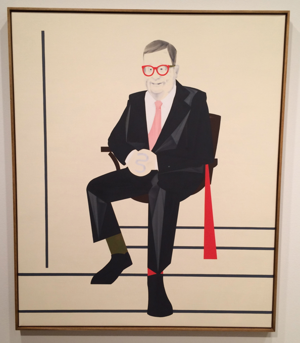
So first up is always the Archibald.  I would like to see the AGNSW mix this up for once and have you enter through the Wynne, that'd get everyone talking!  Hardly any real controversy this year, even the chicks making out didn't raise an eyebrow.  What is going on?  I did like the collection of smaller works that had been hung together.  I, like many others, decry the super sized entries that this prize seems to encourage.  One other thing I like about the Archibald is that it is quite acceptable to tee off on the art.  John McDonald has had a great go this year, see here, lots of reasonable arguments there.  John's pet peeve this year is portraits painted from photographs rather than the subject formally sitting.  I know what he is talking about.  I sat for a portrait back in the day and it took quite a few of them.  My own pet peeve concerns all the random punters being painted.  Officially the prize is for a portrait "preferentially of some man or woman distinguished in art, letters, science or politics, painted by any artist resident in Australasia".  My preferential is a little stricter than the AGNSW, hence I would've flicked about half the entries for non-compliance.  I was particularly annoyed with Vincent Fantauzzo's 'self-portrait', which is actually a photo realistic portrait of his son and a particularly cloying artist statement to try and get it to qualify for this prize.  Anyway, I'll stop there before I pick off a few others.  Breathe.  Okay, on to those that did actually float my boat.  Top pick was Mitch Cairn's Reg Richardson AM.  Distinguished subject, check.  Portrait in distinctive style of artist, check.  Not too large, check.  This was a very striking portrait (mainly because of those glasses, image top) but I really liked how the portrait was still obviously in the modernist style that Mitch is making his signature.  Other highlights were Sophia Hewson's kissing girls (or the twins as my three year old called it) and Zoe Young's Torah Bright.  I liked the aesthetics of James Powditch's Citizen Kave, it did look like a good movie.  I did try to think, based on the entries submitted, who I'd get to paint my portrait if push came to shove (apart from Mitch). Paul Mallam (pic above, The Card Player) was probably the other winner there.  Before we move on, please note that the top image is courtesy of my iphone, the rest are from the AGNSW website.  You see, they are rocking the no photos allowed policy.  I had seen a few people taking snaps so started to help myself when a guard said no.  I said what about that dude - he turned out to be an artist, and apparently you are allowed to take photos of your own work.  Hey AGNSW, how about next time we actually get on the social media train.  After just coming back from New York where Sotheby's are trying to promote their auctions with the #sothebysselfie tag I can't see why we are being backwards about it.


Next stop is always the Wynne.  For once, I agreed with the judges.  Michael Johnson's Oceania high low (pictured above), probably would've got the nod from me.  This was quite a large work but at the same time a very retro abstract work.  Quite colourful and the 3 year old junior critic liked it a lot, although in her mind the pastel cityscape of Michael Muir would've given it a run for its money.  I liked Noel McKenna's Palm Beach wharf and also Kate Shaw's Maralinga (which I think would be even more striking if she did it when the bomb was going off).  I'm getting a bit over Joshua Yeldham's Wynne entries.  It's like he has had the same work for about 5 years now.  Also due for a spell is Tim Storrier.  You won the big prize last year Tim, take a year off!


Last stop is ... you guessed it - the Sulman!  Now this is usually my favourite prize given how random it is (especially if R. Bell happens to be judging).  Sadly this was one of the weakest years in my mind.  Didn't like much.  I like political paintings but political artist statements give me the irrits, so Darren Wardle was discounted straight off the bat.  Fiona Lowry had one of her trademark works (by the way I did like some random interwebs criticism of her Archie winner that instagram should just develop a Lowry filter - meow), Noel McKenna had a still life and that was about it for the big names.  I quite liked Maz Dixon (image above, Colony). I've seen Maz repped on Sydney's own little art startup Art Pharmacy (link here). So I was familiar with her vintage postcard inspired practise.  Now I think I prefer her Big Pineapple, Gold Coast meter maids and Currumbin Bird Sanctuary lorikeets but this seaworld inspired dolphins and the random blob (which happens to be a whale) are streets ahead of the field here.


Points:  Mitch is going to bag the 3 points for his Archibald entry here.  More prestigious than the Trustee's Highly Commended?  Probably not ... yet.  The 2 will go to Maz for her Sulman entry.  The 1 from the Wynne will actually go to James Drinkwater as I did like his retro abstract landscape and I figured Michael already won the Wynne so what was a point to him!  James' Down the Awabakel Trail (above) lets me in on the fact he is from the Hunter, and Hunter boys stick together.  Well down Jimbo.

Thursday, June 19, 2014

2014 Yen Art Award at gaffa gallery - 19 June


So it turns out that this is the 3rd year of the Yen Art Awards which means the Big Lamington has coverage of 67% of their history (see last years thoughts here, I just re-read the post and it was a cracker!).  For those that can't be bothered lets do a quick revision:  Yen is an Australian magazine aimed at "smart creative cookies who love to be inspired".  I guess they target smart young creative cookies as this award is restricted to women aged 18-35.  Five judges in all (and yet they still didn't need me as a guest judge, editors my offer stands for 2015) and they have whittled the 530* entries down to 20 finalists.  Let's see who inspired this creative lamington cookie!


Now given the prominence of social media it is hard to keep anything a secret and so I'd already heard via tweeter that Claudia Nicholson had won this years award.  Congrats Claudia!  Loyal readers will remember Claudia has taken some points before (here and here) so it was great to see her recognised with a win.  Her work, 'Si Tomas el Agua de Neshuya (once you have tasted the water of neshuya)' (pictured top) continues with her pink dolphin theme which is a commentary on the folklore and myth of illegitimacy in Columbia (that is the pink river dolphins turn into charming blokes that seduce innocent girls).  Unless you know that back story I guess you are just appreciating the handmade aesthetics of the embroidery but with knowledge of the myth I find it much more interesting.  Also inspiring were the pencil or charcoal drawing of Phoebe Boyle ('Day trippin' in Versailles', pictured above).  There was some great technique on display here as the drawn folds were very intricate.  Top work and a great buy at $800.  Most of these works were very affordable (under $1k) so there were quite a few dots on the walls.  I'm a fan of collage so enjoyed Meredith Earl's 'Commonplace Magic' (you'll have to check out Yen's handy website which has a booklet of the finalists for this image).  And I liked the retro illustration of Camila de Gregorio's 'Birds 1'.  I had a great time looking at this exhibition, not only did I have the place to myself for my first walk through, but then to top it off I even got a curatorial tour from gaffa's own Grace Mackey at the end.  In addition to discussing the works above she pointed out Grace Blake's '3 hrs', '18 hrs' and '9 hrs' (pictured below).  These were prints but Grace's great trick is the framing which is actually coloured perspex.  Hello innovation.  I've been picking up a growing trend for inventive framing (Marian Tubbs, Phil James, and at the Frieze fair in NY) and this is a great continuation.


Points:  This is tough.  I was all set to give Claudia another 3 when the curators tips brought Grace Blake into the frame so to speak!  But the dolphin story takes it to another level for me and that pink pimp takes another 3 points.  2 to Grace and 1 to Phoebe.

* that is a lot, see them all here.  I am also going to call out a couple of artists that didn't make the shortlist based on my own trawl through the long list.  Two I would've included both rock a textaqueen aesthetic and incorporate a bit of text, Alanna Lorenzon's Things that are not healed (who has her own website here, good hustle) and Alexandra Sherger's Lana Americana.

Saturday, April 26, 2014

Redlands Art Prize 2014 - 26 April


As I said last year (and I think even the year before), this show is an education.  Very eclectic and a reasonable survey of some established artists and some emerging artists, half of whom I have never heard of!  The premise is that some guest curator picks a dozen or so established artists who then pick an emerging artist to also be in the prize.  They give out $25k to the winner of the established category and $10k to the winner of the emerging.  Sadly the organisers obviously didn't read the Big Lamington review last year where I gave the eminently sensible suggestion that there be a new category for the 'team event' of established and emerging artist. This creates a vacuum, then we fill that vacuum. As popular war advances, peace is closer. What?


On the ground floor of the National Art School gallery you first come across (or are confronted with, depending upon your views) a massive Tom Polo installation.  I read that Tom won the emerging category.  Tom's style is divisive, you either love it, hate it or couldn't give a rats. I'm always confused to which bucket I fall in, so at least he gets you thinking! My junior critics were excited by the prospect of voting for a people's choice award so were busy hunting for their favourites.  On the ground floor we lingered at Tim Maguire's lightbox (Kinglake Panorama) and also Tully Arnot's inventive 'Bottle Song' where he has upcycled some old plastic soft drink bottles into an whistling orchestra with some micro fans blowing in the mouth of the bottle.  The eco propaganda message at primary school must be working as the kids thought this very clever and useful.  Round the corner I came across a great selection of works by Ian Milliss. His works combine coal and flowers (pictured top, 'Homage to Tatlin'). Growing up in the Hunter Valley I have a bit of an appreciation of coal for both its economic benefits but environmental costs. I would've loved this even more if it was a native Australian plant (at first sight I did think the ornamental ginger was a rock lily orchid, dendrobium speciosum, which is native to Sydney and the Hunter Valley). It was only after reading the catalogue that I see he is referencing censorship.  Hmmm.  Next to him is Alex Wisser who is digging a hole.  The work has a video on the wall and a photo on the floor of the artist in the hole.  Very Castle.  The work is from Hill End in NSW which was once a gold mining town.  So I like how Ian and Alex are both referencing mining.  Nice to see artists working as a team!  Upstairs the junior critics liked artist pairing of Pip & Pop (who scooped a Big Lamington point back in 2011!) who included a pastelly print of lollies (image left below) and Amy Joy Watson (Split, image below right) whose helium balloon sculpture had everyone transfixed. I like the inventiveness of this sculpture, the helium must present some issues for collectors no?  Do you have to keep a tank of helium at home and inflate the artwork when guests come over? Nearby Alex Seton's marble sculpture of an a deflated pool toy needed to bring out the reminder of the no touching rule as it is so lifelike the junior critics couldn't believe it was made of stone.  Alex does very fine sculpture work and he is on good form here.  It is a shame that the curators didn't manage to put this work near his invitee Tully Arnot as together it is a strong pairing.  What else?  I liked Scott Redford's 'Proposal for a Gold Cost Public Sculpture' (pictured middle) and more so since he is so outspoken of late.  Keep speaking your mind Scott!  Interestingly the catalogue has the Kylie Minogue version although Scott has Heath Ledger in the comp.  Last name check goes to Greg Weight for his photo of paint splattered boots which are virtually camouflaged against a similarly splattered floor.  Nice.  You can see the full catalogue online here.


Points:  The points here are all team based.  3 points will go to Ian Milliss & Alex Wisser.  I gave my people's choice to Ian as well.  2 points will go to Pip & Pop and Amy Joy Watson, Amy also collected the people's choice of one of the junior critics.  1 point will go to Alex Seton and Tully Arnot.  Please email your postal address if you would like your certificates mailed out!

Friday, April 25, 2014

2014 Gallipoli Art Prize - 25 April


As most Australian know, 25 April 1915 was the date of the Gallipoli landings - becoming known as Anzac day.  This year is the 99th anniversary of the landings and I was down at North Bondi RSL (aka the Rathouse) with about 2,000 folks for the dawn service this year and it was great.  Luckily for me I had swung by the Gallipoli Club in the city the day before to see the opening day of the Gallipoli Art Prize.  As I said last year this is one of my favourite art prizes, and very low key.  Sadly the Gallipoli Club plan to only run it until the 100th anniversary next year.  Hopefully someone can step in and keep it running.  I hear Transfield has some spare capacity in its art sponsorship budget ...


This prize got a fair bit of press with big spreads in all the main papers.  Idris Murphy took out the $25k with his landscape 'Gallipoli Evening 2013'.  I loved the golden colouring he used on this landscape and the abstract lone pine in the centre of work links it more directly than most entries into the ethos of the Club.  It is an acquisitive prize and once they have renovated the club there is planned to be a sort of museum area where all these winners will be hung.  This will be a great addition.  There are a handful of familiar names, Fleur MacDonald, previous BL 3 point winner Kerrie Lester, Haydn Wilson and Leo Robba I recall from previous shows.  Haydn's entry, 'Gallipoli Patched' is a great colourful work, if you don't get to see them in person the SMH article I linked to has a gallery of images (actually, this year quite a few websites have the full images up which is handy for my as the lighting is terrible inside the club to take some happy snaps).  As an aside, I think if you are an established artist you've got a great chance in this prize, having looked at full entry list that was left out on a table on the first day to facilitate pick-ups.  There were some classical war artist work like Sue Jarvis' entry.  There were the more contemporary works like Alison Mackay's Battlefield (above). The artist statement said this work was about the challenges of returning to family.  I don't see that but see a lot more about symbolism and futility. Really liked it.  One of my favourites was Monique Aurichchio's 'For Gallantry' (pictured top).  This watercolour shows a carrier pigeon with medals.  But even better is that this is a real decoration.  As Monique explains in her artist statement the PDSA Dickin Medal is like the VC for war animals.  Of the 54 war animals awarded the medal, 32 were pigeons, 2 of which were aussie birds!  Someone send this to Bill Lawry!  I am thinking of talking an artist friend that does great flower paintings into doing a wreath for next years prize.  I liked Peter Gardiner's entry this year (pictured below, 'Wreath (memory)') but didn't really get the fire.  Or I did get what he was trying to say but I think it would've been prettier without it!  Dean Bowen's charcoal on paper 'Hospital Ship' was a great work.  Really intriguing.  I'll keep an eye out for him.


Points:  I like ribbons & medals, and I like paintings of birds so it looks like Monique will take the 3 points here.  The aesthetics of oil under resin are also a firm favourite, so Alison Mackay's Battlefield will take the 2 points.  The 1 point will go to Peter Gardiner for his wreath.  

Wednesday, April 23, 2014

Easter Show 2014 - 10-23 April


March is always a busy time at Big Lamington HQ, and I'm not just referring to Art Month and the Biennale (what a palaver that has been).  The big event looming large on my calender each year is the Easter Show!  And yours truly was elbow deep in prep for the baking and preserving sections (yes, some ribbons won but sadly this isn't a blog to talk about jam rolls).  Now I said this last year but it deserves repeating for those that came in late.  The Easter Show is likely the oldest art prize in Australia. The Show itself kicking off in 1823 and awarding its first arts ribbons in 1869 (with the oldest AGNSW prize, the Wynne, only kicking off in 1897).  Despite the recent slur by art critic who should know better John McDonald (who said of the Australia exhibit at the Royal Academy that "I've seen more cohesive hangs at the Royal Easter Show"), this is one of my favourite events.  Democratic and very eclectic.  Let's look at the wares ...


There are quite a few categories, all with quite precise requirements, from sculptures (figurative, abstract and small are each separate categories) to still life, landscape, rural subject, australian birds, watercolour, then drawing and photography the schedule runs on and on.  Don't forget to include the gems of folk art and even the tea cosies are quite often works of art themselves (and some of the first works to be snapped up on opening night by savvy collectors.  There are thousands of works so I will just hit my highlights.  The winner of the blue ribbon for watercolour, Giulia Staudinger's 'Kookaburra' was an amazingly detailed piece and a worthy winner, though I wish she had entered it into the native bird section as I was a little disappointed in the avian art on offer here.  I actually preferred the winner of the separate poultry art competition (Turkeys, pictured above) to what was on offer in here.  The Show rewards traditional works and the winner of the still life was a classic, as was the winner of President's prize for 'best rural subject painted in a traditional style' by Melvin Duffy (To water, pictured top).  Melvin is in his 80's which just goes to show I've got quite a few years of exhibiting ahead of me.  The photography is always a bit mixed, or maybe it is the judging I don't agree with.  My pick here was Christina Peterson's Reflections which snagged her a 3rd prize ribbon in the open section.  Of all the categories, I was particularly enthusiastic about sculpture this year.  For those that can't resist skipping ahead you might have just spied that golden object pictured below.  This was the winner of the small sculpture section (less than 15cm in any dimension).  Titled "and the Gold Lamington for 2014 goes to ..." it won the blue ribbon in its section for James Dolton.  I agree with the judges here, what a great kitschy treat.  Like the CWA's version of the gold logies!  The abstract category was also a hit.  The 2nd prize winner from here, Julie Donnelly, was also a favourite with her tall assemblage of old crystal bowls, platters and cake stands (have a look at my twitter feed for an image).


Points:  Hands up who thinks the Big Lamington is going to give the 3 points to the Gold Lamington?  Give yourselves a highly commended ribbon 'cause you're dead right.  3 to James for his tasty looking treat.  2 points will go Julie for her repurposing some classic nana style crystal pieces into a contemporary work.  1 point will go to Melvin.  He really hit the brief with his traditional work although his signing the painting "Melvin Duffy OAM" in a large font is really subverting the anonymous judging!  Will have to keep an eye out for him next year ...

Saturday, November 16, 2013

Blake Prize at UNSW - 17 October to 16 November


2013 and the Blake Prize tries its third venue in 3 years.  Maybe one of the organisers reads the Big Lamington? I was refreshing my memory of what this gave us last year and I see I wasn't a fan of the entry price at the SH Ervin.  This year the big show came to COFA (aka the College of Fine Art, aka the old Paddington High School!) and I swung by on the way home to check out the opening night. That was 17 Oct so sadly you can no longer see this in the flesh but the show lives eternally online here (okay, bad spiritual gag, I'll try harder).


Opening night was quite a bit of fun, especially as I had the pleasure of spoiling the announcement ceremony.  I was looking at my twitter whilst on the bus over to COFA and the abc had tweeted Trevor Nickolls had won the main prize bang on 6pm so I was surprised when I finally got to the venue to see all these people lined up for the speeches.  I recognised someone from Artereal, a gallery with quite a few artists included, what was going on and apparently the crowd was waiting for the announcement. Apologies Rihanna for blowing the suspense! Anyhow, that saved me having to listen to some of the worthies who were primed to go on for far, far too long. Even Leichardt Council is involved!  Heaven help those ratepayers.  Inside was a familiar scene.  A lot of works taking a fairly long bow with the approach to the spiritual.  Not as many familiar faces for me this year.  Nell, Liam Benson and Joan Ross were about the only artists I could recognise without the aid of the catalogue this year.  I did pick Paul Ryan's entry but had read about this earlier in SMH (image above).  Nell's was probably the most 'spiritual' for me, celebrating childbirth in her signature black and white style (image top).  Liam's Santa was very clever (and was similar to his performance at Sydney Contemporary) and does look a little god-like (as in Neptune) but is probably a little secular for me given the aims of this prize.  Likewise Joan Ross' video where 'the underlying message suggests the spiritual connection to the land' reads more like a contorted rationale to get an already existing work to somehow qualify for this prize. I have read about David Capra before and it was great to see his installation of banners and video ("Year of Jubliee" image below) which really did bring to mind the banners you see in Church.  And I love a good hand made banner or flag.  David also won the emerging artist award here.  Other notables included Greg Semu's quite dark 'head of john the baptist' which connected matyrdom to headhunting no less!  This also won the people's choice.  Another highlight was Kate Just, whose 'postscript: burial suit' was a photo of Kate wearing a handknitted bright pink burial suit with motifs from her life (she also has a handy website and you can see the burial suit there).


Points:  3 to Nell for the slab of pine. Quite spiritual and iconic. I have a real soft spot the signature style of this artist.  2 to David Capra for the banners.  I think I will give 1 point to Kate's knitted burial suit which had a great Easter Show craftiness to it as well as being right out there in conceptual terms.

Saturday, October 26, 2013

The Woollahra Small Sculpture Prize - 26 October


With the Mrs working a weekend, yours truly was the one at Council chambers with three junior critics racing around the exhibition on Saturday.  There was quite a bit to see, but helpfully you can see it again online here (and in the flesh until 10 November).


A couple of familiar names here, Joan Ross, Troy Emery and Peter Cooley all submitting works emblematic of their quite distinctive styles (Peter's Cassowary, above, was pretty cool if you like cassowaries. I do).  Likewise Julia Deville.  She is owning taxidermy at the moment and her 'Sorrow' (image top) of a stillborn deer sitting on an antique silver platter won the prize.  Her work is still priced competitively and its yours for $7.9k (or maybe not, is this prize acquisitive?  I can't remember).  I didn't recognise it immediately, but Donna Marcus has a work in her this year (Khrushchev + Nixon) that references her Big Lamington 3 point winner from 2011.  Other highlights included Dani Marti whose bead encrusted rope kind of made me think of an Angela Ellsworth (think pin bonnets) door snake.  There were quite a few works challenging the 80cm size rule, like David Jensz's plane space (79cm in 2 dimensions) and this large confusing wooden crib from some guy with a made up name.  What else?  Well I can't help mentioning Kirsteen Peiterse's Downpour.  Primarily because it reminded me of that random 80s kids TV show Fraggle Rock.  Those acrylic rods look just like doozer constructions.  Other prizes?  Stephen Bird and Michelle Ussher won Highly Commended's for their pieces and Uri Aeurbach won something called the Plinth Prize.


Points:  Loath as I usually am to actually agree with the judges verdict I think Julia gets my 3 points as well, well done.  2 points to Darren McGinn's Building Blocks (above) and 1 point to Abdullah Syed's woven dollar (if you follow me on tweeter you would have already seen this.  Damn, stop missing out on the fresh stuff!) which I really liked but am not so sure it wouldn't have been better just framed instead of being contortioned into flying rug for the rules of sculpture.  Well done Woollahra Council.  Good to see (some) of my rates supporting this.

Friday, October 18, 2013

2013 NSW Visual Arts Fellowship for Emerging Artists at Artspace - 18 October


I gather this award is supposed to give an emerging artist's career a leg up (& their bank balance a good one too - it is $30k).  It certainly should take up a few lines on the resume as the title is a mouthful.  I came down to Woolloomooloo on a Friday lunchtime to check out the entrants and take down a Curry Tiger from Harry's cafe de wheels.


It was art first and a few familiar sights all around.  JD Reforma's installation was similar to something I saw at MOP, again some Jonny Niesche's work I think I recognised from Firstdraft (see image top, JD on the left and the glitter is Jonny's).  Then I realised you mightn't have had to make anything new for this and just submit work representative of your career.  This makes a bit more sense.  The winner of the fellowship was Jamie North (installation view above), whose work reprised a recent show at Sarah Cottier.  It is pretty interesting but I do wonder at the conservational aspects of keeping the plants alive.  I'm not sure my gardening skills are up to it.  Apart from more familiar names I also liked David Capra who rocks another flag (or banner really) in his video Intercession, Marian Tubbs randomly framed triptych (which looked like a single work had been framed and then sliced into 3 non-symmetrical pieces) - points here, always good to see something new and Mark Shorter's video where he acts like a white feathered yowie on Mount Wellington in Hobart.


Points:  3 to Jonny Niesche.  The more I see the glitter, the more I like it.  What is that theory about familiarity again?  2 points to Marian Tubbs for rethinking the standard approach to framing & display - it is always hard to do something different (at least this was the first time I had seen it). 1 point to Mark Shorter for the totes bizarro video.  It might have scored higher but I did think it a trifle unnecessary to see his junk.

Saturday, August 3, 2013

The Brett Whitely Travelling Scholarship - 3 August


Despite 5 great years in the 'hood in the late '90s I never made it to the Brett Whitely studio in Surry Hills so it was time to make amends and also check out the scholarship that is dished out to an emerging artist ...


The studio itself is run by the AGNSW and is open Fri through Sunday.  The assistants take it pretty seriously and two of my junior critics copped an official warning for a bit of raucousness around the Whitely's on the ground floor (to be fair the noise does cannon around the studio, they need some carpet or something) so we were quickly upstairs to check out the actual studio and the scholarship finalists.  If you weren't paying attention you would easily miss it.  I did the first time.  They have a selection of works from three of the finalists tucked into a little corner and then on the i-mac on Brett's desk they have a slideshow running with some others.  They might be doing good work with the prize itself but the exhibition of it appears hung as an afterthought.  I get the sense that curatorially they see Brett as the big deal round here.  The winner was a young gun from the nations capital called Tim Phillips who had about 4 similar works on show.  It was a pretty tight little selection.  These were quite delicate still lives on a monochromatic pinkish background.  Kind of takes me back to art school with its focus on bottle and glasses and the like but it obviously appealed to the judges.  He is now $25k richer and has a 3 month stay in Paris.  I had originally thought two other finalists were chosen at random but now I realise both James Drinkwater and Dane Lovett were highly commended (I think they need some ribbons a la the Easter Show to make this a little clearer!).  Drinkwater's entries were very abstract and I guess meant to be landscapes based on the titles.  His colour palette is quite earthy and hung in this studio they appeared to have a real retro look as if they were painted in the '70s.  Lovett's work was reasonably familiar to me as I think I have seen his work at Sullivan and Strumpf.  These works were much sparer than his usual focus on obsolete technology.  Other finalists you only see in pixels despite schlepping over to the hills include Valentina Palonen, Clara Adolphs, Samuel Condon, Nick Hall and Tom Polo (Andrew Frost obviously not the judge!). If you can't make it to Surry Hills here is the show in all its online glory


Points:  The fact that you see half of the show in person and the rest on the screen makes these points hard to give award.  And even my old favourite of blatant self-interest is absent as I'm not really overly familiar with any of these artists.  What would Richard Bell do?  I asked my daughter and rainbows it is.  I will give Tim the 3 for his portrait (above), 2 points for Valentina's tidal march (middle) and 1 point for Tim's Paninaro '95 (top).  Job done.  Let's go to Bourke St bakery (it's right around the corner - my son recommends the sausage rolls!).

Monday, July 8, 2013

2013 Yen Artist Awards at Gaffa - 8 July


Hands up who loves a random art prize?  Yep, thought so.  So do I and I was lucky enough to squeeze in a visit to Gaffa on the last day they were showing the 2013 Yen Artist Awards.  According to their website, Yen Magazine is Australia's #1 independent magazine for women.  Who knew? Their art prize is also women only, but they've gone all contiki tours and made it for 18-35s only.  You can't see this at Gaffa anymore but Yen have done a great little website with all the finalists (all the entries, as in at least a hundred appear to be online, at Gaffa there were probably only 20 works).


I had actually spent some time on the award website prior to my visit so had seen quite a few familiar works online (Leah Emery's cross stitch porno come to mind!) and probably a few that should've made the exhibit in my opinion (Sarah Sheehan's entry a great example here). Some works look much better in person than on the computer, Annie Davidson's Cactus Land was a great example. Bright, vivid colours and a little bit quirky.  The official winner was a fairly dour affair for mine, certainly when compared to works that really captured the eye like Robin Clare's Tropical Thunder (top) or Emma Coulter's Foreign Landscape (above). It was about 50/50 works for sale versus NFS, and given most of those featured were emerging the prices were more than reasonable. All in all a great show and certainly one that has given me some names to watch out for. A few I was already aware of, like Claudia Nicholson and Montana Miller but also some new ones like Robin Clare and Nicole O'Loughlin.


Points: 3 points to Robin Clare's Tropic Thunder.  Just like 10CC said, 'I don't like Jamaica, I love it'! Robin actually has a solo show right now at Black Penny in Surry Hills.  Here's a link.  I missed the opening but will be sure to go check these out over the weekend if not before, stay tuned!  2 points to Emma Coulter.  It's a little more abstract than what I usually go for but it certainly stood out in the room.  I will give the 1 point to Greedy Hen (their "we just ignore the neighbours" digital collage above). I do like their name! Great work Yen, just shout if you need a hand with the judging next year.