Showing posts with label AGNSW. Show all posts
Friday, April 17, 2015
Artexpress 2015 - 17 April
Last week for Artexpress at the AGNSW. I went on Friday lunchtime and joined the pretty big crowds checking it out. Seriously, place was packed. As I mentioned last year, Ben Quilty got his first break in this gig all the way back then. Are we going to find the next big art star?
Well, I don't think just art star. To me, the arts subject is getting much broader in 2014 (to clarify, if you are at Artexpress in 2015, you did the HSC in 2014). Certainly not all of these are 'fine arts' as you would've once expected. One student has a big architecture project in here. Quite a few seem to have promising careers in graphic design. Darien Law's Simple Cinema (extract above and also pic bottom) was great. Now I've mentioned before that one of the BEST things about artexpress is that the students need to list out their artist influences. Darien listed Chip Kidd and Alvin Lustig. Recognise the names? Only 1 for me. Chip Kidd is a well known book designer and it turns out so is Alvin. Darien has been inspired by book design to make new movie posters. Now it might be hard to make out all the posters in enough detail online so I've put 2 above for you to work out (but think quick as I'll put the spoiler with the points). It was great to see all the punters in the AGNSW trying to do the same 'name that movie' thing. Quite a few I didn't get but it was a lot of fun playing. Another student taking a populist path was Jordan Abram. One of his influencing artists was Eugene Tan. Who? Oh you mean ::uge from aquabumps! Don't get me wrong, I am at Bondi every week, subscribe to (and was even featured once!) on the daily email. I love aquabumps, but is it art? Jordan has taken a photo of random (and not so random, hello Tony Hawk) punters in Bondi and combined it with a little quote of theirs has produced a photo book called 2026 (Bondi's postcode). I was going to say it reminded me of the blog 'Human's of New York' until I researched his other art influence, Brandon Stanton, and discovered that he was the photographer / blogger of HoNY fame. Still following a populist (cartoon) aesthetic but with a bit more art theory was Li-Hsien Lee. Her work, The Artyssey (pictured top), was a series of panels that told the story of an art disciple learning from a master. I liked how it appropriated the traditional chinese style but was created entirely digitally. Li's influences ranged from Herge (i.e. Tintin) to Noel McKenna (he is everywhere at the moment!) and even Brett Whitely. Also in the show this year were extracts from the students art process diaries and my favourites were Li's as you can see how she did these panels in digital form. Very illuminating for an analog critic.
Points: 3 points to Li-Hsien Lee for her Artyssey. It was a great little story, lots of fun but also clever in the references to art history and the use of a number of pieces (e.g. Jackson Pollock's Blue Poles) which served as little easter eggs for viewers. 2 points will go to Darien Law for Simple Cinema. For those racking their brain, the movies for the images in the middle were Back to the Future (LHS) and Jurassic Park (RHS), that is the car needed to hit 88mph and the t-rex made the glass of water vibrate. Get it now? I think Darien should put these into a little artist book! 1 point will go to Gabrielle Holmes for her work Once Again, The Facts Have Been Erased. This was a piece of high concept that wouldn't be out of place in a NY gallery. You can see Gabrielle's work here. The rest of the exhibition can be found here.
Saturday, September 13, 2014
Reko Rennie at AGNSW - 13 September
So I am not very technical, but one of the things I like about blogger is the 'schedule' function as it allows me to travel back in time and pretend to post this on 13 September, when I actually visited this exhibition, as opposed to todays date which is a week and half later. Luckily you all still have time to see this work, as the AGNSW has this up until November 30. And you should definitely see it. The AGNSW's contemporary space has been kicking a lot of goals recently. Well, by recently, I mean I liked Tony Albert's Projecting our Future in July 2013 and Tony Garifalakas' Mob Rule in July of this year.
That said, Reko Rennie's work 'No Sleep till Dreamtime' (full image top & bottom) isn't actually in the contemporary project space. That whole floor is being renovated for the summer Pop show so this project is downstairs in the aboriginal galleries. Which is a bit disappointing to me as there were plenty of crowds on the main level but only about 4 others punters downstairs when I visited. Now I like this on a number of levels. Firstly, great title. I am, as Reko obviously is, a bit of a fan of the Beastie Boys (except for their suing of a great toy company Goldie Blox for using a song in an AWESOME youtube commercial - my daughters have some of the toys and they still watch this ad on youtube) and Reko is taking inspiration from their No Sleep till Brooklyn. The hip hop vibe totally ties in with the street origins of Reko's style. Secondly, Reko's has really trademarked a street style especially the tagged crown, diamond and flag symbols common in much of his recent work. I also really liked the 'deadly' (image bottom) in the stylised font, but as I have said many times. I am a sucker for text in art. The stencils were also very cool. These you had to get up close to as from a distance you can't really see them in the pics. One great example was the kangaroo on the boomerang (image above) and another was a playing card (a king of some suit). Lastly that glitter works a treat in the darkened space AGNSW provided. Lots of sparkly diamonds interspersed between the symbols and stencils. On the whole I found this work similar in ambition to Tony Albert's AGNSW project. They both collect a number of works that could stand on their own and make a much, much bigger work across a horizontal plane. And just like Tony's I left very impressed.
Points: As is traditional in a solo show with a single work there can only be one set of points. Best on ground to Reko. Come along on 5 November and hear the Reko's artist talk. Details here.
Saturday, July 19, 2014
Archibald, Wynne and Sulman at the AGNSW - 19 July
The big prizes have moved back in the AGNSW calendar and that's a good thing as far as I can see. There really isn't anything else on right now in the art world. Which is why yours truly decided to brave the crowds and head over to the AGNSW on the first weekend after the Archibald, Wynne and Sulman prizes were announced. Would we concur with the trustees / judges? Would we be allowed to take a selfie? Let's find out ...
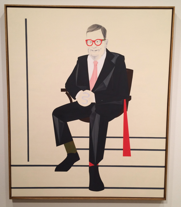
So first up is always the Archibald. I would like to see the AGNSW mix this up for once and have you enter through the Wynne, that'd get everyone talking! Hardly any real controversy this year, even the chicks making out didn't raise an eyebrow. What is going on? I did like the collection of smaller works that had been hung together. I, like many others, decry the super sized entries that this prize seems to encourage. One other thing I like about the Archibald is that it is quite acceptable to tee off on the art. John McDonald has had a great go this year, see here, lots of reasonable arguments there. John's pet peeve this year is portraits painted from photographs rather than the subject formally sitting. I know what he is talking about. I sat for a portrait back in the day and it took quite a few of them. My own pet peeve concerns all the random punters being painted. Officially the prize is for a portrait "preferentially of some man or woman distinguished in art, letters, science or politics, painted by any artist resident in Australasia". My preferential is a little stricter than the AGNSW, hence I would've flicked about half the entries for non-compliance. I was particularly annoyed with Vincent Fantauzzo's 'self-portrait', which is actually a photo realistic portrait of his son and a particularly cloying artist statement to try and get it to qualify for this prize. Anyway, I'll stop there before I pick off a few others. Breathe. Okay, on to those that did actually float my boat. Top pick was Mitch Cairn's Reg Richardson AM. Distinguished subject, check. Portrait in distinctive style of artist, check. Not too large, check. This was a very striking portrait (mainly because of those glasses, image top) but I really liked how the portrait was still obviously in the modernist style that Mitch is making his signature. Other highlights were Sophia Hewson's kissing girls (or the twins as my three year old called it) and Zoe Young's Torah Bright. I liked the aesthetics of James Powditch's Citizen Kave, it did look like a good movie. I did try to think, based on the entries submitted, who I'd get to paint my portrait if push came to shove (apart from Mitch). Paul Mallam (pic above, The Card Player) was probably the other winner there. Before we move on, please note that the top image is courtesy of my iphone, the rest are from the AGNSW website. You see, they are rocking the no photos allowed policy. I had seen a few people taking snaps so started to help myself when a guard said no. I said what about that dude - he turned out to be an artist, and apparently you are allowed to take photos of your own work. Hey AGNSW, how about next time we actually get on the social media train. After just coming back from New York where Sotheby's are trying to promote their auctions with the #sothebysselfie tag I can't see why we are being backwards about it.
Next stop is always the Wynne. For once, I agreed with the judges. Michael Johnson's Oceania high low (pictured above), probably would've got the nod from me. This was quite a large work but at the same time a very retro abstract work. Quite colourful and the 3 year old junior critic liked it a lot, although in her mind the pastel cityscape of Michael Muir would've given it a run for its money. I liked Noel McKenna's Palm Beach wharf and also Kate Shaw's Maralinga (which I think would be even more striking if she did it when the bomb was going off). I'm getting a bit over Joshua Yeldham's Wynne entries. It's like he has had the same work for about 5 years now. Also due for a spell is Tim Storrier. You won the big prize last year Tim, take a year off!
Last stop is ... you guessed it - the Sulman! Now this is usually my favourite prize given how random it is (especially if R. Bell happens to be judging). Sadly this was one of the weakest years in my mind. Didn't like much. I like political paintings but political artist statements give me the irrits, so Darren Wardle was discounted straight off the bat. Fiona Lowry had one of her trademark works (by the way I did like some random interwebs criticism of her Archie winner that instagram should just develop a Lowry filter - meow), Noel McKenna had a still life and that was about it for the big names. I quite liked Maz Dixon (image above, Colony). I've seen Maz repped on Sydney's own little art startup Art Pharmacy (link here). So I was familiar with her vintage postcard inspired practise. Now I think I prefer her Big Pineapple, Gold Coast meter maids and Currumbin Bird Sanctuary lorikeets but this seaworld inspired dolphins and the random blob (which happens to be a whale) are streets ahead of the field here.
Points: Mitch is going to bag the 3 points for his Archibald entry here. More prestigious than the Trustee's Highly Commended? Probably not ... yet. The 2 will go to Maz for her Sulman entry. The 1 from the Wynne will actually go to James Drinkwater as I did like his retro abstract landscape and I figured Michael already won the Wynne so what was a point to him! James' Down the Awabakel Trail (above) lets me in on the fact he is from the Hunter, and Hunter boys stick together. Well down Jimbo.
Mob rule - AGNSW Contemporary Projects.
What a pleasant surprise the contemporary project space at the AGNSW was on the latest visit (for the Archibald). I nearly didn't bother checking it out as we had the full complement of junior critics for this visit. One had just seen the Archibald and we were waiting for two others to finish the children's art workshop on the bottom floor so had some time to kill ...
Tony Garifalakis is a name I have read about, but I am not sure I've seen in the flesh. Or at least not enough to warrant a mention before. His work "investigates political, social and religious systems of belief while questioning mechanisms of surveillance, compliance and control", but I guess you could say that about anyone nowadays! Specifically for Mob Rule Tony is meant to be altering found images by censoring them a la the redacted copies you get from a government freedom of information request. That is, if the government in question redacted documents by using black spray paint. I think it is a very aesthetically pleasing result. The wet enamel paint runs down the subjects in a graffiti style, with the eyes mostly remaining visible. There are two different sets of images in this show. The first, running around three walls at eye level are portraits of world leaders Tony has ripped out of magazines (or offset lithograph images as I think the gallery labelled them). My favourite he was man of the moment Putin (above), he does look pretty evil. On the main wall were publicity type shots of various royals and military personnel that have received the same treatment. These are larger and from what I deduce, Tony has taken the image and then had c-type prints made which he has then 'censored'. My favourite here was probably Prince Harry, mainly due to his natty uniform (top image, bottom left).
Points: man of the match effort here from Tony, overall this show was much more impressive than the Sulman and quite a few of the Archibald entries. 3 points to Flash Harry, 2 to Putin and I'll give a point to one of the Queens - hopefully Liz.
Wednesday, April 30, 2014
ArtExpress 2014 at AGNSW - 30 April
Points: 3 points for Jessica Hodge for her glitter cancer works. Visually striking and moving artist statement. 2 points for Giorgia Jackson for the book coral sculpture and 1 point for Tracey Poon whose cardboard treats appealed to the baker in me (and would've been 3 if there were some lamingtons!).
Saturday, August 3, 2013
The Brett Whitely Travelling Scholarship - 3 August
Despite 5 great years in the 'hood in the late '90s I never made it to the Brett Whitely studio in Surry Hills so it was time to make amends and also check out the scholarship that is dished out to an emerging artist ...
The studio itself is run by the AGNSW and is open Fri through Sunday. The assistants take it pretty seriously and two of my junior critics copped an official warning for a bit of raucousness around the Whitely's on the ground floor (to be fair the noise does cannon around the studio, they need some carpet or something) so we were quickly upstairs to check out the actual studio and the scholarship finalists. If you weren't paying attention you would easily miss it. I did the first time. They have a selection of works from three of the finalists tucked into a little corner and then on the i-mac on Brett's desk they have a slideshow running with some others. They might be doing good work with the prize itself but the exhibition of it appears hung as an afterthought. I get the sense that curatorially they see Brett as the big deal round here. The winner was a young gun from the nations capital called Tim Phillips who had about 4 similar works on show. It was a pretty tight little selection. These were quite delicate still lives on a monochromatic pinkish background. Kind of takes me back to art school with its focus on bottle and glasses and the like but it obviously appealed to the judges. He is now $25k richer and has a 3 month stay in Paris. I had originally thought two other finalists were chosen at random but now I realise both James Drinkwater and Dane Lovett were highly commended (I think they need some ribbons a la the Easter Show to make this a little clearer!). Drinkwater's entries were very abstract and I guess meant to be landscapes based on the titles. His colour palette is quite earthy and hung in this studio they appeared to have a real retro look as if they were painted in the '70s. Lovett's work was reasonably familiar to me as I think I have seen his work at Sullivan and Strumpf. These works were much sparer than his usual focus on obsolete technology. Other finalists you only see in pixels despite schlepping over to the hills include Valentina Palonen, Clara Adolphs, Samuel Condon, Nick Hall and Tom Polo (Andrew Frost obviously not the judge!). If you can't make it to Surry Hills here is the show in all its online glory
Points: The fact that you see half of the show in person and the rest on the screen makes these points hard to give award. And even my old favourite of blatant self-interest is absent as I'm not really overly familiar with any of these artists. What would Richard Bell do? I asked my daughter and rainbows it is. I will give Tim the 3 for his portrait (above), 2 points for Valentina's tidal march (middle) and 1 point for Tim's Paninaro '95 (top). Job done. Let's go to Bourke St bakery (it's right around the corner - my son recommends the sausage rolls!).
Wednesday, July 3, 2013
Tony Albert - 'Projecting our future' at AGNSW (May-July)
So this is quite remiss of me. I came to the opening artist talk for this back in May but am only posting now, and mainly just to let you all know you've only got until 7 July to get down to the contemporary project space at AGNSW to check out this massive Tony Albert installation called 'Projecting our future'. I think this is what the internet had in mind when it coined the term 'totes amazeballs'.
I had the opening for this locked in my diary for quite a while. On top of the great artist chat on the day all the punters got to go over the buzzing gallery line and get a nice close up at the work. Trust me on this buzzing line thing, when I came back another day for a look see I set the sensors off (Catherine Zeta Jones in Entrapment I aint!). This work is officially described as an "installation made of reworked objects, sculptures and paintings; original photographs, paintings and drawings and three unique artworks by Daniel Boyd, Dale Harding and TextaQueen, dimensions variable approx 280 x 1200 cm". It is a collection of ephemera and Tony's own works from his archive that he has re-worked (or "intervened" with was the term they were using on the day). It's no secret I am a big admirer of Tony's style, I too am an eBay tragic and it was reassuring to hear that despite Tony signalling that this was going to be his last big Aboriginalia (a term Tony has coined for kitschy Aboriginal themed Australiana) inspired piece he is still online fighting the good fight for the treasures that are out there. One of my favourite things about this show is that fact that the work was completed right at the last minute. The outcome of that is that the AGNSW brochure shows the work in progress (see picture below). So you get to see the finished product and play the "spot the differences" game. It was really interesting to hear Tony say that this work was meant to be more full of hope for the future than the previous works which were a bit more sorrowful. In that regard he felt he needed to tone down some of the messaging in this work as it was being completed, one example I can see is that the map of Australia with the 'f*&k off we're full' has simply become a monochrome black (you can kind of make that out in the action photo below and then the detail from top). I could never fit this in my home so if I were to cherry pick some items I would've taken the 'make decisions not reactions' plate (detail photo top) and the upcycled teaspoons (above) which I thought was a really neat idea that is about to get stolen by the Big Lamington household. There was also a union jack type design on a yellow number plate which I thought would be a good flag - Tony can we make one of them?
Points - it's usually just a best on ground with a solo work by a single artist but there are some others lurking to the observant. Naturally Tony will take the 3 points, its a really impressive installation. I will give 2 points to Texta and the 1 to Daniel Boyd for their cameo appearances. Nice touch. Am really looking forward to see his next body of work at SSFA in August ...
Monday, April 8, 2013
The Archibald, Wynne and Sulman Prizes - 6 April
Here we are again at the AGNSW for something that I think is quite peculiar to the Australian art scene - the annual art prize blockbuster exhibition. I am sure the AGNSW publishes the stats for the punters that walk through the door. My tip for bringing the junior critics - get there early. We were there with the 3 kids at 9.55 just waiting for the doors to open and were right in line behind this years big winner Del Kathryn and her family who were trying to keep a low profile and also beat the crowds.
First up is always the Archibald. The team at Big Lamington hearts Michael Lindeman's work and this years finalist for the portrait prize is no exception (top - Dear Trustees (self portrait)). Lots of text, funny, makes you think. Glad they put it in such a prominent position too. Everyone has to notice this work - although apparently the centre room is key to winning. After reading this letter to the trustee's in full I actually really enjoyed turning around and watching the reaction of the other early bird punters. This was getting lots of good press and is my dark horse for people's choice (I did give it my 2 votes as well - doesn't everyone vote twice?). I did like the winner. Del's works are very rich in colour and imagery. My wife adores them although at this rate the waiting list must be getting longer and longer with her 2nd win. I didn't think much of the Vincent Fantauzzo work next to it. I read a great review of this show in maybe the Australian newspaper where the writer was taking to task artists that are obviously painting from photos and this work is exhibit A in that regard. I did quite like McLean Edward's entry although one review I read said it failed in capturing the sitters likeness. Oh dear.
Next was the Wynne. Imants Tillers certainly seems like the boy who can do no wrong in the trustee's eyes - going back to back here with his Namatjira. I liked Fiona Lowry's work although in my mind it was very similar to her landscape entry which made last years salon de refuses. My wife would've given the wynne to her favourite sculptor - Alex Seton - who was unlucky not to win with his great hoodie wearing marble piece called Soloist. By recent form a sculpture was due to win this year, maybe 2014 is a lock. I really liked Noel McKenna's centennial park (above). I like the naive style and the information heavy nature of the work. I also quite like centennial park!
On to the Sulman where some names keep popping up - Paul Ryan (a Big Lamington points winner last year) was again a standout for his Fine Young Cannibal, and again also for his artist statement which was one of the best of the day. I like a nice memento mori so Craig Waddell's Hungry Hollow (above) was one of my top picks here. I also liked Annette Bezor's entry of 3 portraits of Kate Moss although I thought just the middle one with the veils of colour would've sufficed. I noticed Fiona Lowry's work which gives her a finalist in each prize and must surely warrant a ribbon or somesuch from the AGNSW, hopefully something is forthcoming - top effort that. Good to see Michael Lindeman's 2nd finalist of the day and I also liked Kate Bergin's flamingo from wonderland (as did my better half). All things considered I think Victoria Reichelt's After Books a pretty worthy winner.
Points - 3 to Michael Lindeman for his archibald effort. Hey if the Trustee's can keep giving the Wynne to Imants then I can certainly keep giving the best on ground to Michael! I will give 2 points to Noel McKenna who is postively swimming in Big Lamington points after the recent MCA show. 1 point will go to Craig Waddell for
Tuesday, February 26, 2013
Artexpress at AGNSW - 26 February
So I feel old coming to Artexpress. Mainly because I am visiting during my lunch break and there are school groups everywhere. This is always an interesting show and it too has now moved up to the top floor room where the last Dobell was. This is on until 14 April so you've got plenty of time to swing by, oh and it is free so put that tenner back in your pocket.
So what did I like? Well I had forgotten my favourite thing about this show from last year and it was that all the student artists (well not all but most) list their artistic influences on the wall tag. There were quite a few Salvador Dali's, Picasso, and even a Leonardo Da Vinci! I think the cool kids rocked the no influences. One of those cool kids was Francesca Fox. Her work Vadallat (or wild animal, above) was some hand masks based on her family's heritage which she then photographed. I would've listed her influences as Polixeni Papapetrou. Other favourites were Lochie Howard who had a suburban cardboard diorama (top, one of the scenes from 'love the home you're in'). I immediately thought Howard Arkley when I saw this and YES! he has him listed as a reference, go me. He also had the Strutt Sisters listed and hey I had heard of them too, and knew they were from Newcastle and then picked the Seven Seas which is a real art deco pub in Carrington. So maybe my Hunter Valley bias is showing a little bit but I was buying what Lachie was selling here - celebrating the good times, kitschy as they may be. I suspected Milli Wheeler had Banksy as an influence and was not to be disappointed here, two nice collages. My other favourite was a sculptural still like done in a flat pack cut out way (days of our still lives kit, below). This was by Ella Sanderson who had listed all of 5 influences. I do like a good vanitas (Hirst or the Phantom, I really don't care) and would've happily had this on a shelf in my pool room (although they are getting quite crowded).
Points: 3 to Lochlan Howard; 2 to Francesca Fox and 1 to Ella. Hope you all keep up the art no matter what course of study you pursue.
Monday, December 24, 2012
Dobell Prize at AGNSW - 6 December
So let me get this straight. The Trustees of the Dobell Foundation decided to axe the prize and instead run with an invitation only show every 2 years? Way to disenfranchise young and emerging artists! One of the great things about a prize is that it is open to anyone. Hell, even I was considering having a crack (I have at least a week of NAS drawing instruction under my belt!). Art prizes are just the way we do things in Australia, we like winners in sport and I think that goes the same for the arts. So yes in summary I think it is a fucking terrible decision. The Dobell Foundation Trustees had better put on one hell of a drawing event in two years time!
On to this years show (which is open until 10 February). I am only just getting around to posting about this a few weeks late due to a hectic Christmas season so I have to consult my notes extensively. I think this has moved around the floors of the AGNSW for the last 3 years but I did prefer to take the stairs up to the exhibition this year. As per usual form I disagree with the judges decision. Gareth Sansom's series of small drawings called 'Made in Wadeye' won the official comp, but to me this seemed more like a gong for lifetime achievement rather than the work in question. After much deliberation I think my Dobell for 2012 would've gone to Katherine Hattam's 'Heidegger's Hut' (pictured above, taken before I realised they actually have images on the intrawebs for about half the finalists this year, I have gone with mine as the colours on my iphone seem brighter). Graham Fransella has quite a good watercolour entry this year, luckily for him there is still the Trustee's watercolour prize within the Wynne! Quite a few other recognizable entries, like former winner Suzanne Archer and Wendy Sharpe's sketch for her recent show at King St gallery. I always make a point of asking the guides what their favourite was and in this case the Pam Hallandal would've taken the points. There is still time so go and see for yourself.
Points: 3 for Katherine Hattam. 2 points for Marinka Bozzec's 'Box Office Poison', (above, a series of small drawings. Marinka is also on flickr so you can see some of her other work). 1 point will go to Craig Waddell's 'You are the lightness in my dark' which for some reason isn't available on the AGNSW site but was a great drawing of waratahs which resonated with the state patriot in me.
Wednesday, September 12, 2012
18th Biennale at AGNSW - 12 September
The beauty of the AGNSW is you can sneak over here at lunchtime and see quite a lot. Certainly much quicker than the schlep out to Cockatoo Island so it is surprising it has taken me until the last week to see this last part of the Biennale, which is a shame as I reckon the AGNSW's offerings were the best bits.
Things started of well with Jorge Macchi's Blue Planet. This is a small collage (what is it with collages at the moment? They are everywhere!) where he has pasted over all the landmass with more sea. It is out front as the title of this work was meant to inspire all the pieces in the AGNSW section. To me I thought they meant all the art would have water or seas or fluid in it, which a lot did although some works like the burning model house didn't really fit in with that narrative in my head so like most overly curated shows I stopped trying to think about any connecting theme and just went and had a look at the pretty pictures. The absolute standout highlight was in the second room. This was Guido van der Werve's video 'Nummer Acht: Everything is going to be alright' which was projected onto an entire wall (still from video above). This video ran for about a 16 minute loop and I nearly did 2 sittings. It was amazing. Some guy (I presume the artist) walks in front of this giant icebreaker in some remote gulf off Finland. The boat is going slow and he just keeps about the same pace with it, so always just enough out of harms way. It is very quiet except for the muffled noise of the ice breaking. I found it very calming and meditative. The gallery attendant (you should always ask questions of the gallery attendants as most of the time you get these completely honest appraisals of the art that would make the curator faint) also pointed out the dichotomy of the boat walking on ground (being the ice) and the man walking on water (in a sense). He thought it was a bit religious. Maybe. It was hard for anything else to stack up to this. Coming close was Bouchra Khalili's map prints where he does a white line map on blue background connecting illegal immigrant routes around the Mediterranean to look like maps of the constellations. He teams this with some great videos of a hand drawing the routes as narrated to them by an immigrant. Very SBS go back to where you came from. Also good were Juan Manuel Echavarria's wall of lenticular prints (those are the photos that change when you move them, very Easter showbag ruler circa 1985. why there aren't more lenticular prints in art galleries?) and Yuken Teruya's little sculptures made out of paper shopping bags, very delicate indeed.
Points: 3 to Guido van der Werve whose Nummer Acht video was amazing. I could've watched this all day and would love a copy of this, Guido let me know when this is available on DVD. Region 4 please. 2 points to Jorge Macchi for his great collage, Blue Planet. 1 point will go to Bouchra Khalili for more good map work.
Thursday, April 19, 2012
Please exit through the Sulman - 19 April
I guess it must be that competitive Australian nature but I do like a good art prize. So with just one of the junior critics in tow the Big Lamington team was off to check out this years Archibald, Wynne and of course Sulman Prizes ...
The Archibald gets all the headlines but usually disappoints, and this year was no exception - I hated the winner (but then again I don't really like much of his stuff so we'll move on). I quite liked the idea behind Luke Robert's portrait of Richard Bell. He has done it as a coin with Bells head in profile on the obverse (that is the 'heads' side obviously!). I've seen something similar from photographer Darren Siwes in the not too distant past and I reckon his version was a little better. Currency featured in some other highlights, my 4 year old listing Martin Sharp's 1000 dollar bill of David Gulpilil as her top pick (she was lucky that this was one of the few postcards carried by the gift shop). I really liked Reko Rennie's portrait of Hetti Perkins. He has done a single colour on raw linen and made it look like a stencil (I thought it was until reading his little spiel which implies it is freehand). I am not sure I approve of portraits of AGNSW trustees given they are judging the comp so I would have sent Kate Beynon's portrait of Lindy Lee up to the Salon des Refuses.
Next up was Wynne, which I have a real soft spot for - just the name conjures up that classic 'Across the Blacksoil Plains'. Stepping into the back room my first thought was that I had been transported to deepest darkest Zetland as it was a Sullivan and Strumpfest back there: Juan Ford, check; Kate Shaw, check; Michael Lindeman, check. Just as I am sure a Kate Shaw will adorn a wall of mine one day I believe she will win the Wynne eventually. I guess the trustees, like myself, are just waiting for the right one to come along. I liked Louis Pratt's wavy sculpture but did think he picked the wrong year to enter. Since 2008 the Wynne has gone painting, sculpture, painting, sculpture so the conspiracy theorist in me thought a painting was a good bet for 2012. I was right. Imants Tiller's Waterfall took the chockies this year. It was my favourite winner of the three separate prizes but my top Wynne pick was Lindeman, whose 'attractive painting of Bega' got my attention. I haven't called the mobile phone number listed in the painting ... yet, but would encourage all to give it a try as last year it was actually his real number. I also love the combination of the text with the referenced image above. Strangely enough that is the exact combo I have running in my dining room, so who says familiarity breeds contempt?
Finally the Sulman, which is always a mixed bag. My picks here included Kathrin Longhurst's Grenade Girl, but then again I have a fondness for retro kitsch (she has painted it in that communist realist style) and will always look twice at a half dressed girl with a hand grenade; Angus McDonald's bull (with sash!) and Pamela (could that be Bundle?) Horsley's Out at Tidbinbilla (I thought at first that a nutjob objector had actually attacked the work and hence the surveillance note plastered in the top right but then I read the blurb!). My Sulman would've gone to Paul Ryan's Welcome to Wollongong (pictured) which was accompanied by the best artist statement of the day: "Governor Arthur Phillip arrives in Wollongong. For his first visit he comes as a black-and-white minstrel. Those Wollongong natives, they love a good joke. Strangely nobody seems to be laughing. This work asks questions. It does not provide answers." Points coming for this guy. It did also remind me a bit of Daniel Boyd's pirate first fleeters which is an all time favourite.
Points. I will give the 3 to the Wynne this year and that means Michael Lindeman. He deserves a big call out as in the last three years he has gone 2010 Sulman (winner), 2011 Archibald (finalist) and now 2012 Wynne (finalist). That is pretty impressive. 2 points will go to Reko Rennie for his Archibald (although I guess that means his already unaffordable stencils won't be getting any cheaper!) and 1 point will go to Paul Ryan for the beautiful randomness of Welcome to The Gong.
The Archibald gets all the headlines but usually disappoints, and this year was no exception - I hated the winner (but then again I don't really like much of his stuff so we'll move on). I quite liked the idea behind Luke Robert's portrait of Richard Bell. He has done it as a coin with Bells head in profile on the obverse (that is the 'heads' side obviously!). I've seen something similar from photographer Darren Siwes in the not too distant past and I reckon his version was a little better. Currency featured in some other highlights, my 4 year old listing Martin Sharp's 1000 dollar bill of David Gulpilil as her top pick (she was lucky that this was one of the few postcards carried by the gift shop). I really liked Reko Rennie's portrait of Hetti Perkins. He has done a single colour on raw linen and made it look like a stencil (I thought it was until reading his little spiel which implies it is freehand). I am not sure I approve of portraits of AGNSW trustees given they are judging the comp so I would have sent Kate Beynon's portrait of Lindy Lee up to the Salon des Refuses.
Next up was Wynne, which I have a real soft spot for - just the name conjures up that classic 'Across the Blacksoil Plains'. Stepping into the back room my first thought was that I had been transported to deepest darkest Zetland as it was a Sullivan and Strumpfest back there: Juan Ford, check; Kate Shaw, check; Michael Lindeman, check. Just as I am sure a Kate Shaw will adorn a wall of mine one day I believe she will win the Wynne eventually. I guess the trustees, like myself, are just waiting for the right one to come along. I liked Louis Pratt's wavy sculpture but did think he picked the wrong year to enter. Since 2008 the Wynne has gone painting, sculpture, painting, sculpture so the conspiracy theorist in me thought a painting was a good bet for 2012. I was right. Imants Tiller's Waterfall took the chockies this year. It was my favourite winner of the three separate prizes but my top Wynne pick was Lindeman, whose 'attractive painting of Bega' got my attention. I haven't called the mobile phone number listed in the painting ... yet, but would encourage all to give it a try as last year it was actually his real number. I also love the combination of the text with the referenced image above. Strangely enough that is the exact combo I have running in my dining room, so who says familiarity breeds contempt?
Finally the Sulman, which is always a mixed bag. My picks here included Kathrin Longhurst's Grenade Girl, but then again I have a fondness for retro kitsch (she has painted it in that communist realist style) and will always look twice at a half dressed girl with a hand grenade; Angus McDonald's bull (with sash!) and Pamela (could that be Bundle?) Horsley's Out at Tidbinbilla (I thought at first that a nutjob objector had actually attacked the work and hence the surveillance note plastered in the top right but then I read the blurb!). My Sulman would've gone to Paul Ryan's Welcome to Wollongong (pictured) which was accompanied by the best artist statement of the day: "Governor Arthur Phillip arrives in Wollongong. For his first visit he comes as a black-and-white minstrel. Those Wollongong natives, they love a good joke. Strangely nobody seems to be laughing. This work asks questions. It does not provide answers." Points coming for this guy. It did also remind me a bit of Daniel Boyd's pirate first fleeters which is an all time favourite.
Points. I will give the 3 to the Wynne this year and that means Michael Lindeman. He deserves a big call out as in the last three years he has gone 2010 Sulman (winner), 2011 Archibald (finalist) and now 2012 Wynne (finalist). That is pretty impressive. 2 points will go to Reko Rennie for his Archibald (although I guess that means his already unaffordable stencils won't be getting any cheaper!) and 1 point will go to Paul Ryan for the beautiful randomness of Welcome to The Gong.
Friday, December 2, 2011
Dobell Prize for Drawing - 2 December
Things are starting to wind down for 2011 but there is one last competition to go judge - the Dobell Prize for Drawing. I didn't get around to entering this year, lets see if I fancy myself over any of the official entries.Well, the first thing I noticed this year is that everything was really big. Most of the entries were huge. And quite a few artists saved on framing costs by entering the work on paper to be hung up by bulldog clips. In fact, one funster I overheard at the gallery remarked that "Please do not touch" had a lot of entries. I didn't much like the official winner, a triptych of pastelly shadows by Anne Judell, quite a few visitors shared that sentiment based on the gasps the punters let out when they saw the notice. Highlights for me included Reg Mombassa's glittery horses and Graham Fransella's Passegiata, although there was enough watercolour here for it to get in the Wynn. That is the thing about the Dobell - they don't define drawing. My definition includes pencil, pen and/or charcoal. Both Melissa Thompson and Eloise Rankine had reduced these materials to those 'repeated line' drawings that look like you are counting off the days (although one was more orderly than the other). I saw something similar at a NAS show earlier in the year. It looks good done on a big scale but in my mind is far too easily replicated to worthy of the points.
Points - 3 for Peter Gardiner's Hexham Swamp (pictured above courtesy of my blackberry if that explains the quality of the image). Chosen not not just because I agree Hexham is a swamp (I used to see it daily on the train ride between Maitland and Newcastle) but also because it was big (tick) and used only charcoal (big tick). 2 points for Reg aka Chris O'Doherty for the horse and I'll give the 1 point to Graham Fransella.
Sunday, May 22, 2011
New contemporary galleries at the AGNSW - 22 May
Opening weekend and I thought I'd brave the crowd with one of my junior art critics in tow for a late Sunday morning stroll. The new galleries are apparently the old storage rooms and occupy the 2nd basement level. You can get there by the stairs, the escalators or even the elevator and by the time we left we had used all three. What were the initial impressions?Well we arrived via elevator which is not the grandest entrance you can make. I think grand is what they were trying to design for the escalator arrival but I think the art at the staircase is much better. Here you are greeted by Ugo Rondinone's 'clockwork for oracles' which is a collection of framed coloured mirrors and a large Richard Prince cowboy (just so happens this is my favourite Richard Prince and I have it as my computer background, I saw this image auctioned at Phillips in NY back in 2005 when it set the record for most expensive contemporary photography; for a little bit of banking trivia the mirror image of this photo is in Patrick Bateman's apartment in American Pyscho!). I didn't think much of the Christo works. I know he wrapped Little Bay back in the day (before I was even born) but I probably got my fill from him when he did the Gates in Central Park (which I did like). Likewise I was really disappointed with the Jeff Koons stuff on show. I know he does banality but most of his work here (small puppy, mixed rocker, bronze basketball) actually deserved to be in the gift shop rather than the gallery. I have seen much, much better Koons than this. Probably a similar sentiment to the large Thomas Struth photos. The Sol LeWitt works, by contrast, were genuine drawcards. The big room dedicated to his Wall Drawings was very memorable. We were drawn towards the Tony Cragg sculpture which kind of reminded my daughter of a Christmas tree and really liked the Shaun Gladwell video work - approach to mundi mundi, is this on youtube yet? Other works that caught the eye were the Donald Judd sculpture (maybe I liked this as I do need a new set of shelves) and some of the photos of Rosemary Laing (who I recognised from somebody else's collection).
All in all a promising space although the collection, mostly the collection of a single benefactor, is a little mixed - some strong pieces and some ordinary pieces by a mix of household names and others not so well known. I am sure we will be back to check this out again. One other funny thing is that the AGNSW has developed their own character, Pertinos, to lead the kids tours. Mine was absolutely terrified of this crazy green lady and our own tour was designed to avoid any room with them. Maybe next time.
The points today are from my daughter, and I am pretty happy with the allocation so won't even edit - 3 for Richard Prince, great to know that Sydney has a really iconic one of his works. 2 to Tony Cragg's Spyrogyro and 1 for Shaun Gladwell's video - gee we hope he doesn't fall off. Also an honorable mention to the AGNSW gift shop which has helpfully done postcards of the nice stuff.
Wednesday, April 27, 2011
Archibald, Wynne and Sulman at AGNSW - 27 April
I actually checked this out with the whole family back on its first weekend. But if you have ever taken three kids aged three and under to the Archibald, Wynne and Sulman then you will be able to appreciate how fleeting that first visit was. The kids saw some stuff they liked and then were off and racing. Which is why I am back at the AGNSW in my lunchbreak forking out another ten bones to see this gig.Which is just as well because at last the requisite controversy has erupted courtesy of Richard Bell (contemporary aboriginal artist and guest judge of this years Sulman). I actually thought the awards were all handed out by the trustees so at least it has also educated a lot of people to how the comps work. Here is the scandel here, but the gist of it is that Richard Bell narrowed it down to some works chosen fairly haphazardly, wrote those down on scraps of paper, laid them out on a table and then tossed a coin. Wherever it landed - winner! I am fine with this, it does highlight how subjective all these prizes really are, and long time readers (all 3 of you) will know I am a believer of Bell's Theorem which is that aboriginal art is a white mans thing. Now the eventual winner of the Sulman, Peter Smeeth, has come out and complained that this cheapens his win. Not in my opinion - it is a great story, and also explains why this fairly ordinary work won the chockies. And I know you won't believe me now but had I posted on the 16th I would have said the Sulman was the weakest winner this year!
Enough of the scandal, on to the rest of the show. I really liked Michael Lindeman's Archibald entry - great combo of his classic text work and a portrait to boot. I also liked Del Kathryn Barton's - again a very recognisable style but am not sure Cate Blanchett was that recognizable in it (my wife, a big fan of celebrity spotting didn't even pick who it was meant to be). Not sure I would've given it to Quilty. I think his Moran winner was better (and what is with SMH critic John McDonald calling him young and fashionable? he is older than me!). The portrait subject figured large in my assessments so I found myself liking Geoff Dyer's David Walsh (I heart Mona) and disliking works like Lucy Culliton's Ray Hughes.
Onto the Wynne which comprises landscape and sculpture. Given the small painting won last year it was the turn of a really big ordinary sculpture to win this year. I didn't care for the motorbike on the back of the rickshaw. I was glad to see Nell get a guernsey for one of her sculptures and I did chuckle when I saw Graham Fransella had won the Trustees watercolour prize again (this must be like an annuity for him, hardly anyone enters any watercolours so he picks up this mini prize, awarded out of the Wynne field but just to the best watercolour - he has won it 5 times now, including four out of the last five). I liked Kate Shaw's entry and I hope she wins this one day as landscapes are really her thing but I don't think a triptych will do it (I think this one is yours for $11k but like most triptychs I would prefer just a single panel - I think she should just go all out with a big single frame next year).
Points, I'll give one to each category. 3 for Ken Yonetani's salt frame in the Sulman. I think it is a shame it is hanging outside the ticketed area as most punters will walk straight past this. They also got the 3 points for their blog entry explaining that they were cool with how the Sulman was judged. 2 for Lindeman's portrait - I am sure Richard Bell would agree with me voting for someone in the Big Lamington collection. 1 point for Kate Shaw, probably the only Wynne I would've wanted in my pool room.
Tuesday, March 22, 2011
artexpress @ AGNSW - 22 March
After Fenella plugged it on art nation I decided to wander over to the AGNSW at lunchtime to check out artexpress - a survey of the best high school art submitted for the HSC. Well it was an interesting collection of stuff. Keen to get a quick crib I asked the security guard who looked like he had been pulling a long shift which pieces he thought were the best. Answer? He didn't really like any of it, although to be fair he said he wasn't really into the arts!! Nice work AGNSW, maybe include a box "interest in the arts, yes; no" on the job form so you can avoid these walking pr nightmares. It's in the same three rooms that housed the Dobell we visited late last year so interested to see if they kept up the practice of putting the good stuff in room 1. I think so, and two of my favourites, Alexandra Hunt's 'Building a metropolis' and Amy Hamilton's 'it is the link itself which perplexes' were here. An interesting touch that I liked was that the students could list some artists that influenced their practice. Some opted out, some listed artists I have never heard of and some listed a couple that rang a bell. Of the top 5 artists of the last century according to the $12 million shark (I think, Picasso, Pollock, Warhol, Hirst and someone else) no one here was influenced by Warhol, none by Hirst, only one by Pollock and a couple for Picasso. Even two people listed Fiona Hall! Amy was one of those listing Fiona Hall as one of her influences and I could kind of see that. Highlight of the second room was Iva Velevska's 'Personal Blueprint' where she had turfed out the furniture of her living room and then installed blue tarps and painted outlines over it. On closer inspection she had also listed Do-ho Suh as an influence - nice work, he is represented in the Big Lamington collection. Look for some points going to Iva as even in the art world you should always bet on self-interest. Room three had a couple of prize winners (as with the NAS grad show there were at least 5 prizes to go around the ~40 students showing here so a fairly good chance of bagging something). I probably disagreed with the judges and thought Kate Devlin's Illusio was the strongest here.
All told an interesting show. Best of all it looked like open season on photography being allowed but even so the whole show is online so you can save the shoe leather on the hike over to the AGNSW. Points this week, 3 to Hamilton; 2 to Velevska and 1 to Hunt. Hopefully some of you will continue with your art.
Monday, December 6, 2010
Dobell Prize - 6 December
We checked out this years Dobell Prize for Drawing at the Art Gallery of NSW during the week. Calling itself the most respected award for drawing in Australia (maybe it is, I can't think of another) but deliberately not defining what constitutes a drawing in the conditions of entry leads me to think the Dobell trustees are trying to manufacture controversy. I thought the only controversy this year was that the winner, Suzanne Archer's Derangement, wasn't very good. Did have some colour in there with the use of the pastels and it was easily one of the bigger works but probably wouldn't have taken the chockies if yours truly was the sole judge (yes only one judge here, Alun Leach-Jones the responsible party this year).
On one hand there were some excellent examples of pencil draughtmanship, Catherine O'Donnell's #19 being one example of finely detailed work of an apartment building facade. But on the other there were some entries I think I could have easily dashed off a copy of, Katherine Hattam's ink and liquid paper Snakes and Ladders comes to mind. Fiona Fenech's triptych of thread and collage and pen didn't meet my definition of drawing but around the corner from this I did like Betty Bray's ink Kimberley Rockface.
My own pick for the 2010 Dobell was Gino Palmieri's Untitled Drawing #13. This was a large geometric piece with pencil lines done with a ruler sitting on top of a charcoal background. The silver of the lead pencil worked well over the charcoal and had the AGNSW not had a no photos rule (or put images up on its website, sold postcards or not had attendants all around) would have been pictured above (instead we have the actual winner).
Points on the day were 3 to Gino, 2 to Catherine O'Donnell for some actual drawing and 1 to Betty.
On one hand there were some excellent examples of pencil draughtmanship, Catherine O'Donnell's #19 being one example of finely detailed work of an apartment building facade. But on the other there were some entries I think I could have easily dashed off a copy of, Katherine Hattam's ink and liquid paper Snakes and Ladders comes to mind. Fiona Fenech's triptych of thread and collage and pen didn't meet my definition of drawing but around the corner from this I did like Betty Bray's ink Kimberley Rockface.
My own pick for the 2010 Dobell was Gino Palmieri's Untitled Drawing #13. This was a large geometric piece with pencil lines done with a ruler sitting on top of a charcoal background. The silver of the lead pencil worked well over the charcoal and had the AGNSW not had a no photos rule (or put images up on its website, sold postcards or not had attendants all around) would have been pictured above (instead we have the actual winner).
Points on the day were 3 to Gino, 2 to Catherine O'Donnell for some actual drawing and 1 to Betty.
Subscribe to:
Posts (Atom)