Saturday, February 16, 2013

TextaQueen and Kate Shaw at Sullivan+Strumpf - 16 February


Loving the trend for Saturday afternoon openings in Zetland.  It is just a little easier to get to than Thursday 6-8pm.  This weekend was Kate Shaw and the famous TextaQueen at Sullivan + Strumpf.  Given that TextaQueen (no more Arlene, and it appears the Q is now capped, as in PricewaterhouseCoopers - gee they were ahead of the game those folks) is well known to the family it was pretty easy to convince one of my junior critics to tag along ...

Which meant it was upstairs at once to check out Texta's latest show 'Unknown Artist'.  Gee hasn't TextaQueen's style become more refined?  The way she has drawn the hair in 'Sacred Heart' (pictured above) seems a lot more styled than previous self-portraits.  There were some really pretty works here, and most of them are fully clothed (in fact the nudity is nearly absent which contrasts with the more raunchy work at her last show). This was a complete sell out before opening so a great result for all involved.  I did get a look see at one of the works pre opening but sadly my budget is still GFC restrained so I wasn't able to add another Texta to the Big Lamington collection (we are still very happy with our textanude that adorns the wall in the 2 and 3 year old critics room).  These are all pretty much the same size (130 x 100cm) and the same price $4,500 and I would've liked a couple.  Indeed a few museums did exactly that, with my sources suggesting the NGV and GOMA picked up the lions share of the 8 works on offer.  My 5 year old was a bit concerned that Texta wasn't wearing her superhero costume.  Maybe it was in the wash? That said, she wasn't in mufti and instead came dressed in the colourful lycra suit from the 'Grown / Flown / Unknown' self portrait.  Sadly no fortunes like last time but there were some postcards! Yay, I love a good souvenir so points here.  My junior critic picked up the postcard versions of 'Save Yourself' and 'Grown / Flown / Unknown' (which has a rainbow feather motif that seems irresistible to a 5 year old girl).  

Downstairs was Kate Shaw's lovely acrylic and resin on board landscapes.  For those that came in late these are essentially painted collages where Kate pours out the paint on paper to make some trippy patterns, cuts them up and them makes those shapes into landscapes.  The Mrs and I are very into Kate's signature style and I keep saying one day but these prices continue to climb (or the sizes keep getting bigger, that is why you file room sheets!).  Mainly Kate does mountains and water with the odd tree here and there but this time I noticed a cave theme, with drippy stalactites featuring on two of the works (Nightingale and Meridian).  I much prefer the mountains to the trees and the brighter the better so Gongshi (pictured below) which was all pinks was the combined favourite here.  In a interesting twist Kate has given bracketed titles to most of the works that reference atomic tests (e.g. Maralinga, Monte Bello, Muroroa etc). I like where she is going here but I don't get why she didn't go all out and actually recreate one of those big mushroom cloud explosions in her style (there is a great photo here of a test at Maralinga with these random grid like smoke columns behind the explosion, probably my favourite nuclear image if you can have one!).  Also interesting is the image that was chosen for the litho.  I think it is great to make an entry level work available (this is sub $1k, by $10 for an edition of 15) but I do think you miss out on the resin and the real pop of colour.  Personally I would settle for an A4 version of Lop Nor.


Points:  3 for 'Sacred Heart' by TextaQueen.  I am actually convinced that Texta is turning into our felt tip version of Frida Kahlo.  I do want to get one of her self portraits!  2 for 'Colonised Desire', what can I say, I like the muppets! 1 point for Kate's Gongshi. 

Friday, February 15, 2013

Various Artists, Artspace - 15 February


With the rain clearing I thought I could put some culture on to the Friday lunchtime menu.  After a quick walk to Woolloomoloo I soon had some art as the first course.  Artspace have three shows on now until 3 March, History is Made at Night by Daniel Boyd; You Gotta Love It by Pat Hoffie; and Wellington by Mathieu Gallois.  That sounds a lot but you can easily squeeze this into a lunch break, and more importantly still have time for a hot dog de wheels at Harry's.


How is one to choose which of the self contained shows to look at first? My rule is ask the guy at the counter, he has been living with the works for a few weeks now and suggested Pat Hoffie.  Both he and the artist were right.  I did love it.  Pat's project considers Australian identity, but by mixing the bogan bumper sticker message with the craft of Balinese woodworking.  As the room notes say, "in this more elaborately laboured form they are rendered into artefacts that warrant closer scrutiny, as objects embodying some of the inherent complexities of cultural exchange."  They are also damn clever and still very funny.  My top picks were probably 'Fuck off, We're Full' (top, there was also another version of this with frogs but I prefer the coat of arms influences), 'Toughen Up Princess' (above), and 'Women Love Me, Fish Fear Me' (check my twitter for this one). That said pretty much all of them were great, although I think there were a few typos either accidental or on purpose to keep you guessing and really accentuate the cultural distance. Next up was Daniel Boyd, mainly because I really like his old stuff (pirate capt cooks and the like).  This new body of work continues his exploration of dot painting but also adds a big video work.  I'll be frank, this I just did not get.  Apparently this "draws upon recent philosophical and scientific advancements relating to the existence of dark matter".  Perhaps.  It is a very trippy piece, all colours flowing in and out and music.  It was relaxing but I do worry that the artists intentions are not well translated if a random punter could look at a video work for over 10 minutes and conclude the viewing of the piece would be made infinitely more sensible by being on drugs.  Last up was Mathieu.  Again you will need to read the room sheet here if you are not to wonder why there is a random Judy Cassab portrait mixed in with all the aboriginal historial stuff (it is of his grandfather, who owned the Wellington Times, that makes a lot more sense now).  I really liked this body of work, but it was definitely 'museumy' type work.  And by that I mean the kind of strident non-commercialism that you see at all the biennales.  In fact, I am sure I have seen piles of newspapers at the MCA quite recently.  The blacked out text of the Wellington Times (example below) worked well as it highlighted just the stories on aboriginals.  It was very interesting to read these stories from the 1950s in the present day.  The world certainly has changed a lot from our grandfathers time.


Points:  easy 3 here for Pat Hoffie.  I would really like one of these souvenirs - Pat get a website!  2 for Mathieu Gallois who had a very thoughtful body of work.  1 point for Daniel Boyd, please bring back the pirates!


Friday, February 8, 2013

Online exhibitions?


So I was scrolling through tweeter the other day.  Yes you should too.  You could do worse than follow @BigLamington, and I would also recommend following Michael Reid as he has some pretty interesting posts.  A post from Iain Dawson took my eye, linking to an interesting story which said art fairs are causing fewer gallery shows.  Iain took it further and suggested it is going to be all art fairs and online shows.  It was a good read.  Then, as if to predict the future and then make it happen right on cue Iain announces an online exhibition!  Certainly makes it easier to schlep the kids to.  Well yes and no, because instead of my kids getting force fed some culture at a random gallery around Sydney I am having a browse on the computer whilst the kids apply their critical theory to the Disney Channel (at the moment I think Doc McStuffins would bag their 3 points).  

So Twenty Thirteen it is.  Iain has assembled eight 'important' emerging artists.  Some familiar names in my book, Liam Benson and Lucas Grogan and some other interesting work by Seth Birchall, Minka Gillian and Tim Roodenrys.  I love Liam Benson's photographs and his 'The Flag' (pictured above) is another one mixing patriotism and gender.  Tim Roodenrys' Prayer Flags looked interesting, and at 115 x 113cm might be pretty impressive but it is hard to tell online.  I will keep an eye out for Seth Birchall as well, his oil on board stereo view of Sidney Nolan caught my eye.  After a bit of research brought to you by google it looks like this was from his Man Crush show at the Liverpool St Gallery.  Lucas Grogan has one of his trademark blue works included.  There was a pretty big brouhaha about his work last year - with two artists from the Big Lamington collection quitting their galleries as they represented him.  Lucas borrows aboriginal imagery and some artists don't think he is entitled to do so.  It is a pretty controversial topic and far too much for me to cover here.  

Points:  3 for Liam Benson's flag.  Love his work and hope to get another some day.  2 for Seth's Sidney Nolan and 1 for Iain for having a crack at the online caper.  In a way it is really a call to arms for Big Lamington to do likewise.  That said I do think the experience suffers a lot, will we just get used to it?  I have bought a few things based just on a digital image, including a half finished Ryan Presley, but I do prefer the seeing things in the flesh.  And you miss out on the opportunity to have a bit of banter with the gallerist, which in the case of Iain himself is a shame as he is always great for a bit of a gossip! 

Friday, February 1, 2013

Happy new year at SSFA - 2 February


Happy new year art lovers!  Like a lot of galleries around town the team at Big Lamington took a well deserved break over the new years period and are only just getting back into the swing of things.  First up for 2013 was a visit to Sullivan & Strumpf's group show with all 3 of the junior critics in tow on a very wet Saturday ...


This exhibition is rather cleverly called 'Sullivan+Strumpf 2013' but as in most group shows is a nice assemblage of the stock room for their featured artists who are on the calendar for the year.  Most of the works are 2012 but there is one from 2004 and even one from 1974!  I liked gallery newcomer Arie Hellendoorn's works (pictured top, 'Fever') who has an anatomical / cartoonish style which kind of reminds me of one of the kids apps on the iphone (Toca Doctor if anyone has an under 5, it is very good).  I was pleased to recognise this artist as loyal readers may recognise that name from our time in New Zealand, in fact Arie won the 3 points from Big Lamington back in August 2011.  Also appealing are Sam Leach's works, my favourite here was not the ones in the official show but 'Flight and Display' which is also available upstairs.  These are fantastic and were I to hit powerball would definitely add to the collection but they are a little too much opportunity cost (in terms of what else you could buy).  By that rule I would also never get an Alex Seton but my wife likes these and she is much more willing to save up for a single work so never say never.  Speaking of work well out of my price range I did like eX de Medici's large scale watercolour but much preferred Penny Byrne's ceramic wall instal (photo below) called 'Syria Souvenirs'.  I really liked the way they looked grouped en masse on the wall, the kids didn't mind either, my 2 year old declaring her favourite was 'the one with the peoples who had blood on them'.  The other junior critics liked the more colourful works.  So Gregory Hodge's Electric and Alasdair Macintyre's Happy Trooper (above), which both feature rainbow colours, battled it out for their votes.  Gregory got the vote of my 5 year old.  Enough of them, how did I score this ...


Points:  3 to Penny Byrne.  This looks really good as an installation, and fair enough it was $22k! I need to find a hook to glue on the back of my gitmo souvenir! 2 points for Arie's fever and 1 point Sam Leach.

Monday, December 24, 2012

Christmas eve special at MOP and pompom - 23 December


Okay - I realise this is a little late!  But I did want to put the 59th (and last) post up for 2012.  I could've made 60 but will defer Taboo until 2013.  This was a Christmas eve eve eve special to check out MOP and Galerie pompom before they (and I) take a long break.


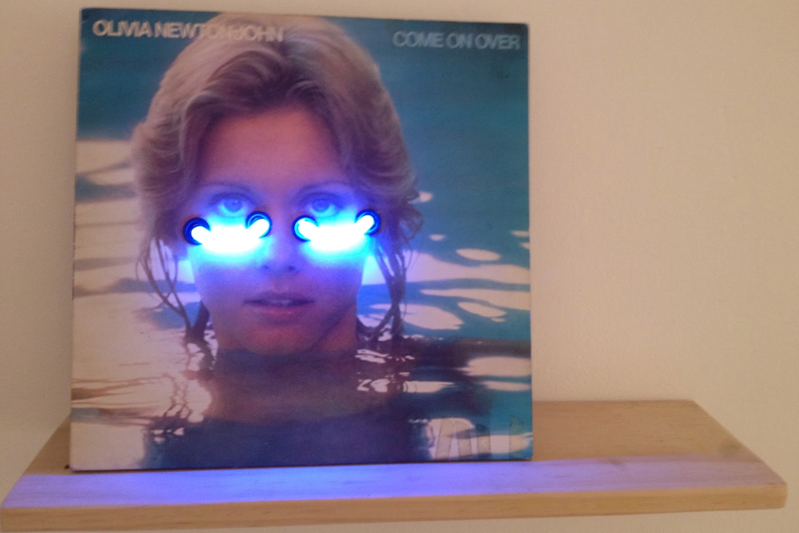
First up was MOP.  Here Sarah Contos (yes, more artists with websites, keep it up) has a show called 'My Eyes Through Your Mountains'. I really liked this.  I finally got around to reading the exhibition essay by Joel Mu (who guest curated the show at Alaska I quite liked) and it is pretty reassuring as even Joel makes the same titular links as I did.  Apparently Sarah likes working with images of old iconic Aussie performers, Olivia Newton John, Kamahl, Dame Joan Sutherland etc.  I didn't realise that the embellished screenprints (above 'Spring (DJS)') was actually meant to be Dame Joan, I think a little cut and paste job here.  There were 4 of these screenprints and only $650 each so a total bargain although I would struggle getting these breasts in the house, even covered up with bead tassels.  Family friendly was 'the bluest moon' (pictured top) which was neon on an old album cover.  Loved it.  And only $850?  I should've got her sooner ... and not spent my 2012 budget already!  Great work MOP.


Next door at pompom was a good old fashioned group show called 'heaven or las vegas'. Which sounded promising but to me had nothing to do with the works on show, but that is kind of par for the course with modern curatorial practice so you barely even make note of it nowadays.  Here I quite liked Craig Bender's photos.  Especially the ones where he orients them a little squiff.  My favourite was a work called 'Ballad of the New World II' which was turned on its side.  Mr Squiggle eat your heart out.    I did like Vivian Cooper-Smith's works which appear crumpled and then re-photographed (instal photo of 'The sound of tomorrow 1 & 2' above).  Also appealing was Todd Robinson's funny sculpture of a pink balloon called 'he knows at any moment it may be lost in a vertical field'! Much better than 'untitled'.

Points:  3 to Sarah for her Olivia Neon. I want one. Did Melissa Tkautz ever release on vinyl?  2 points for Craig's side photo and 1 point back to Sarah for her collagey screenprints.  In my interpretation those were the mountains ...

Dobell Prize at AGNSW - 6 December


So let me get this straight.  The Trustees of the Dobell Foundation decided to axe the prize and instead run with an invitation only show every 2 years?  Way to disenfranchise young and emerging artists!  One of the great things about a prize is that it is open to anyone.  Hell, even I was considering having a crack (I have at least a week of NAS drawing instruction under my belt!).  Art prizes are just the way we do things in Australia, we like winners in sport and I think that goes the same for the arts.  So yes in summary I think it is a fucking terrible decision.  The Dobell Foundation Trustees had better put on one hell of a drawing event in two years time!

On to this years show (which is open until 10 February).  I am only just getting around to posting about this a few weeks late due to a hectic Christmas season so I have to consult my notes extensively.  I think this has moved around the floors of the AGNSW for the last 3 years but I did prefer to take the stairs up to the exhibition this year.  As per usual form I disagree with the judges decision.  Gareth Sansom's series of small drawings called 'Made in Wadeye' won the official comp, but to me this seemed more like a gong for lifetime achievement rather than the work in question. After much deliberation I think my Dobell for 2012 would've gone to Katherine Hattam's 'Heidegger's Hut' (pictured above, taken before I realised they actually have images on the intrawebs for about half the finalists this year, I have gone with mine as the colours on my iphone seem brighter).  Graham Fransella has quite a good watercolour entry this year, luckily for him there is still the Trustee's watercolour prize within the Wynne!  Quite a few other recognizable entries, like former winner Suzanne Archer and Wendy Sharpe's sketch for her recent show at King St gallery.  I always make a point of asking the guides what their favourite was and in this case the Pam Hallandal would've taken the points.  There is still time so go and see for yourself.


Points:  3 for Katherine Hattam.  2 points for Marinka Bozzec's 'Box Office Poison', (above, a series of small drawings. Marinka is also on flickr so you can see some of her other work).  1 point will go to Craig Waddell's 'You are the lightness in my dark' which for some reason isn't available on the AGNSW site but was a great drawing of waratahs which resonated with the state patriot in me.

Saturday, December 1, 2012

Archie Moore at The Commercial - 1 December


Hot one today so I enjoyed the aircon on my way over to The Commercial.  This was my first visit and for some reason I can't stop singing the chorus to that 80s song 'feels like the first time'.  Anyway, the team behind The Commercial were really nice and it was a really enjoyable visit, especially 'for the very first time'.  Sorry.


I had read about this show on tweeter of all things (which I do suggest you get by the way, and follow me of course, and separately also follow Michael Reid because he is a really interesting character and you get art and all sorts stuff, I see a twitter post coming in Dec/Jan).  This was the last day of Archie Moore's Flag's, and given that December 1st is West Papua Independence Day (where they raise the morning star flag in defiance of Indonesian rule) I thought it an appropriate show to visit.  Archie has produced 10 different versions of the Aboriginal flag (see above for the gallery shot).  They are 'acrylic on nothing' in that he paints them on a rubber mat and then peels away the rubber to just leave the paint that has dried together.  I thought these would be quite brittle but if you ask nicely you can have a touch and they are very soft and move like a vinyl banner.  There is a real mix between the more overt political flags (like the hammer & sickle and the swastika flags) and the more social progressive flags (like the heart and the peace sign).  They were also great value at $2k a throw.  Unfortunately for me I was too late and the National Gallery had picked up three works (the most political ones) and another institution had also picked up a brace.  I think the only one still available was the rainbow which I could understand as the red / yellow / black is a really strong colour combo and the rainbow didn't really appear vibrant against the background. I really liked this show, but then again I am a bit of a vexillological geek (flagpole coming soon!) and was impressed at the re-imagining of such a recognisable standard.


Points:  3 to Aboriginal Heart (pictured top).  2 points to Aboriginal Deadly (pictured above).  I only learnt about the phrase 'Be Deadly' from the Tony Albert poster and now I know there is a flag as well and it does look deadly!  1 to Aboriginal Peace.  I think Archie just put himself on the Big Lamington wish list for 2013, especially if he does some cotton flags which I think pose less conservational issues than painting on nothing.